
Skip to content
EXPLORATIONS IN DATA STORYTELLING WITH POWER BI

EXPLORATIONS IN DATA STORYTELLING WITH POWER BI

  • Home
  • Visualisations
  • Templates
    • Deneb Templates
    • SVG Templates
    • PlotlyJS Templates
  • Services
    • Consultancy & Training
    • Shop Swag
  • About
  • LinkedIn
  • Bluesky
  • YouTube
  • Instagram

Month: April 2025

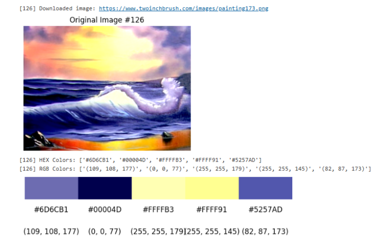
Extracting dominant colours in Fabric Notebooks

This blog post and accompanying code are inspired by this article on Towards Data Science, which walks through extracting dominant image colours using Python. The challenge From a Nightgale Data…

Continue reading Extracting dominant colours in Fabric Notebooks
Published April 8, 2025
Categorized as Analysis, Fabric Notebooks, How To's

Care with Proportional Data Bars

Power BI’s data bars in matrix visuals can be a helpful way to visualize numeric values quickly. However, they have limited formatting options that can impact how easily users interpret…

Continue reading Care with Proportional Data Bars
Published April 7, 2025
Categorized as DataViz, SVG

Recent Posts

  • A matter of scatter
  • Smoothed Line Faux-Pax’s (and Other Things UI/UX Can’t Teach You About Data Visualisation)
  • Upcoming Workshops
  • Cool report design tips with the updated Image visual
  • Protected: Make your blogs stand-out from the crowd

Archives

Categories

Meta

  • Log in
  • Entries feed
  • Comments feed
  • WordPress.org
EXPLORATIONS IN DATA STORYTELLING WITH POWER BI