
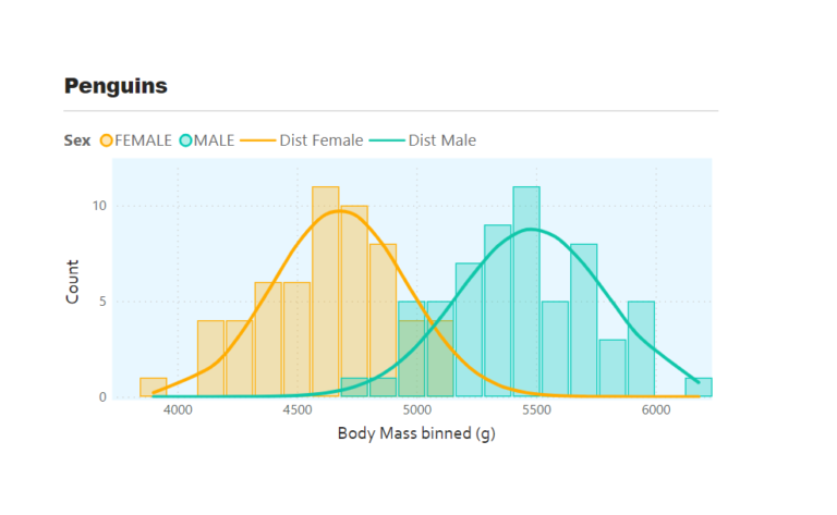
Overlapping histograms with normal curve overlays are used to compare the distribution of a numerical variable across different groups such as male and female body mass. With this we can…
Category: How To’s
Radial Column chart
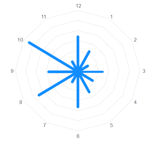
In a previous blog, I wrote about creating polar charts with Power BI Core visuals. This article continues that conversation and demonstrates how to create a radial column chart, with…
Polar and radial charts with Power BI Core Visuals
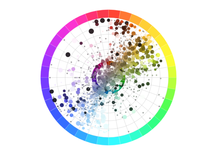
Aside from the pie and donut charts, there is not much in the way of polar plots in the Power BI core visual set. Polar plots are rarely used in…
Formatting Locale, Values and Tooltips in Deneb
When building a Deneb custom visual for a client I came across a scenario whereby the currency within the visual showed dollars in Bing browsers but British pounds in other…
Folding (Unpivot Data) with Vega-Lite & Deneb
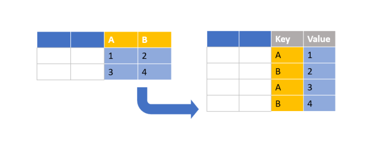
Creating a bar chart with Deneb is relatively simple when using a category field and a measure. But what about when you have only measures? In this particular scenario, I…
Adding sparklines to New Card Visual
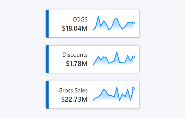
The New Card Visual is out in preview for the June 2023 Power BI Desktop – and it’s absolutely fantastic. With this first drop of the Card Visual we can…
Measure-driven data labels
May 2023 Power BI Desktop brought the beginnings of measure-driven data labels. Currently available on bar and line charts, but not yet scatter charts. With measure-driven data labels you are…
KPI trend indicators on Core Visuals
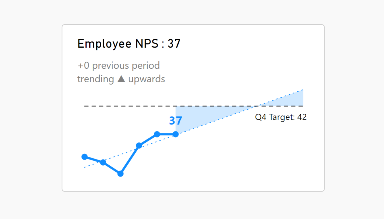
With the February and March 2023 Desktop releases comes more features enabling us to enhance our KPI visualisations out of the box. This article talks specifically to the DAX function…
Visualise Filters Applied
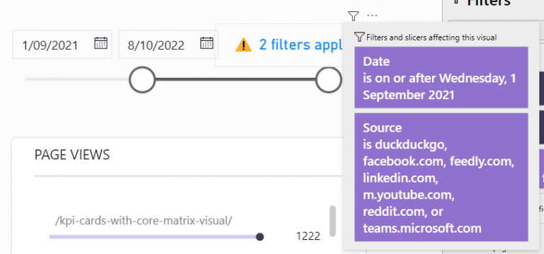
Creating a DAX measure to notify filters have been applied to a report is helpful when there are hidden slicer or filter panels.
Custom path axis with Charticulator
If there is one stand-out feature of Charticulator… …it is the ease at which we can design data visualisations along custom path axes. If you’re into the technical details, there…