
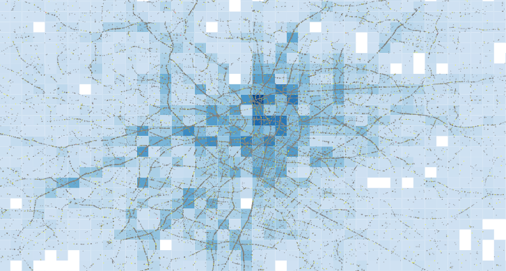
In almost a decade of building Power BI reports, a common blind spot I still see from colleagues regards data point limits in core visuals — largely unnoticed until someone…
Category: Power BI
Smoothed Line Faux-Pax’s (and Other Things UI/UX Can’t Teach You About Data Visualisation)
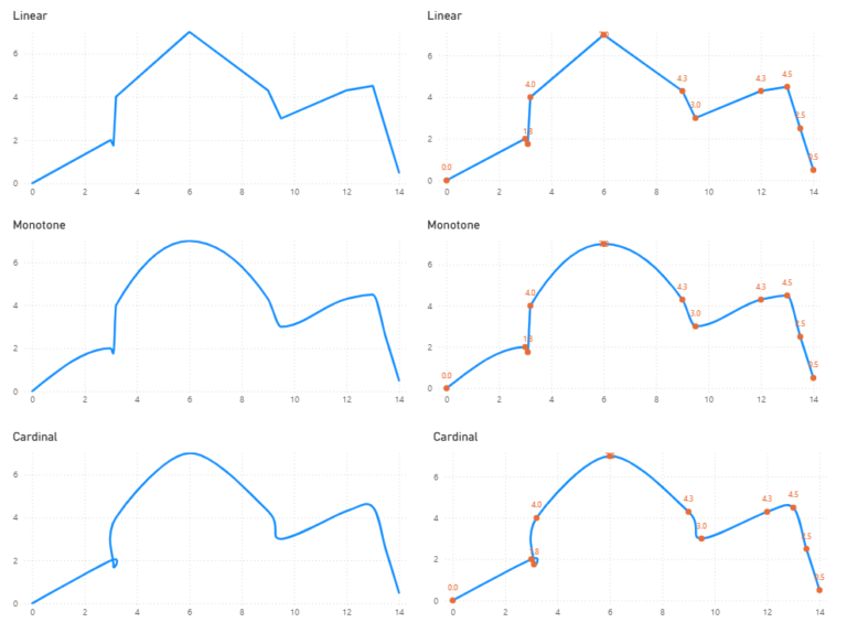
→ The explanation → Jump to the Point Power BI development is a relatively straight forward process when managed by one individual start to finish. But when the development process…
Timeseries smoothing

Quite often when exploring data within Power BI, we might want to visualise timeseries data, only to be met with an unsightly jagged line: We might be tempted to smooth…
Lasagna Plots and Heatmaps with Core Scatter

A relatively new Power BI Desktop release comes with the ability to rotate markers on scatter plots… … some interesting use cases have arisen from this feature, but one such…
Embedding Charts from Web
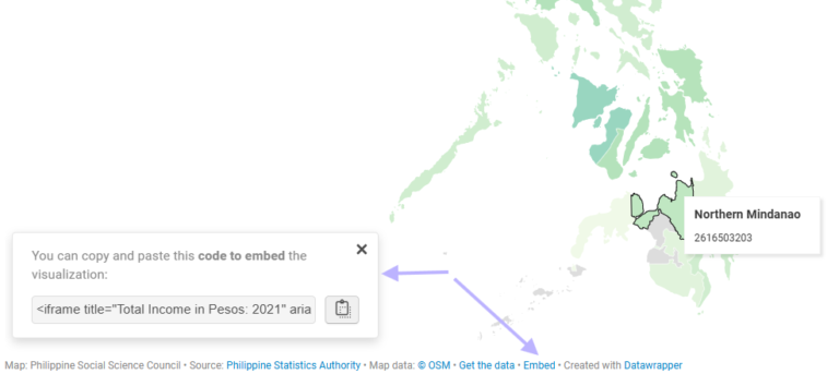
As far as custom visualisations go for Power BI, the HTML Content visual is one of the most versatile. Demonstrated uses of the visual have been: WSS Schools provides a…
Overlapping histogram with distribution curve
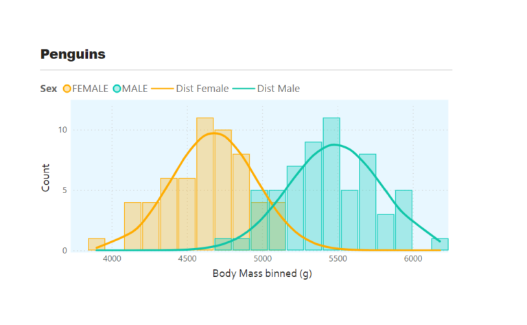
Overlapping histograms with normal curve overlays are used to compare the distribution of a numerical variable across different groups such as male and female body mass. With this we can…
Radial Column chart
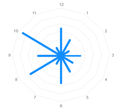
In a previous blog, I wrote about creating polar charts with Power BI Core visuals. This article continues that conversation and demonstrates how to create a radial column chart, with…
Polar and radial charts with Power BI Core Visuals
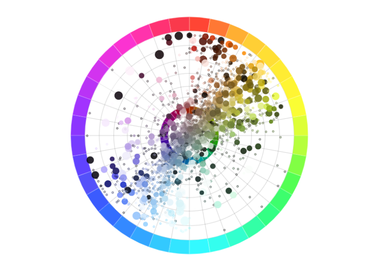
Aside from the pie and donut charts, there is not much in the way of polar plots in the Power BI core visual set. Polar plots are rarely used in…
Adding sparklines to New Card Visual
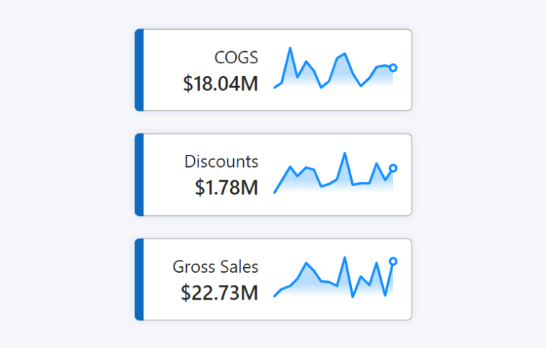
The New Card Visual is out in preview for the June 2023 Power BI Desktop – and it’s absolutely fantastic. With this first drop of the Card Visual we can…
Measure-driven data labels
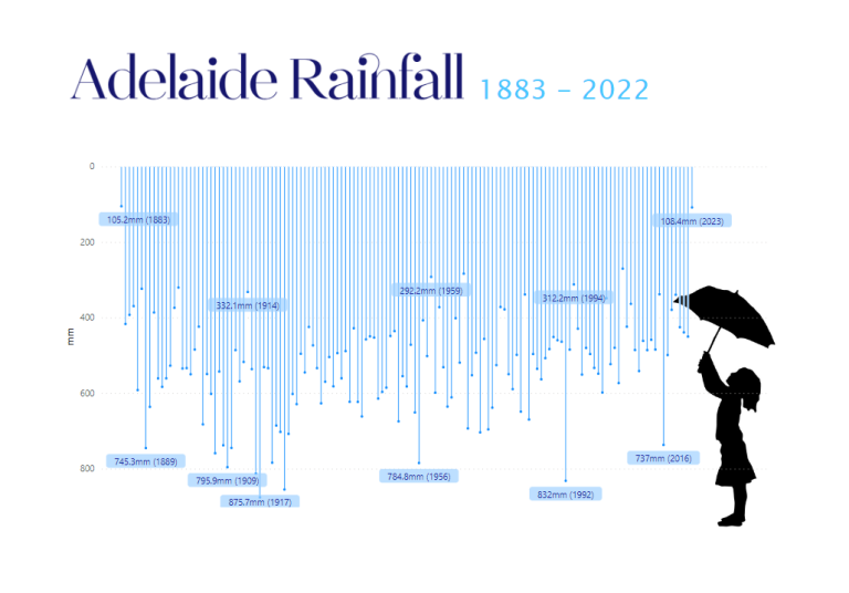
May 2023 Power BI Desktop brought the beginnings of measure-driven data labels. Currently available on bar and line charts, but not yet scatter charts. With measure-driven data labels you are…