
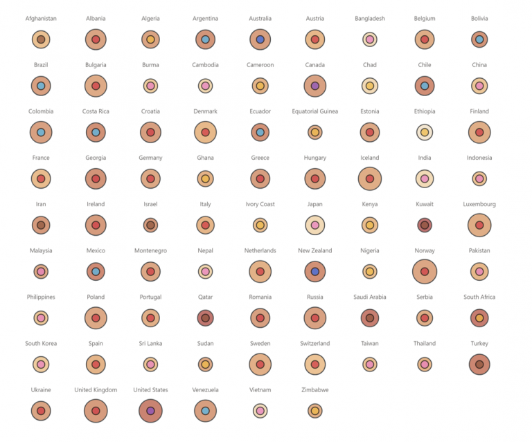
My latest Deneb creation breaks ALL THE RULES of Dataviz But. I like it! This is a visual I designed for myself. I’m fascinated with the human body and the…
Category: Infographic
Position with PureViz
This post is a continuation of my exploration of the latest updates on the PureViz custom visual for Power BI. In my previous post, I looked at colour fill and…
Comics with PureViz
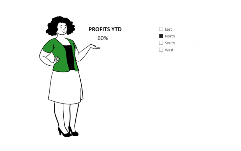
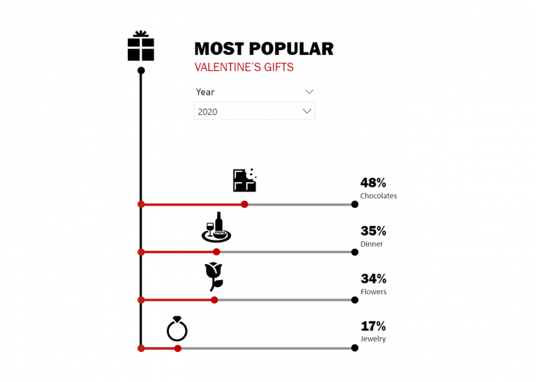
I recently discovered a new feature in PowerPoint – “Cartoon People”. It offers the ability to mix and match bodies, faces and expressions and looked quite a bit of fun.…
Taking PureViz for a spin
I came across PureViz in my LinkedIn feed a week or two ago. It immediately caught my attention because lo and behold, there was a rotating turbine 🙂 “Ooh is…
Exploring Data-Driven SVG Part 2 (Rotation)
Having experimented with colour-fill and width I next wanted to play with rotation. How the devil was I to do that? Google is my friend. And so is CSS Tricks.…
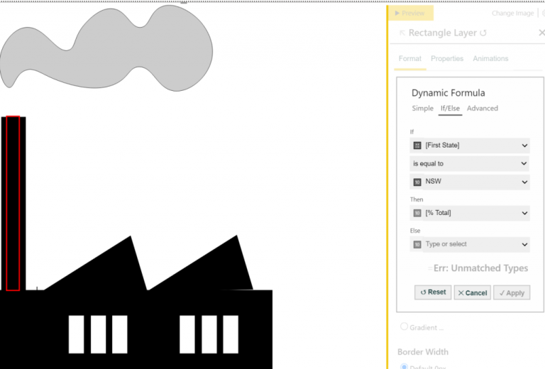
Exploring Data-Driven SVG Part 1 (Colour-fill and Size)
In earlier years of using Power BI I came across an article by David Eldersveld on utilising SVG and colour fill. I was wrapped with the idea and immediately set…