
This post is a continuation of my exploration of the latest updates on the PureViz custom visual for Power BI.
In my previous post, I looked at colour fill and show/hide options, in this post I will look at shape fill and position.
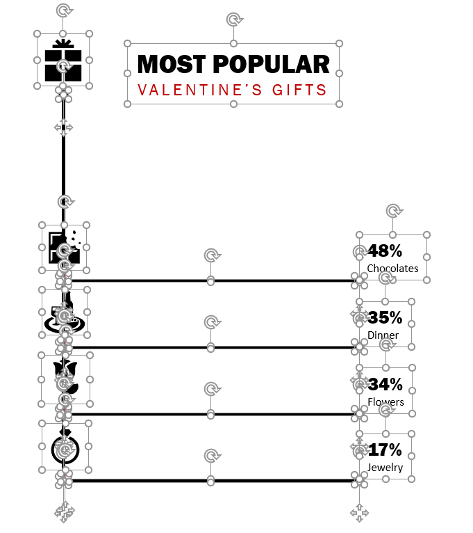
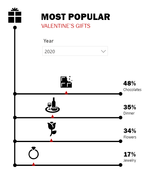
I began with a collection of shapes in PowerPoint – lines, circles, text and icons. It might not make for the best infographic, but it was good enough for a play.
Once finalised, I selected all shapes and saved as SVG. Upon import into the PureViz visual I could see the dimensions for various shapes, but could not see the dimensions for the lines. As I had intended to move markers along these lines, it was difficult to determine how far to move these markers horizontally.
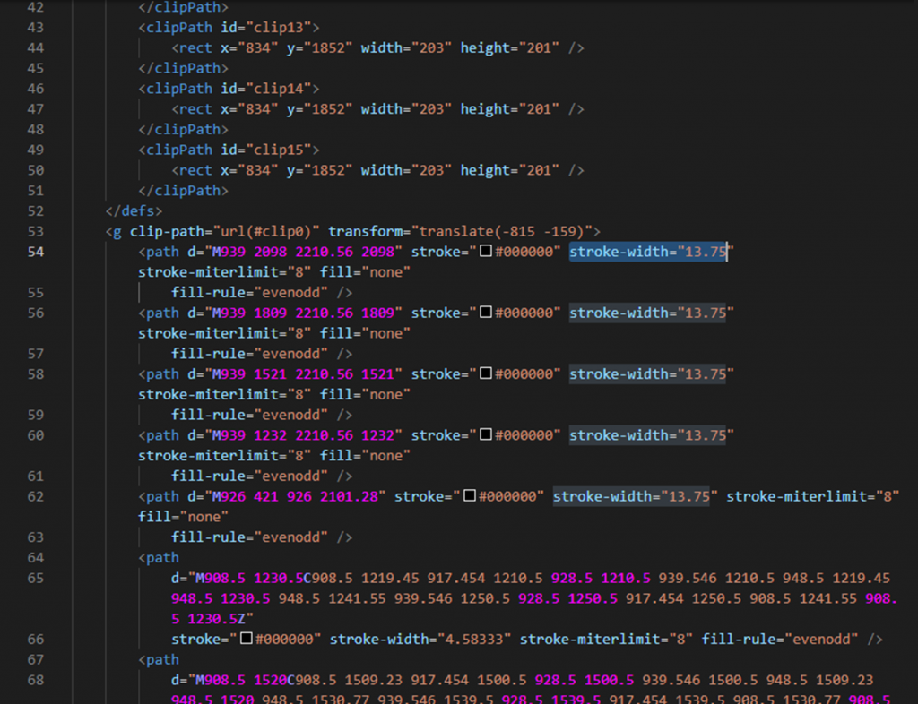
So I looked at the SVG in visual Studio Code and saw that the lines were represented as path elements.
Rather than calculate the length of the paths, I re-opened my PowerPoint and changed the lines to rectangle shapes, and re-imported into PureViz.
Aha! There we go…
The element was now recognised as a rectangle with its respective dimensions.
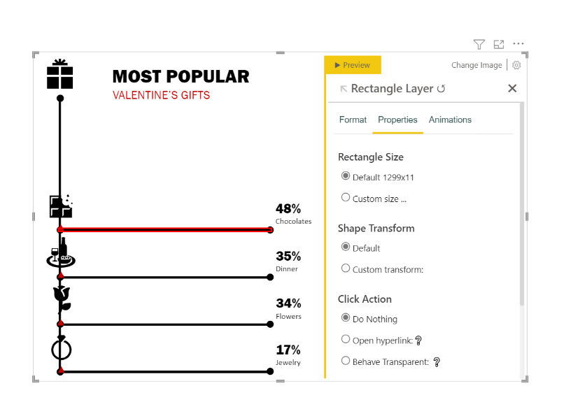
A quick look in Visual Studio confirmed the new shapes were represented by rectangle elements with width and height dimensions of 1299×11.

Knowing the width of the rectangles then allowed me to calculate position of the markers. I started by selecting the first marker shape and assigning it to a category (Gift=Sweets) under the Move X function.
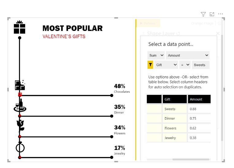
Then modified the formula to find its proportionate position along the line.
{math|1299*[Amount::sum?Gift=Sweets]|}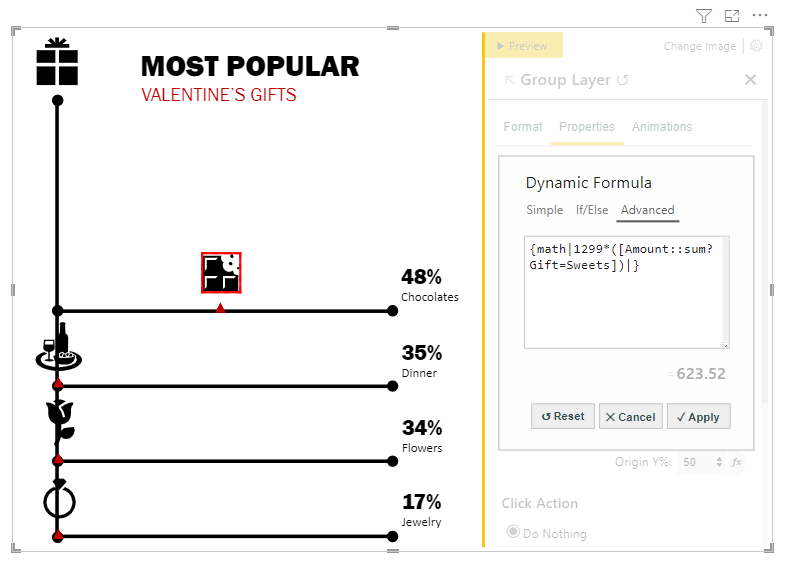
I applied the same logic to the icons, updated the text labels to be dynamic, and took a look at the result.
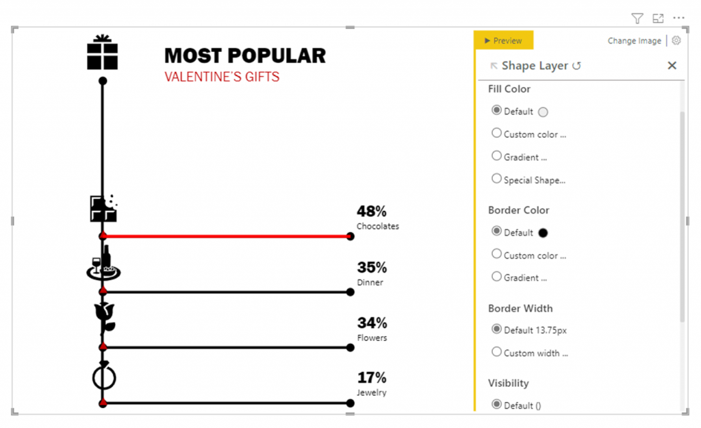
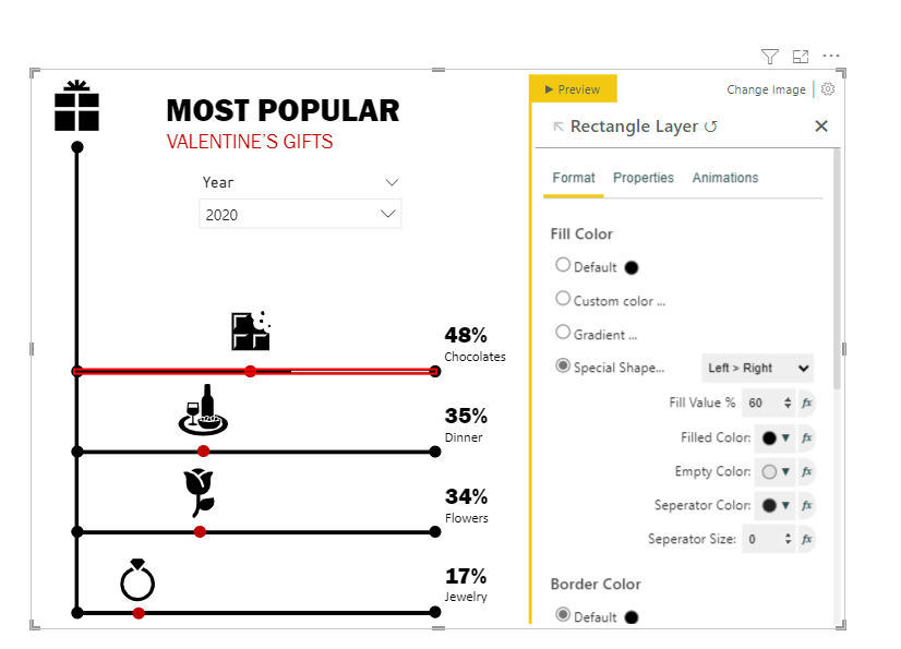
It was a bit bland. So I thought I’d add a little more colour.
I changed the markers from triangles to circles and modified the line (rectangle) shapes to have a percentage fill. I chose red for the filled colour and increased transparency for the empty colour.
Interesting…
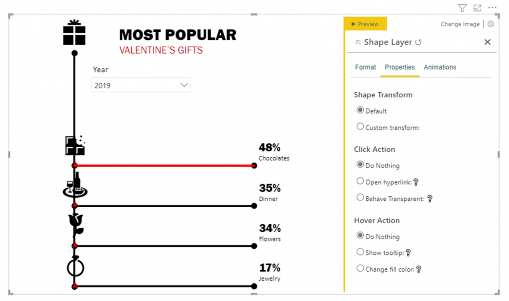
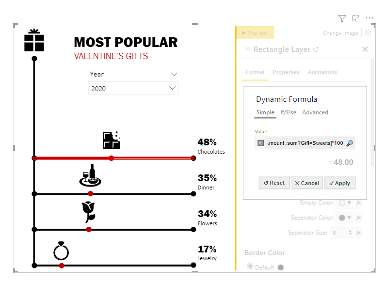
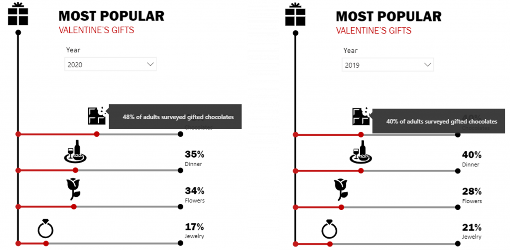
I decided to add a little more context to the graphic through tooltips. I selected the first icon group, then the show tooltip option.
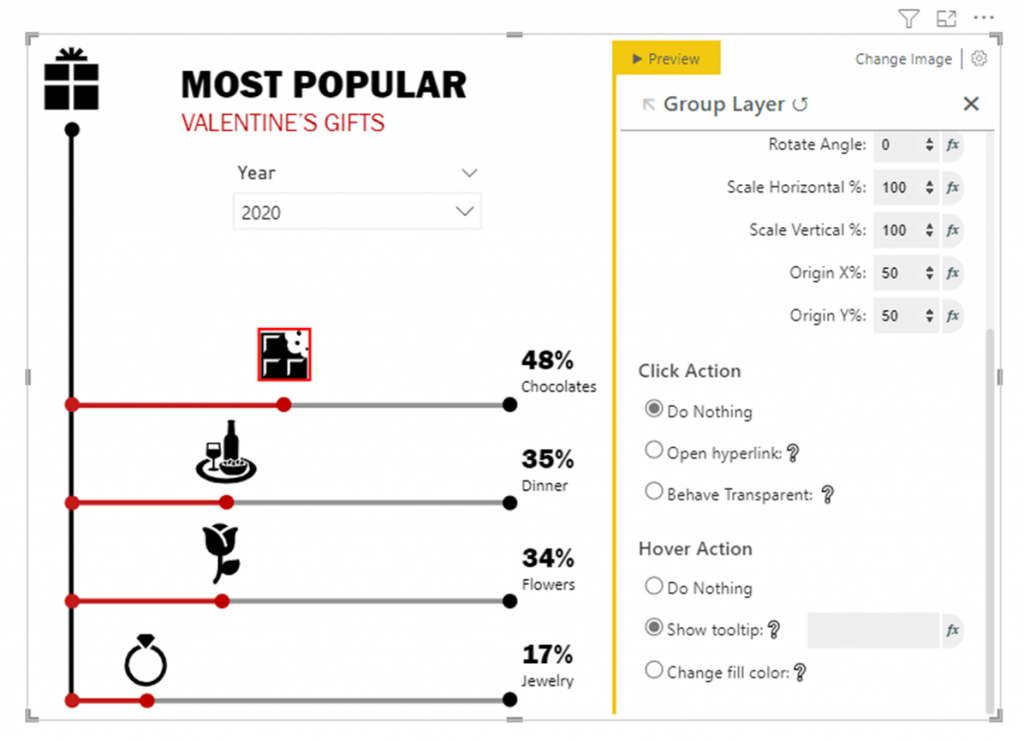
I used Advanced Dynamic Formula to calculate the filtered amount and append a text description.
{math|[Amount::sum?Gift=Sweets]*100|,}{text|% of adults surveyed gifted chocolates|}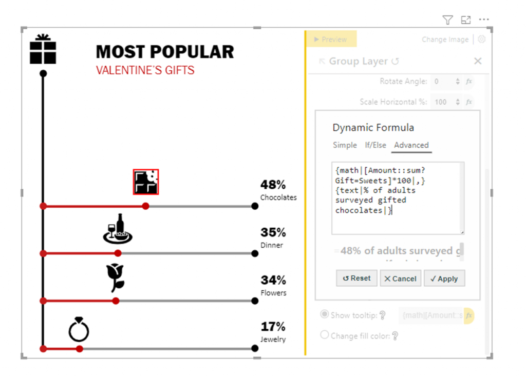
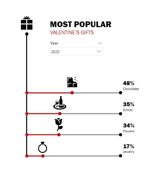
And done.
Hello Kerry, great report, you are using custom viz like a boss !!!
Can we get the .pbix file for this example ? Please
Thanks,
Kind Regards,
Antoine MICK