
In a previous blog, I wrote about creating polar charts with Power BI Core visuals. This article continues that conversation and demonstrates how to create a radial column chart, with…
Author: Kerry Kolosko
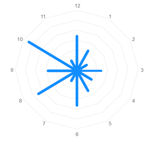
Polar and radial charts with Power BI Core Visuals
Aside from the pie and donut charts, there is not much in the way of polar plots in the Power BI core visual set. Polar plots are rarely used in…
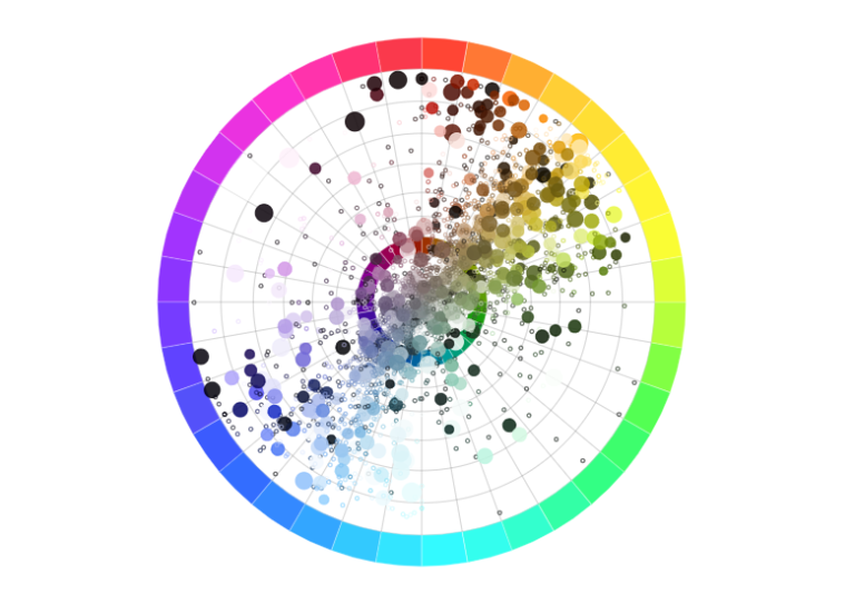
How do you choose the right visual? Turning to nature for dataviz inspo
“When shortcutting the design process, I think back to the natural world.” In my years of data visualisation consultancy, I am often asked “How do I choose the right visual?”.…
How to remove Copilot from Bing/Edge

If you are photosensitive, motion sensitive, or have AI fatigue, you might be desperately wanting to tone down the CoPilot neon colours, text animations, and attention-hogging prompts from your browser.…
Formatting Locale, Values and Tooltips in Deneb
When building a Deneb custom visual for a client I came across a scenario whereby the currency within the visual showed dollars in Bing browsers but British pounds in other…
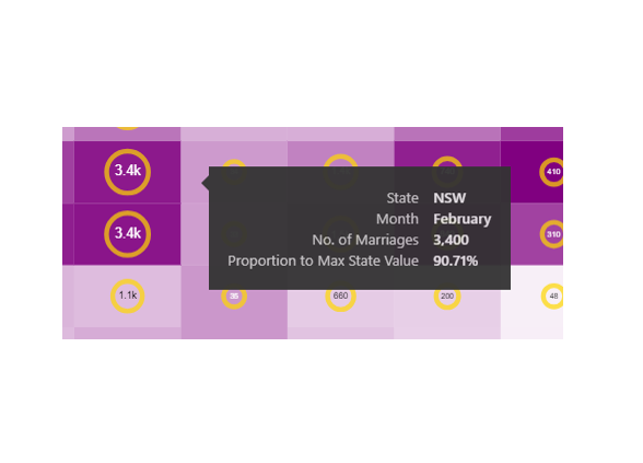
Independent Scales with Deneb (Ring Chart)
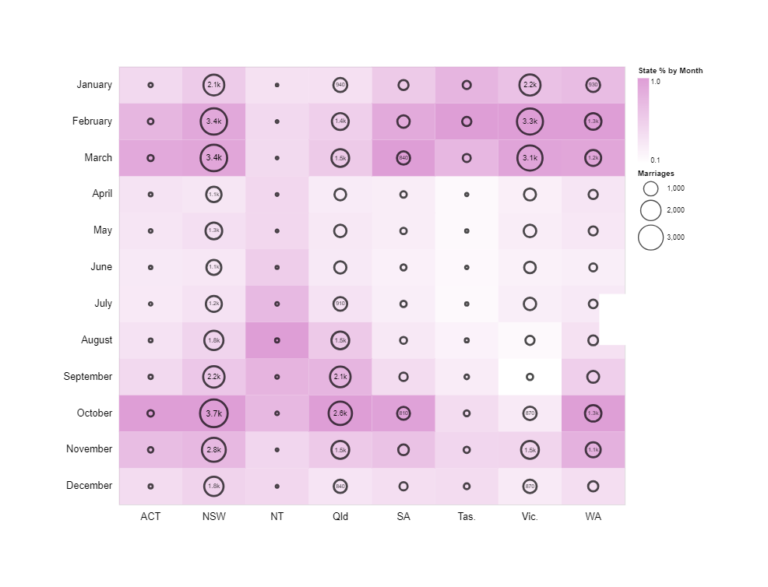
A chart I created for a Workout Wednesday Challenge. The chart shows the number marriages by month and Australian State encoded by size as rings, and (given that each state…
Peak Geek

That’s it! I’ve done it! I’ve officially hit Peak Geek I cannot possibly imagine creating an image geekier than the one below: For those that need the explanation, the image…
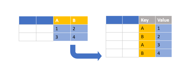
Folding (Unpivot Data) with Vega-Lite & Deneb
Creating a bar chart with Deneb is relatively simple when using a category field and a measure. But what about when you have only measures? In this particular scenario, I…
Drop the Drop Shadows!
*WARNING* This article contains images that may be potential vestibular and photosensitivity risk. Drop shadows should be used with caution in UI/UX design. When overused or poorly implemented, drop shadows can…
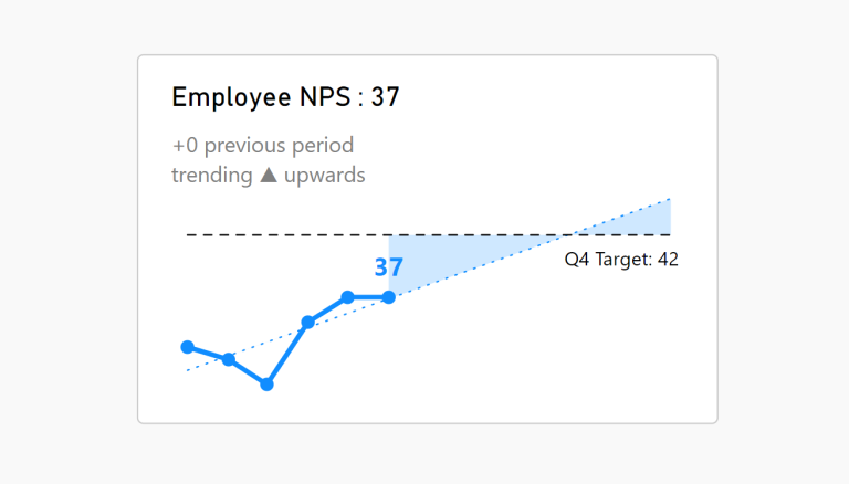
KPI trend indicators on Core Visuals
With the February and March 2023 Desktop releases comes more features enabling us to enhance our KPI visualisations out of the box. This article talks specifically to the DAX function…