

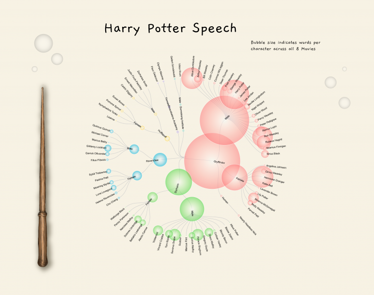
That’s it! I’ve done it! I’ve officially hit Peak Geek I cannot possibly imagine creating an image geekier than the one below: For those that need the explanation, the image…
Category: Creative
Power BI + Adobe = Magic
Adobe Illustrator has been a tool in my dashboard design kit for quite a while. I’ve used it predominately for creating report assets such as icons, headers and backgrounds. I’ve…
Position with PureViz
This post is a continuation of my exploration of the latest updates on the PureViz custom visual for Power BI. In my previous post, I looked at colour fill and…
Just because you can…

I’d seen a number of blogs of late using the phrase “Just because you can doesn’t mean you should”. I don’t think I’ll ever get to the bottom of where…
Exploring Data-Driven SVG Part 4 Animation and Filters

After exploring SVG size, colour fill, pattern fill, rotation, polygon paths and arcs, the next natural progression was to explore filters and animation. There are a few methods to animating…
Exploring Data-Driven SVG Part 3 Polygons and Arcs
Following Data-Driven SVG Parts 1 & 2; I next explored polygon paths and arcs. The below “infographic” was an exercise in creativity and was never intended to inform. Thus, breaks…
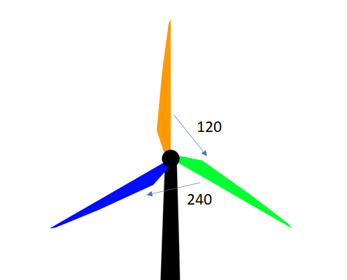
Exploring Data-Driven SVG Part 2 (Rotation)

Having experimented with colour-fill and width I next wanted to play with rotation. How the devil was I to do that? Google is my friend. And so is CSS Tricks.…
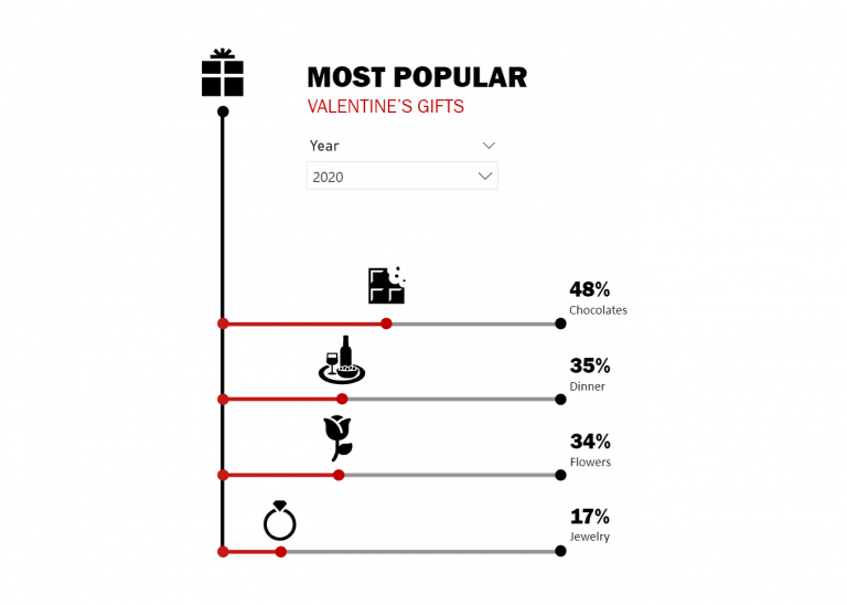
Exploring Data-Driven SVG Part 1 (Colour-fill and Size)
In earlier years of using Power BI I came across an article by David Eldersveld on utilising SVG and colour fill. I was wrapped with the idea and immediately set…