Skip to content
EXPLORATIONS IN DATA STORYTELLING WITH POWER BI

EXPLORATIONS IN DATA STORYTELLING WITH POWER BI

  • Home
  • Visualisations
  • Templates
    • Deneb Templates
    • SVG Templates
    • PlotlyJS Templates
  • About
  • LinkedIn
  • Twitter
  • YouTube
  • Instagram

Category: Experimentation

Breaking the Rules

My latest Deneb creation breaks ALL THE RULES of Dataviz But. I like it! This is a visual I designed for myself. I’m fascinated with the human body and the…

Continue reading Breaking the Rules
Published September 29, 2022
Categorized as Deneb, Experimentation, Infographic

Reversed Deviation Icicle Chart

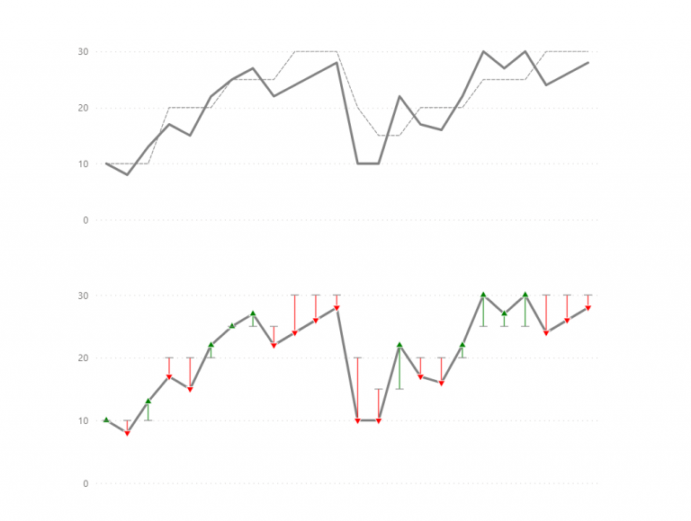
A deviation icicle chart is an uncommon chart to show variance from a target or baseline value across time. There are a multitude of ways to show comparison to target…

Continue reading Reversed Deviation Icicle Chart
Published September 5, 2022
Categorized as Custom Visualisations, Deneb, Experimentation

A Game with Field Parameters

Power BI Word Game

This mid-year has been an awfully busy time for me. A number of family events, holidays and a company change, have kept me occupied. Which has meant that it’s taken…

Continue reading A Game with Field Parameters
Published August 8, 2022
Categorized as Experimentation

Power BI + Adobe = Magic

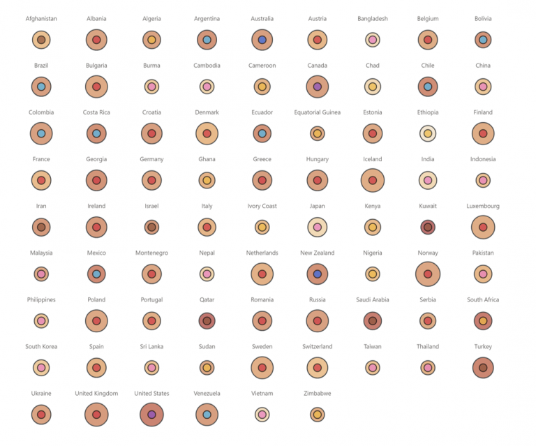
Adobe Illustrator has been a tool in my dashboard design kit for quite a while. I’ve used it predominately for creating report assets such as icons, headers and backgrounds. I’ve…

Continue reading Power BI + Adobe = Magic
Published April 22, 2022
Categorized as Creative, DataViz, Deneb, Experimentation, Musings

Position with PureViz

This post is a continuation of my exploration of the latest updates on the PureViz custom visual for Power BI. In my previous post, I looked at colour fill and…

Continue reading Position with PureViz
Published April 11, 2022
Categorized as Creative, Experimentation, How To's, Infographic, PureViz

Thinking about target bands

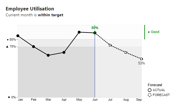
I’ve come across many charts like this in the wild. This one depicts utilisation and RAG status by month. They’re not bad charts, they serve a purpose, but they could…

Continue reading Thinking about target bands
Published March 4, 2022
Categorized as DataViz, Deneb, Experimentation

Images and custom shapes in Deneb

Over the past few months, I’ve had considerable fun exploring images and custom shapes with Deneb Custom visual for Power BI. I’ve finally gotten around to blogging about it. There…

Continue reading Images and custom shapes in Deneb
Published January 6, 2022
Categorized as Custom Visualisations, Deneb, Experimentation, Vega-Lite

Reasons to avoid gradient backgrounds on Power BI reports

Gradient Optical Illusion

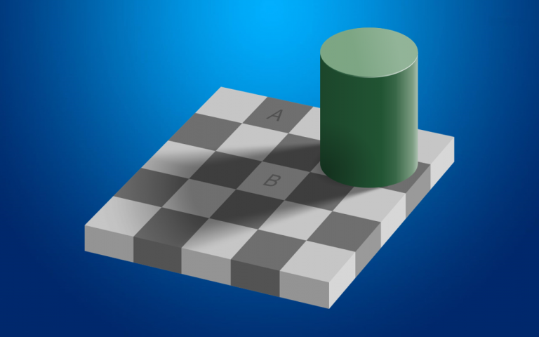
Gradient backgrounds are all the rage in dashboard design. They appear to be floating around everywhere. Looks cool right? Perhaps. I am not a fan, and for some time have…

Continue reading Reasons to avoid gradient backgrounds on Power BI reports
Published May 9, 2021
Categorized as DataViz, Experimentation, Musings, Power BI

Exploring Data-Driven SVG Part 4 Animation and Filters

After exploring SVG size, colour fill, pattern fill, rotation, polygon paths and arcs, the next natural progression was to explore filters and animation. There are a few methods to animating…

Continue reading Exploring Data-Driven SVG Part 4 Animation and Filters
Published February 26, 2021
Categorized as Creative, Experimentation, HTML Content Visual, SVG

Exploring Data-Driven SVG Part 3 Polygons and Arcs

Following Data-Driven SVG Parts 1 & 2; I next explored polygon paths and arcs. The below “infographic” was an exercise in creativity and was never intended to inform. Thus, breaks…

Continue reading Exploring Data-Driven SVG Part 3 Polygons and Arcs
Published January 4, 2021
Categorized as Creative, Experimentation, HTML Content Visual, SVG

Posts navigation

Page 1 Page 2 Older posts

Recent Posts

  • KPI trend indicators on Core Visuals
  • Visualise Filters Applied
  • Custom path axis with Charticulator
  • Breaking the Rules
  • Convert to Shape

Archives

Categories

EXPLORATIONS IN DATA STORYTELLING WITH POWER BI