
Gradient backgrounds are all the rage in dashboard design. They appear to be floating around everywhere.
Looks cool right?
Perhaps. I am not a fan, and for some time have found it hard to articulate to others why this is the case. My verbal utterances were never much more than “it makes me go cross-eyed and headache-y” or “it makes my stomach churn”. Not convincing enough reasons to ask the report designer to pause and reflect.
In contemplating the matter more deeply I set about putting my thoughts to paper.
Gradients are great in design because they add interest, texture, warmth and in some cases depth to an otherwise flat subject. Given that our outside world is not flat, monotone or uniformly illuminated, it’s easy to see why we might be drawn to a visual with such cues. According to colour psychology, various gradient colours and mixes will elicit various emotional and visceral responses. Although the exact response desired in our audience is hard to target when there are cultural and individual differences in colour associations and preferences.
So why is it that I have such an averse response to gradient backgrounds on a dashboard? Why do I feel headache-y and even nauseous?
I doubt I’ll ever truly know the answer, but I can experiment and postulate.
My Experiment
In thinking of how gradients might impact visual perception, I am reminded of this infamous optical illusion from my undergraduate psychology classes.
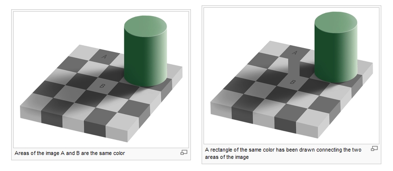
Squares A and B are the same shade, however, square B is depicted in shadow tricking us into thinking it is several shades lighter. Here, our brains are trying to make sense of luminance and colour constancy.
Imagine then, what is happening with our perceptive systems when trying to discern foreground colours against a background of varying shades.
Let’s take a look…
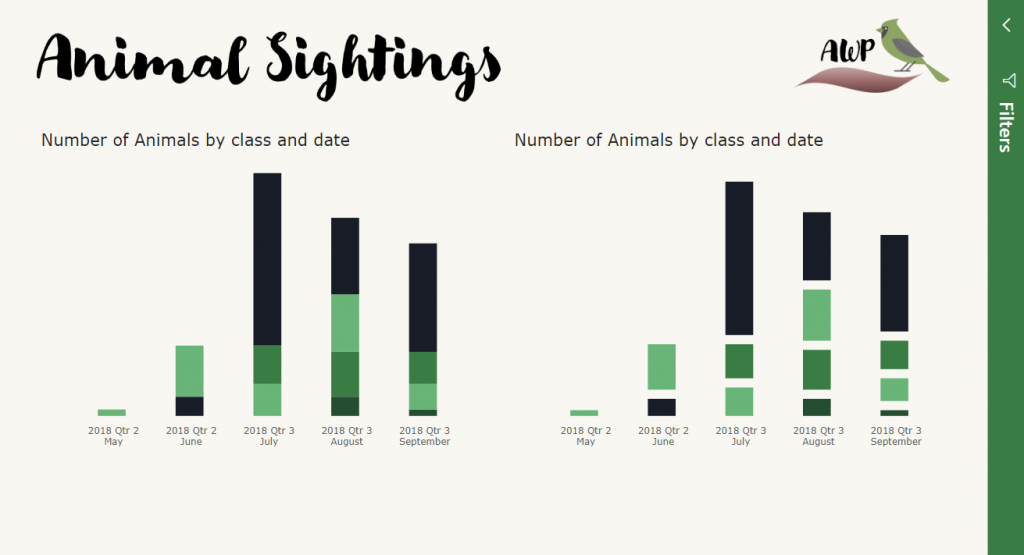
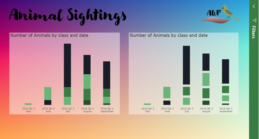
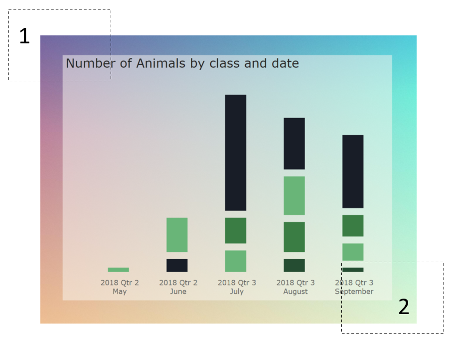
Here I have a bar graph recycled from a previous blog post. You’ll note that as the bars move further away from each other the contrast appears to change.
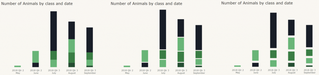
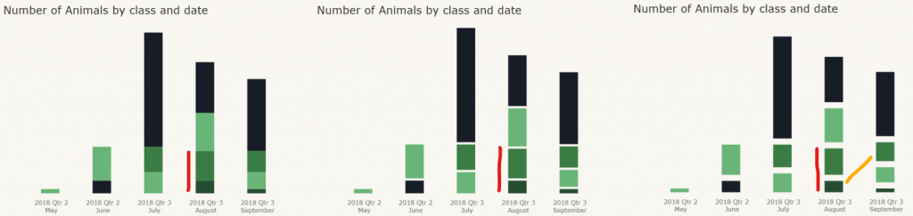
Not so easy to tell apart anymore.
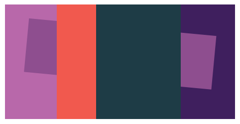
Now let’s put a gradient background on the page.
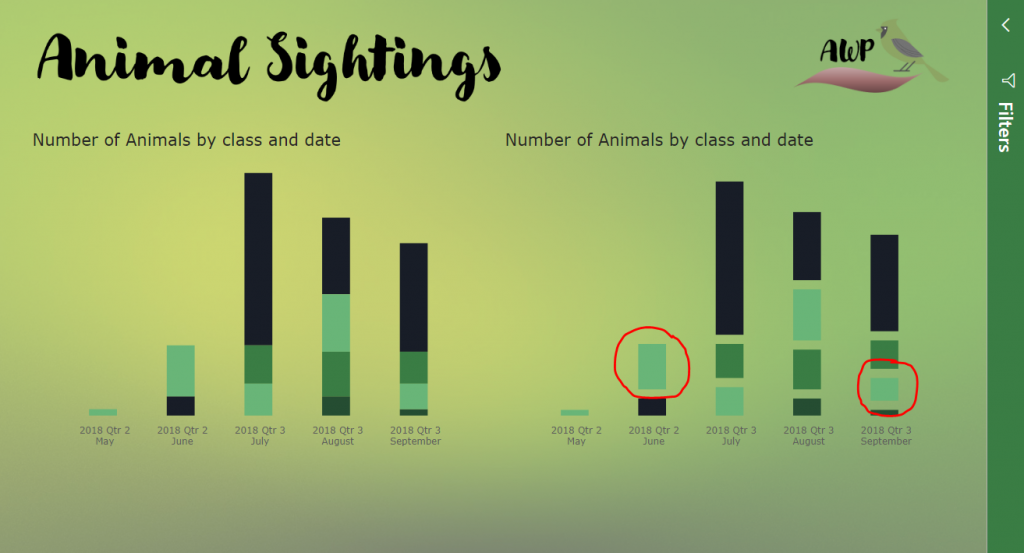
Not only does the gradient here affect contrast and saturation, making one block less visible than the other, but the surrounding colour variation has my brain questioning whether the blocks are in fact the same colour. One looks a slightly bluer hue than the other.
“Ah, Kerry” you say, “that’s only because its green on green!”
No worries, let’s change to blue.
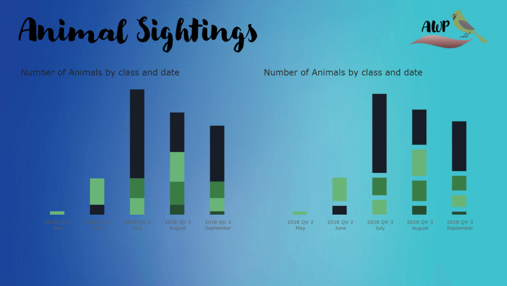
Hmm… not much to see here except that the text has become harder to read on the left side of the report. Pain to correct, so let’s try another background.
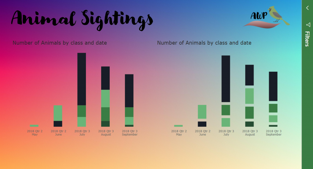
Eewww. The imagery this colour mixture conjures up is gag-worthy.
Quick, let’s try and find some relief from that pink by lightening it up.
Oh goodness my eyes! Now I’m getting that eye-strain induced headache feeling again…
What’s happening here?
Again, I can only speculate and describe my experiences. What I do know is that everything on the page is competing for my attention. The boxes have broken up the gradient, which before showed a gradual change in hue and brightness. The boxes have now made this change more abrupt. Scanning across the page, I feel my pupils or other parts of my perceptive system are rapidly trying to adjust to the variations in contrast and brightness causing strain. The more luminous colours are triggering a sharp pain at the back of my head and are lingering even after closing my eyes.
I am drawn to the richer pink and purple colours to the left of the report. When reading left to right, these colours stay clearly in my peripheral vision vying for my attention, my eyes keep wanting to snap back. I’m therefore using a considerable amount of concentration trying to block out distraction and read the text on the screen.
The boxes also confuse, which I believe might be due to depth perception. Things that are hazy, naturally, seem further away. Gradations in brightness and saturation are also visual cues for light, shadow and distance. Due to the transparent nature of the boxes, when scanning the page left to right, up then down, my brain can’t decide whether the boxes are in the background or foreground and how far to the background or foreground they should be… as the box keeps moving on me in terms of depth perception, I am starting to feel a sensation similar to motion sickness…
Back to my experiment and I decide to change from bar graphs to line graphs.
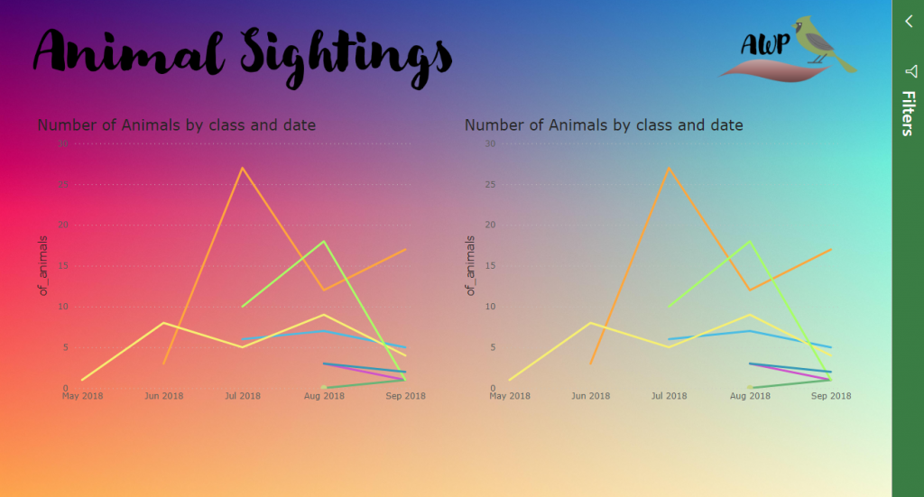
Wait, what’s that?!
Hmmm….
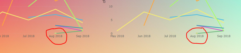
Question: How many shades of green are there in the below image?
Answer: Three.
I’d thought I pause at this stage to do some research. From playing around with charts on various background colours I was able to manipulate my brain into seeing different hues for the same object just by dragging it around on the screen. There must be some scientific study into this and a name to call the phenomenon.
I couldn’t find a fancy-schmancy latin name but I did find some research on colour saturation and colour adaption theory. I also came across a book by Josef Albers The Interaction of Colour and blog posts (here and here) from which I derived the below images. These images illustrate how the same colour can be perceived to be different and how two colours can be perceived to be the same by merely adjusting context.


My learnings
So, at the end of my experimentation and research, what did I learn?
- High-energy, luminant colours irritate and overstimulate our senses, particularly for those with photosensitivity. Blue light is considered the most irritating.
- Rapid changes in light frequency and certain high contrast visual patterns can trigger migraines
- We are visually drawn to brighter, more saturated colours above the rest
- Gradations in brightness and saturation are also visual cues for light, shadow and distance
- When a coloured object is placed against a coloured background, the background may change the objects hue, saturation and brightness.
Each of these things in turn can be designed for on a plain Power BI background. However, when using gradients (particularly multi-coloured gradients), it becomes not only a challenge for the report designer who must try to create consistent contrast across the canvas, but for the report consumer too. We use variations in colour as visual cues to understand where we are in our natural environment. “Layering” charts on these gradients (without respect to the underlying gradient) confuses these cues. The consumer then expends a considerable amount of energy trying to eliminate background noise and create constancy, before they can even begin to interpret meaning, thus, as in my case, can quickly become overwhelmed.
When it comes to building dashboards, it’s important to remember objectives. A dashboard is intended to facilitate rapid assessment of key metrics at a glance. Gradients need to aid this rapid assessment, else they are merely decoration or distraction. Whilst decoration is important on dashboards as a means to engage users, unless it is intended to market or sell a product, it should be kept to a minimum. Any decoration that may influence a consumer’s visceral or emotional response when assessing metrics and making decisions should be very carefully considered. For business users, a neutral and minimalistic design is key.
Well, there you have it. A visual exploration of why I dislike gradient backgrounds on dashboards. Excuse me whilst I go rest my eyes for a while.
Now I have a headache lol. Great post and I’m glad you put it into words because I never could quite convey the message.
I’ve never seen it so well explained. Essential in any BI course.
Great !!!