
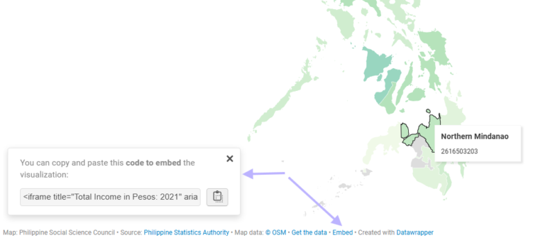
As far as custom visualisations go for Power BI, the HTML Content visual is one of the most versatile. Demonstrated uses of the visual have been: WSS Schools provides a…
Category: HTML Content Visual
Microcharts and radial gauges
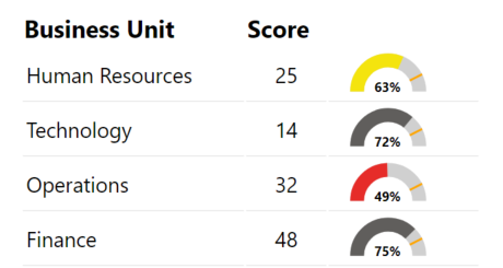
I’d written in a previous post about building a custom gauge table with HTML. This is an extension of that post with DAX for additional gauges or microcharts. Radial Gauge…
Building a custom Gauge Table with HTML
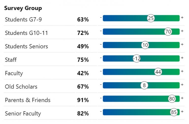
A quick design for a very specific use case I wanted to visualise scores similar to the above in a way that was quick and easy for me to read…
Playing with data on an empty stomach…
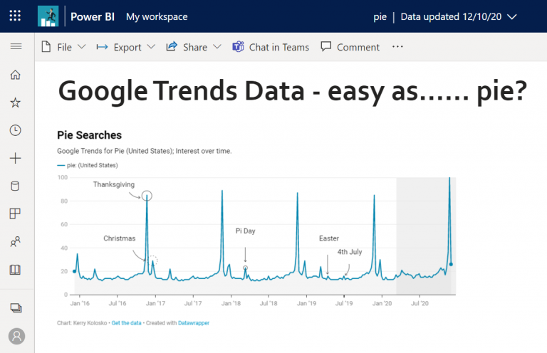
I couldn’t tell you why, but one day I decided to check out Google Trends, knowing about it of course, but never having actually used it. I navigated to the…
Exploring Data-Driven SVG Part 4 Animation and Filters
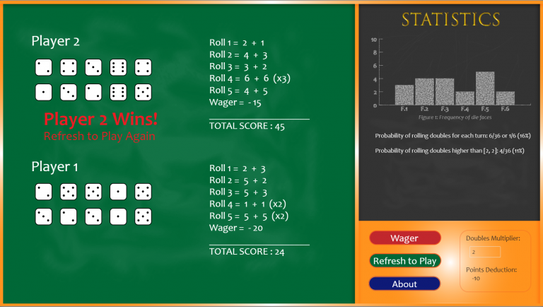
After exploring SVG size, colour fill, pattern fill, rotation, polygon paths and arcs, the next natural progression was to explore filters and animation. There are a few methods to animating…
Exploring Data-Driven SVG Part 3 Polygons and Arcs
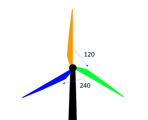
Following Data-Driven SVG Parts 1 & 2; I next explored polygon paths and arcs. The below “infographic” was an exercise in creativity and was never intended to inform. Thus, breaks…
Exploring Data-Driven SVG Part 2 (Rotation)
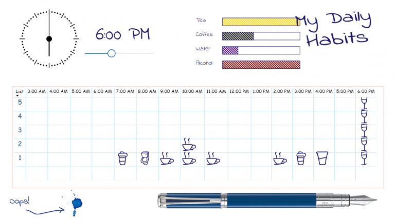
Having experimented with colour-fill and width I next wanted to play with rotation. How the devil was I to do that? Google is my friend. And so is CSS Tricks.…
Exploring Data-Driven SVG Part 1 (Colour-fill and Size)
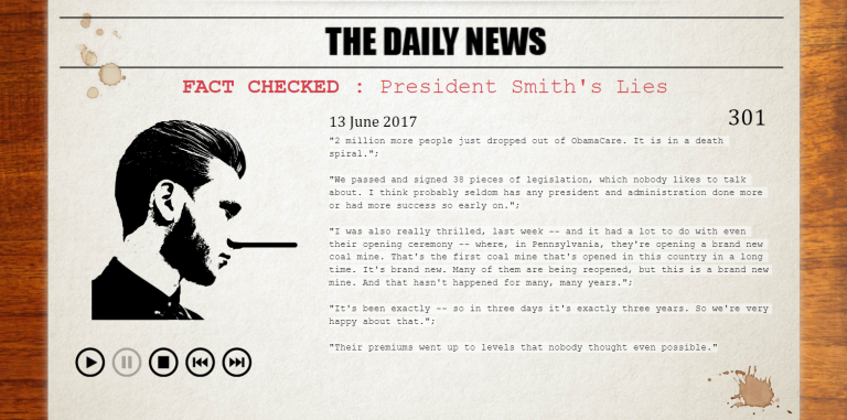
In earlier years of using Power BI I came across an article by David Eldersveld on utilising SVG and colour fill. I was wrapped with the idea and immediately set…