
A quick design for a very specific use case
I wanted to visualise scores similar to the above in a way that was quick and easy for me to read and interpret.
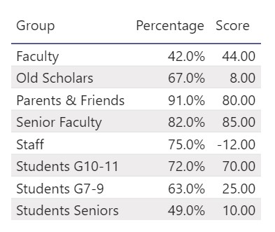
Step 1: The Table
Whilst it is true that SVG can be displayed in native matrix visuals, the last time I checked these rendered square and thus a little impractical for my requirement.
In need of a quick viz, I went to what I was most familiar with. I remembered seeing a worked example from Daniel Marsh-Patrick on how to build a table with the HTML Content Visual, so I moseyed on over to his site to take a look. It was a perfect example so I copied the code and set about modifying it. I added the extra columns and updated the table styling.
<HTML> Linear Gauge Table =
    VAR SourceData =
        ADDCOLUMNS(
            SUMMARIZE(
                'KPI',
                'KPI'[Survey Group]
            ),
            "%", FORMAT('KPI'[KPI Percentage], "0%"), "Score", 'KPI'[Gauge SVG]
        )
    VAR TableRow =
        CONCATENATEX(
            SourceData,
            "<tr>"
                /* column 1 */
                & "<td style='width: 40%;'>"
                & [Survey Group]
                & "</td>"
                /* column 2 */
                & "<td><strong>"
                & [%]
                & "</strong></td>"
                /* column 3 */
                & "<td style='width: 40%;'>"
                & [Gauge SVG]
                & "</td>"
            & "</tr>"
        )
    RETURN
        /* Table Styling */
        "<style>
            table {width: 100%;font-size: 12pt;} td {font-size: 12pt; padding: 3px; border-bottom: 1px solid #ddd;}
        </style>"
        /* Table and heading row */
        & "<table>
            <thead>
                <tr>
                    <th>Survey Group</th>
                    <th></th>
                    <th></th>
                </tr>
            </thead>
            <tbody>"
        /* Data */
        & TableRow
        /* End of table */
        & " </tbody>
        </table>"
Step 2: Linear Gauge SVG
I wanted to show a score on a scale of -100 to 100. I thought to place a number on a sliding track filled with two diverging colours to indicate positive and negative values.
To do this I drew a rectangle 200 x 16 and filled with gradient CSS styling.
I placed a circle at the midpoint (100,10) and added the score to the x value using a transform function so that it would move left and right accordingly on the scale.
Gauge SVG =
"<svg width='230' height='22' xmlns='http://www.w3.org/2000/svg' xmlns:xlink='http://www.w3.org/1999/xlink' display: block' viewBox='-10 -1 220 21' overflow='visible'>
  <defs>
    <linearGradient id='linear' x1='0%' y1='0%' x2='100%' y2='0%'>
      <stop offset='0%'   stop-color='#0056A9'/>
      <stop offset='100%' stop-color='#00A569'/>
    </linearGradient>
  </defs>
  <text text-anchor='right' font-size='10pt' x='-8' y='12.5'>-</text>
  <rect x='0' y='2' rx='3' ry='3' width='200' height='16' fill='url(#linear)'><title>Score: "&'KPI'[Score]&"</title></rect>
  <g transform = 'translate("&'KPI'[Score]&",0)'>
    <circle cx='100' cy='10' r='10' fill='white' stroke='gray'/>
    <text text-anchor='middle' font-size='10pt' x='100' y='15'>"&'KPI'[Score]&"</text>
  </g>
  <text text-anchor='left' font-size='10pt' x='202' y='12.5'>+</text>
</svg>"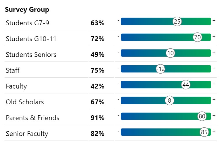
Whilst I thought this looked nice, I found it difficult to sight the mid-point without putting a ruler to my screen.
I tried again without the gradient and placed a centre-line on the track.
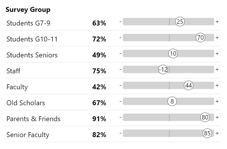
Better.
Much easier for me to read the scores 🙂
Step 3: Go nuts
Whilst I had what I needed, my curiosity piqued. I wondered if I could highlight rows with low response rates.
I could.
I added a flag to the row id so that it could referenced in the CSS table styling like so:
<tr class='"&[KPIFlag]&"'>
[…]
/* Table Styling */
"<style>
        table {width: 100%;font-size: 14pt;} td {font-size: 14pt; padding: 3px; border-bottom: 1px solid #ddd;}
        table tr[class='1'] td {background:#FFFFED;}
        table tr[class='2'] td {background:none;}
        table tr[class='3'] td {background:none;}
</style>"
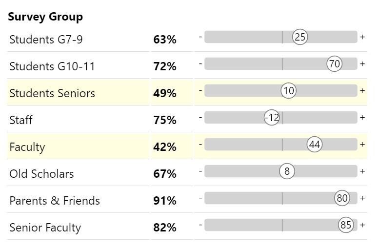
Neat, but it didn’t help my comprehension. I was then curious to see how I could draw attention to low response rates with another microchart.
I didn’t want a bar as
1) I already had a bar
2) Horizontal bars with percentage fill are often construed as progress bars.
Here I wanted to convey percentage as a whole at a point in time whilst also keeping the table compact. So I went for a pie chart.
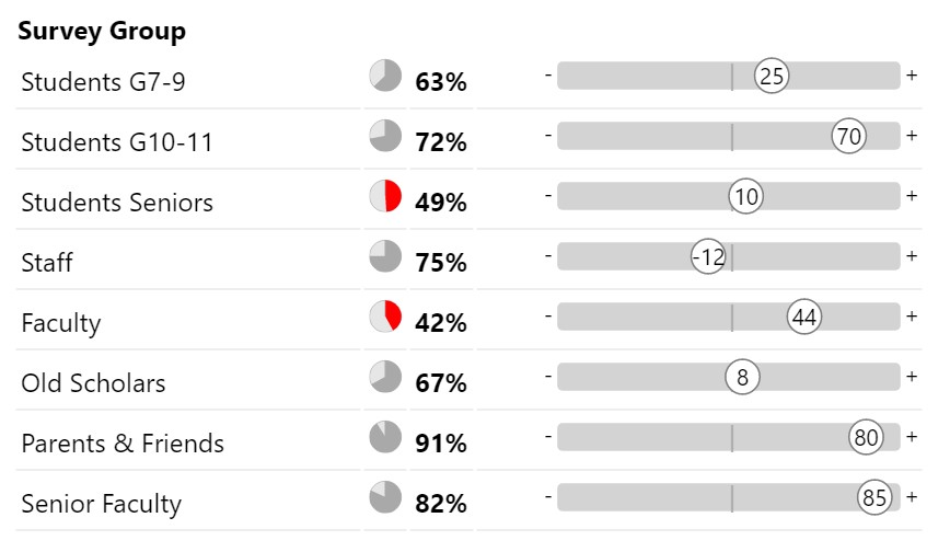
Not too shabby.
Can someone share the pbix file that was used for this. It will help us get this going.