
Skip to content
EXPLORATIONS IN DATA STORYTELLING WITH POWER BI

EXPLORATIONS IN DATA STORYTELLING WITH POWER BI

  • Home
  • Visualisations
  • Templates
    • Deneb Templates
    • SVG Templates
    • PlotlyJS Templates
  • Services
    • Consultancy & Training
    • Shop Swag
  • About
  • LinkedIn
  • Bluesky
  • YouTube
  • Instagram

Month: August 2024

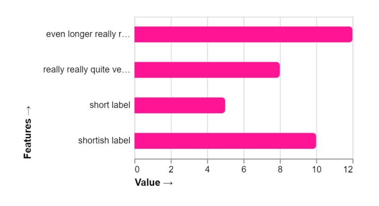
Fixed axis width and truncated labels in Deneb

I recently had a requirement to fix the width of the Y-Axis and Y-Axis labels for two separate charts. For one chart, the axis width would adjust when sliced based…

Continue reading Fixed axis width and truncated labels in Deneb
Published August 18, 2024
Categorized as Deneb

Overlapping histogram with distribution curve
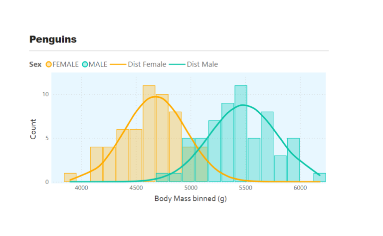
Overlapping histograms with normal curve overlays are used to compare the distribution of a numerical variable across different groups such as male and female body mass. With this we can…

Continue reading Overlapping histogram with distribution curve
Published August 7, 2024
Categorized as Core Visuals, How To's, Power BI

Recent Posts

  • A matter of scatter
  • Smoothed Line Faux-Pax’s (and Other Things UI/UX Can’t Teach You About Data Visualisation)
  • Upcoming Workshops
  • Cool report design tips with the updated Image visual
  • Protected: Make your blogs stand-out from the crowd

Archives

Categories

Meta

  • Log in
  • Entries feed
  • Comments feed
  • WordPress.org
EXPLORATIONS IN DATA STORYTELLING WITH POWER BI