In almost a decade of building Power BI reports, a common blind spot I still see from colleagues regards data point limits in core visuals — largely unnoticed until someone maps their data and finds entire regions are missing.
Compare the following lasagne plot created using a Power BI core visual scatterplot with one created using a Power BI custom visual (Deneb).
The underlying dataset is of London city bicycle collisions containing approximately 60,000 rows.
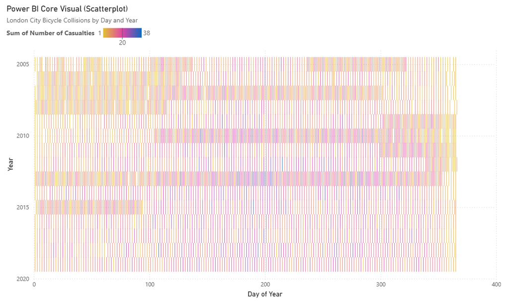
The core visual is clearly missing data.
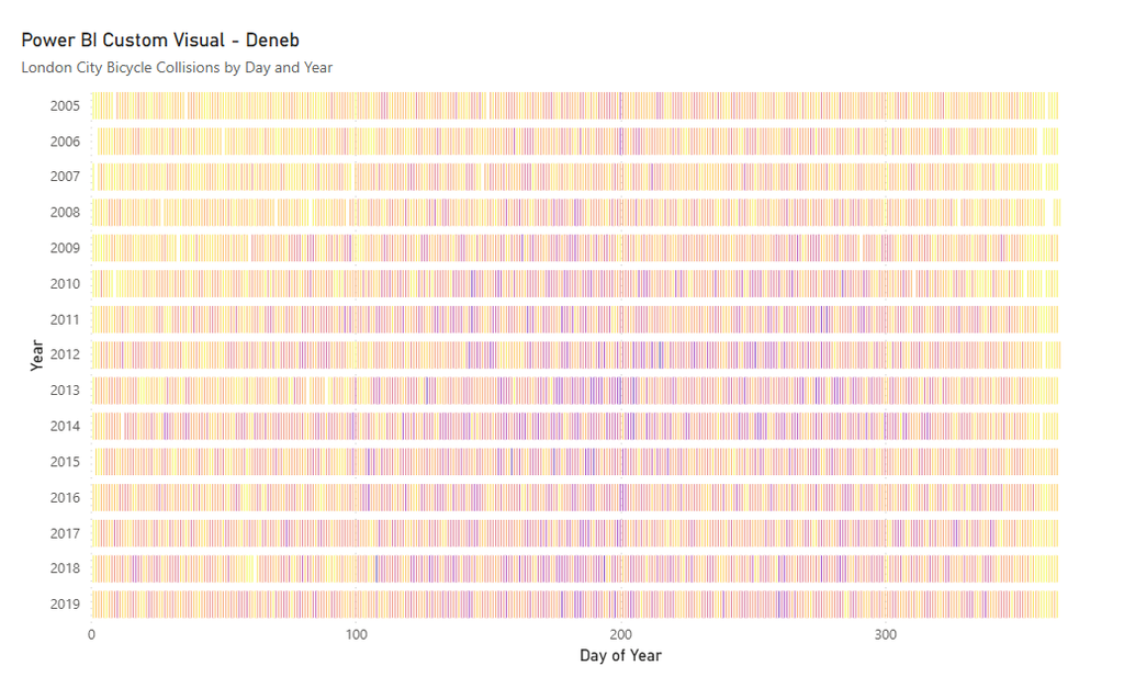
Whilst few are aware of the data point limitations, even fewer are aware of high-density sampling in the core scatterplot visuals and how this affects the perception of data.
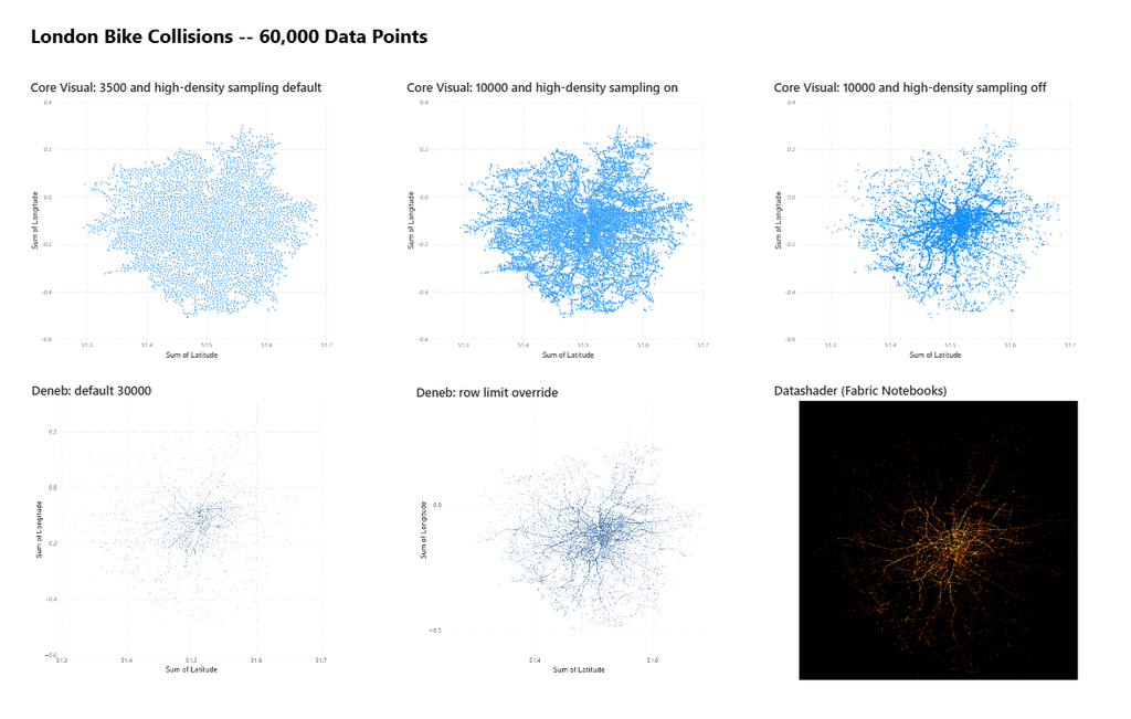
With the same dataset – but this time plotting latitude and longitude of collisions – we get by default, a rough shape of the Greater London boroughs.
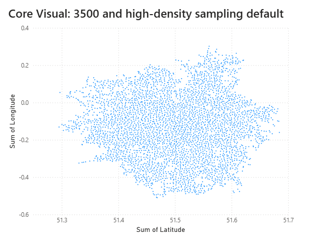
(A scatterplot isn’t the most appropriate visual for geospatial information, but it presents a good working example of how data is sampled.)
We also get, a visual warning indicator that reminds us that due to the large amount of data, we are being presented a sample of that data. Instead of 60,000 data points we only see 3,500 by default, and that data is sampled using a high-density sampling algorithm prioritising data points that aren’t hidden by neighbouring points.
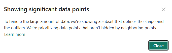
What this means is that we can see the general shape of the distribution of points in a scatterplot, but we don’t see the density of the distribution. Which runs counter-intuitively to the name.
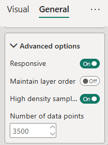
In the general properties menu of the visual formatting pane, we can adjust the number of data points plotted up to a maximum of 10,000 data points.
Which gives us the below :
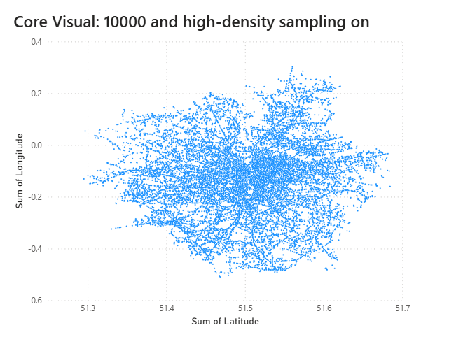
With more points we can start to make out the roadways, and, when we turn high-density sampling off, these roadways become more visible still.
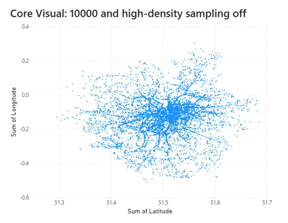
10,000 points is usually a sufficient enough sample of data to analyse shape, spread, density and correlation. But how good are the default sampling options provided with Power BI and what don’t we see?
If we wish to see more data points in our visuals we will need to turn to Power BI custom visuals like Deneb. Custom visuals can plot up to 35,000 data points. Below is the same data plotted with Deneb but smaller point markers and higher transparency.
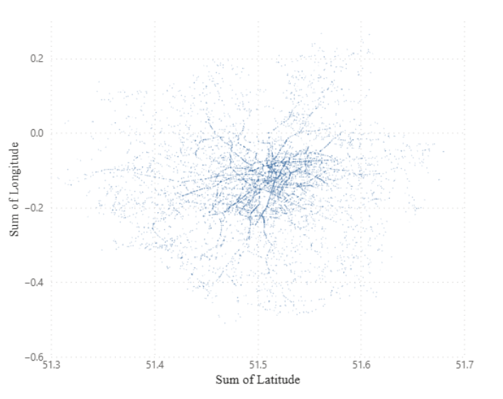
Deneb has a feature to override row limits allowing to plot far more points again. This allows us to see a far more detailed view of our data.
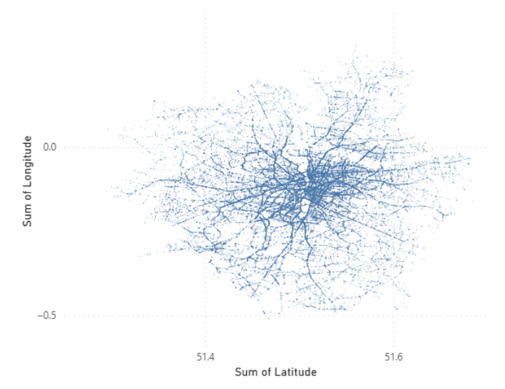
But.
The override row limit comes with a warning that switching this feature on may significantly impact report performance and can sometimes cause your desktop file to crash (even with renderer switched from SVG to canvas).
To plot more data points (or, look for different sampling methods), we need to look to different tools. Fabric Notebooks are usually near at hand for Power BI developers.
Within Fabric Notebooks, data visualisers can utilise python and charting libraries such as Altair (Vega-lite and Vega for python).
Whilst Notebooks still have performance constraints, there is a lot more flexibility to plot higher density visuals.
Below is the same data plotted on to a binned heatmap utilising Altair and Vega-fusion.
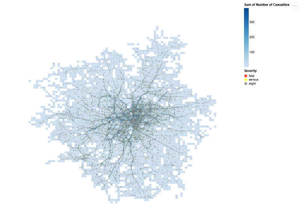
Notebook content size is limited to 32 MB, and running a number of Altair and Vega-fusion visuals with tens of thousands of rows of data can quickly blow out your notebook size.
Other options such as datashader can come in handy.
Datashader is a library that renders the entire dataset as a raster image rather than as individual plotted marks. Instead of drawing one point, line, or shape per row and asking the browser or renderer to handle however many hundreds of thousands (or millions) of objects that implies, Datashader aggregates every row straight into pixel bins on a fixed-size canvas. Each pixel’s colour reflects how many points (or what density of points) fall within it. The output is an image, so there’s no practical row ceiling: a million-row dataset and a hundred-million-row dataset cost roughly the same to render.
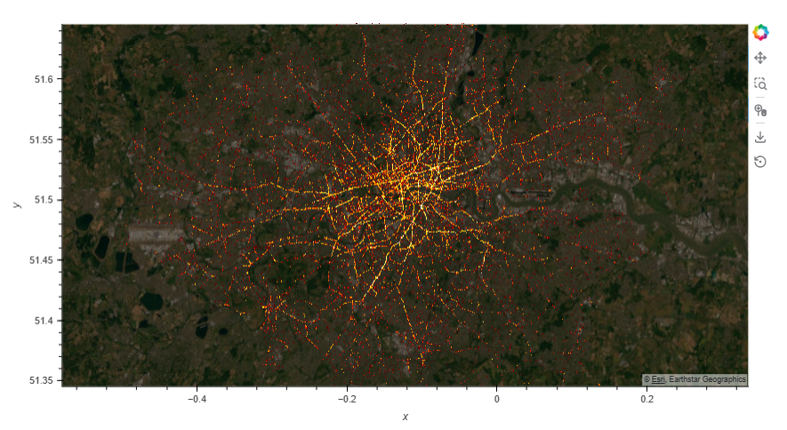
An example below :
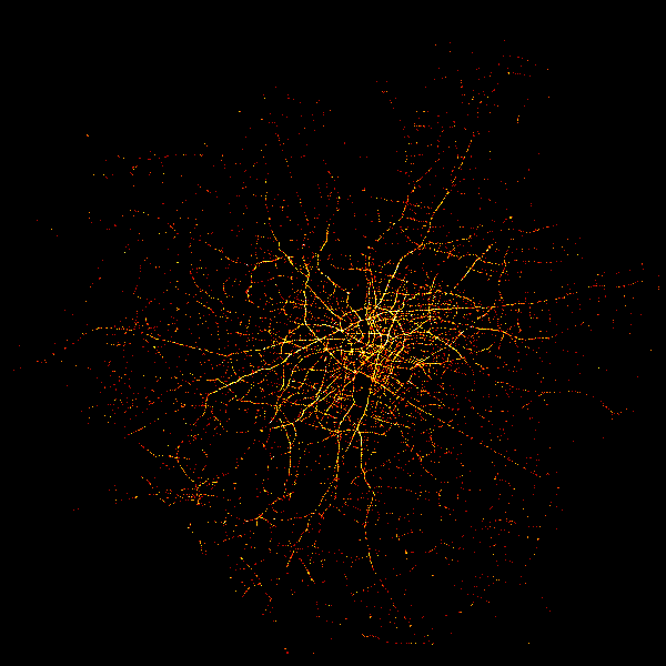
Which is a vastly different output from the default scatter visual presented at the beginning of this article.