Skip to content
EXPLORATIONS IN DATA STORYTELLING WITH POWER BI

EXPLORATIONS IN DATA STORYTELLING WITH POWER BI

  • Home
  • Visualisations
  • Templates
    • Deneb Templates
    • SVG Templates
    • PlotlyJS Templates
  • Services
    • Consultancy & Training
    • Shop Swag
  • About
  • LinkedIn
  • Bluesky
  • YouTube
  • Instagram

Category: Vega-Lite

A matter of scatter

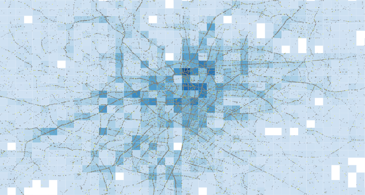
In almost a decade of building Power BI reports, a common blind spot I still see from colleagues regards data point limits in core visuals — largely unnoticed until someone…

Continue reading A matter of scatter
Published September 7, 2026
Categorized as Core Visuals, DataViz, Fabric Notebooks, Power BI, Vega, Vega-Lite

Formatting Locale, Values and Tooltips in Deneb
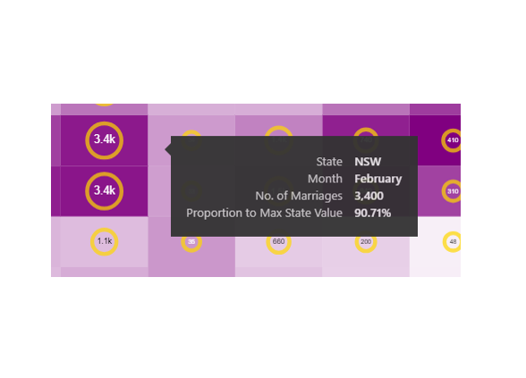
When building a Deneb custom visual for a client I came across a scenario whereby the currency within the visual showed dollars in Bing browsers but British pounds in other…

Continue reading Formatting Locale, Values and Tooltips in Deneb
Published December 23, 2023
Categorized as DataViz, Deneb, How To's, Vega-Lite

Images and custom shapes in Deneb

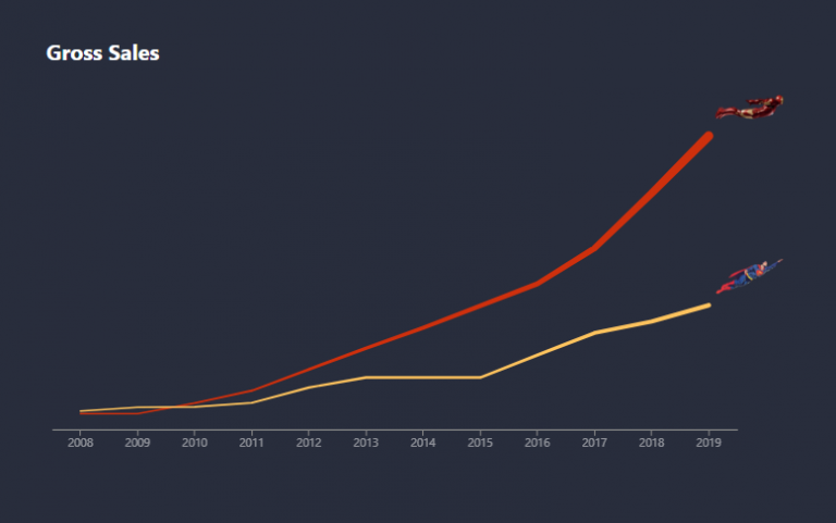
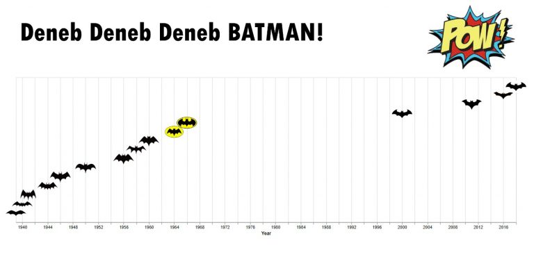
Over the past few months, I’ve had considerable fun exploring images and custom shapes with Deneb Custom visual for Power BI. I’ve finally gotten around to blogging about it. There…

Continue reading Images and custom shapes in Deneb
Published January 6, 2022
Categorized as Custom Visualisations, Deneb, Experimentation, Vega-Lite

Raincloud Plots with Deneb

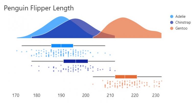
Raincloud plots are a relatively recent and effective addition to the data visualisation toolkit comprising three parts: 1) distributions as density (half-violin plot); 2) summary statistics (box plot) and 3)…

Continue reading Raincloud Plots with Deneb
Published November 7, 2021
Categorized as Deneb, How To's, Vega-Lite

Line interpolation

Slope Graphs

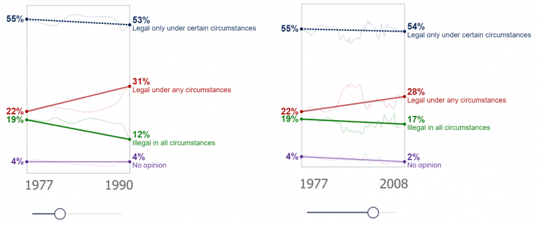
Makeover Monday again! and this time I’m creating a slope graph. Yes, I could achieve this with the core visualisation, but I wouldn’t have as much control as I desired…

Continue reading Line interpolation
Published September 12, 2021
Categorized as Custom Visualisations, Deneb, Vega-Lite

Conditional KPI Cards with Deneb

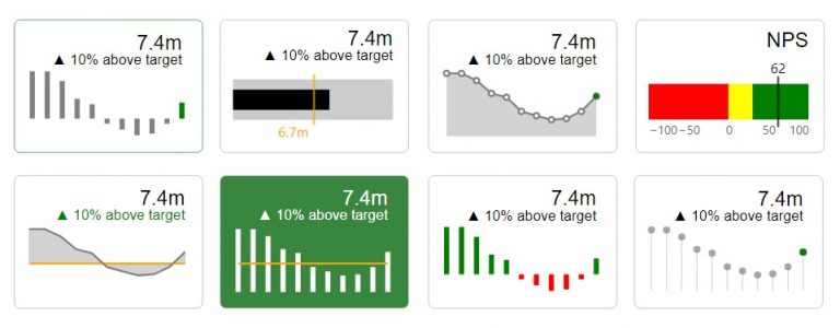
I’d written a piece recently on exploring the Deneb custom visual for Power BI. In that post I touched on KPI Style visuals. I hadn’t seen much in the way…

Continue reading Conditional KPI Cards with Deneb
Published July 15, 2021
Categorized as Custom Visualisations, DataViz, Deneb, How To's, Vega-Lite

Heatmap with marginal bars

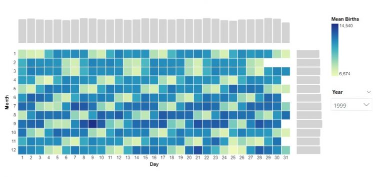
Another visual I explored through a Makeover Monday challenge. To create the chart I installed the latest version of Deneb, dragged the measures I needed into the fields pane. In…

Continue reading Heatmap with marginal bars
Published July 4, 2021
Categorized as Deneb, How To's, Vega-Lite

Area between two lines

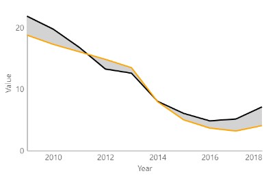
A graph I explored through a Makeover Monday challenge. It didn’t make the final design but I thought I’d write it up for another time. Area fill is sometimes used…

Continue reading Area between two lines
Published July 3, 2021
Categorized as Deneb, How To's, Vega-Lite

Exploring Deneb for Power BI

In my short career doing data visualization with Power BI, I have always desired the flexibility to do more with my visuals. So when I came across a demo for…

Continue reading Exploring Deneb for Power BI
Published July 2, 2021
Categorized as Deneb, Reviews, Vega-Lite

Recent Posts

  • A matter of scatter
  • Smoothed Line Faux-Pax’s (and Other Things UI/UX Can’t Teach You About Data Visualisation)
  • Upcoming Workshops
  • Cool report design tips with the updated Image visual
  • Protected: Make your blogs stand-out from the crowd

Archives

Categories

Meta

  • Log in
  • Entries feed
  • Comments feed
  • WordPress.org
EXPLORATIONS IN DATA STORYTELLING WITH POWER BI