
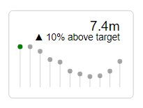
I’d written a piece recently on exploring the Deneb custom visual for Power BI. In that post I touched on KPI Style visuals. I hadn’t seen much in the way of KPI Style visuals in the Vega-Lite Examples Gallery so I thought I’d revisit them and explore them a little more.
I focused on styles that I’m unable to create with other custom visuals or that I would find difficult to produce in Charticulator. Here are some of the resultant outputs:
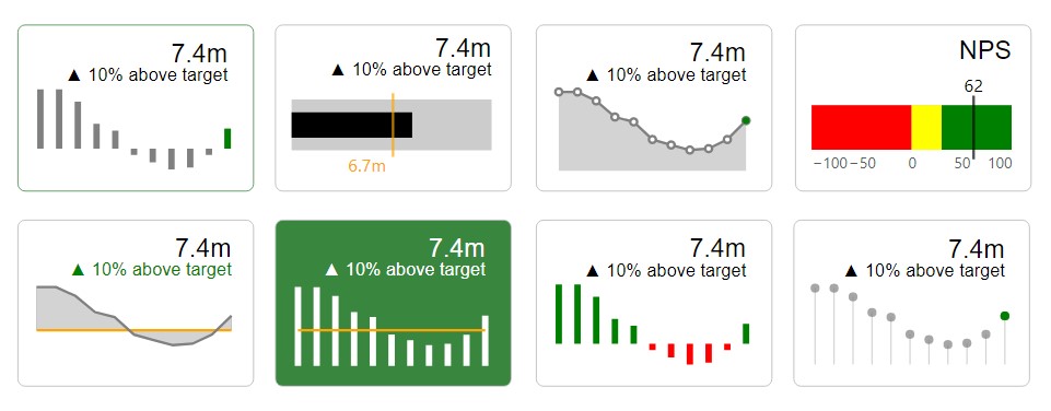
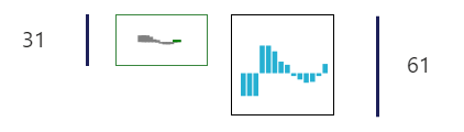
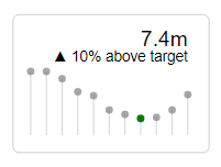
One of the most pleasing things about these visuals (aside from the enormous amount of creative freedom I had) was the ability to resize them to be very small compared to native visuals:
Not at all necessary, but satisfying none the same 🙂
The process
Creating the KPI visuals required some forethought.
There are a number of different ways to achieve a KPI Card as shown, but the following steps outline the approach I took.
To create the KPI chart I would need to layer a few marks like so:
“layer” : [{area}, {line with points}, {circle}, {label 1}, {label 2}]
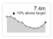
Layer 1 : Area
For the first layer I would need to declare:
- Mark Type = area
- Colour as constant = light gray
- X mapped to Date field
- Y mapped to Value field
- Remove axes
 "mark": {
	        "type" : "area"
	      },
	      "encoding": {
	        "color": {
	          "value": "lightgray"
	        },
	        "x": {
	          "field": "Date",
	          "type": "temporal",
	          "axis": null
	        },
	        "y": {
	          "field": "Value",
	          "type": "quantitative",
	          "axis": null
	        }
	      }
Layer 2 : Line
For the second layer I would need to declare:
- Mark Type = line with white points and tooltip enabled
- Colour as constant = gray
- X mapped to Date field
- Y mapped to Value field
	{
	      "mark": {
	        "type": "line",
	        "point": {
	          "filled": false,
	          "fill": "white"
	        },
	"tooltip" : true
	      },
	      "encoding": {
	        "color": {
	          "value": "gray"
	        },
	        "x": {
	          "field": "Date",
	          "type": "temporal"
	        },
	        "y": {
	          "field": "Value",
	          "type": "quantitative"
	        }
	      }
    },
Layer 3 : Circle
The third layer:
- Mark Type = circle with tooltip enabled
- Colour as conditional = if value is less than target then red else green
- X mapped to the last/maximum Date field value
- Y mapped to Value field for the maximum Date field value
	{
	      "mark": {"type":"circle", "tooltip":true},
	      "encoding": {
	"color": {
	              "condition": {"test": "datum['Value'] < datum['Target']", "value": "red"},
	          "value": "green"},
	        "size": {
	          "value": 30
	        },
	        "x": {
	          "aggregate": "max",
	          "field": "Date",
	          "type": "temporal"
	        },
	        "y": {
	          "aggregate": {
	            "argmax": "Date"
	          },
	          "field": "Value",
	          "type": "quantitative"
	        }
	      }
    },
Layer 4 : Label
The fourth layer:
- Mark Type = text
- X mapped to the maximum Date field value
- Y mapped to Value field for the maximum Date field value, text is from the Formatted Actual field
	        {
	          "mark": {
	            "type": "text",
	            "dx": 0,
	            "dy": -10,
	            "xOffset": 0,
	            "yOffset": 0,
	            "angle": 0,
	            "align": "right",
	            "baseline": "bottom",
	            "font": "sans-serif",
	            "fontSize": 20,
	            "fontStyle": "normal",
	            "fontWeight": "normal",
	            "limit": 0
	          },
	          "encoding": {
	          "x": {
	            "aggregate": "max","field": "Date", "type": "temporal"},
	        "y": {
	          "aggregate": {"argmax": "Date"},"field": "Value", "type": "quantitative"},
	            "text":
	{"aggregate": {"argmax": "Date"},
	              "field": "Formatted Actual"
	            }
	          }
        },
Labels can be formatted with Vega-Lite, however, I chose to use DAX as I was more familiar with this and I could easily concatenate additional information.
Example DAX:
Formatted Actual = FORMAT([Value],”,##,,.0m”)
Or
Formatted Variance = [Unicode Arrow] & ” ” &[Percentage] & ” ” & [Above/Below] & ” target”
Tidying up the code
There is certainly opportunity to tidy up the code at this point though I am content to leave it as it is.
Border and Background
I set the border from the visual formatting pane to radius of 6. The border and backgrounds could be conditionally formatted using a DAX expression.
Variations
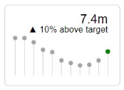
By changing area mark to rule, line mark to circle, the following can be achieved:
By changing argmax and argmin, the highest and lowest values can be highlighted.
To find the min:
	        "x": {
	          "aggregate": {
	            "argmin": "Value"
	          },
	          "field": "Date",
	          "type": "temporal"
	        },
	        "y": {
	          "aggregate": {
	            "argmin": "Value"
	          },
	          "field": "Value",
	          "type": "quantitative"
        }
To find the max:
	        "x": {
	          "aggregate": {
	            "argmax": "Value"
	          },
	          "field": "Date",
	          "type": "temporal"
	        },
	        "y": {
	          "aggregate": {
	            "argmax": "Value"
	          },
	          "field": "Value",
	          "type": "quantitative"
        }
Additional KPI Colours
The Vega-Lite documentation site does not show examples of conditional formatting for more than two values – at least not that I could see. Here’s how to set RAG indicators (which worked for me):
"color" : {"condition": [
{"test": "datum['KPI'] === 2", "value": "red"},
{"test": "datum['KPI'] === 1", "value": "yellow"}
],
"value": "green"}
All in all, I had fun experimenting. I hope you do too 🙂
Kez.
Hi There!
Looks Great, any chance you could share the code for the end-result?
Robin
No problems
{
“data”: {“name”: “dataset”},
“layer”: [
{“mark”: {“type”: “area”},
“encoding”: {
“color”: {“value”: “lightgray”},
“x”: {“field”: “Date”,”type”: “temporal”,”axis”: null},
“y”: {“field”: “Value”,”type”: “quantitative”,”axis”: null}
}},
{
“mark”: {“type”: “line”,
“point”: {“filled”: false,”fill”: “white”},
“tooltip”: true
},
“encoding”: {
“color”: {“value”: “gray”},
“x”: {“field”: “Date”,”type”: “temporal”},
“y”: {“field”: “Value”,”type”: “quantitative”}
}},
{
“mark”: {“type”: “circle”,”tooltip”: true},
“encoding”: {
“color”: {
“condition”: {
“test”: “datum[‘Value’] < datum['Target']", "value": "red" }, "value": "green" }, "size": {"value": 30}, "x": {"aggregate": "max","field": "Date","type": "temporal"}, "y": { "aggregate": {"argmax": "Date"}, "field": "Value","type": "quantitative"} } }, { "mark": { "type": "text", "dx": 0, "dy": -10, "xOffset": 0, "yOffset": -10, "angle": 0, "align": "right", "baseline": "bottom", "font": "sans-serif", "fontSize": 20, "fontStyle": "normal", "fontWeight": "normal", "limit": 0 }, "encoding": { "x": {"aggregate": "max","field": "Date","type": "temporal"}, "y": {"aggregate": "max","field": "Value","type": "quantitative"}, "text": {"field": "Format Actual"} } }, { "mark": { "type": "text", "dx": 0, "dy": -10, "xOffset": 0, "yOffset": -10, "angle": 0, "align": "right", "baseline": "top", "font": "sans-serif", "fontSize": 14, "fontStyle": "normal", "fontWeight": "normal", "limit": 0 }, "encoding": { "x": {"aggregate": "max","field": "Date","type": "temporal"}, "y": {"aggregate": "max", "field": "Value", "type": "quantitative"}, "text": {"field": "Format Variance"} } } ] }
Hi Kerry,
love the KPI cards, I’ve tried testing out your code that you posted in the comments. I copied & pasted it directly but I’m not getting any results. I think since I’m brand new to this code I’m a bit unsure of myself, I have a ‘Date’ field and a measure called ‘Value’ in the values box. I’m sure I’m missing something simply. hope you can help.
Hi David,
There’s a sample workbook here that might help?
https://appsource.microsoft.com/en-us/product/power-bi-visuals/coacervolimited1596856650797.deneb
Ah, thank you, hadn’t spotted the sample workbook due to my excitement around Deneb’s potential. Thanks again, love the website & content.
Hi There,
It is really useful for some of the metrics that I am working on, would you be able to share the file or any similar links to get an idea of how to work out this would be really helpful.Thanks again.
If you can share the code for other KPI visuals too for beginners it will help understanding and get familiarized soon.
Yes that would be great! 🙂
This is great.
The Kpi’s look awesome. I’ll be using this in abundance.
Is it possible to create one card with two KPIs? Or have clickable link in them?
Yes, it is possible to have two or more KPIs in one visual. I’m unsure what you mean by clickable link.
Clickable link means button with URL to other webpage
Thanks for sharing your knowledge. These visuals are amazing.
I was wondering if using Deneb (and Vega-Lite), we could generate a faceted charts with these KPIs cards, with different columns for the different KPIs (ex. sales, sales % growth…) having the different sales shops on the Y-Axis (as an example).
That should be possible
Great looking charts. Nicely done.
Hi Kerry. I remember seeing some KPI styles you did with Deneb+VegaLite that had colored lines on top of the visualization frame. The lines were thin and “glowed” and were encoded green if the measure was above a threshold; red, below.
I liked the subtlety of those thin, glowing lines. Can you share the code for how you made those?
Are we free to use your templates / manipulate them for business purposes? Thank you!
Yes
Do you have the code for creating the NPS example?
Hi Kerry,
This is really great work and I will
add this on some of my dashboards. Thanks.
Hi Kerry,
The color condition test in mark circle doesn’t work for me. Any clue on this?