
“When shortcutting the design process, I think back to the natural world.”
In my years of data visualisation consultancy, I am often asked “How do I choose the right visual?”. The answer I provide is often long-winded.
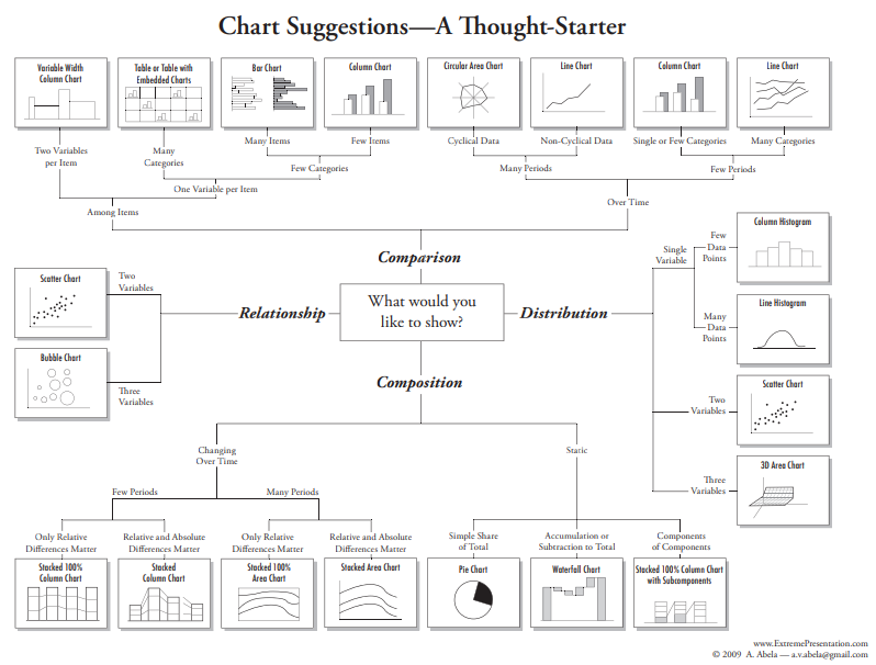
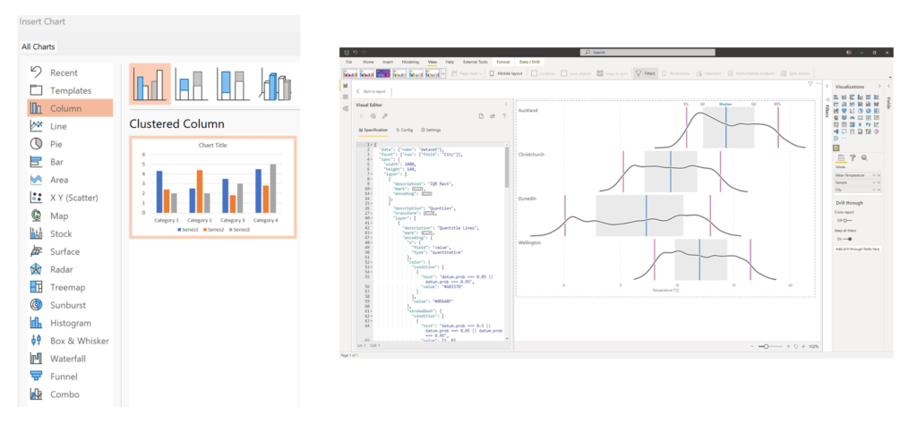
There are typically two main approaches for choosing the right visualisation for your data. The first method (how most people are introduced), involves utilising chart taxonomies or chart choosers, where practitioners select from a predetermined list of chart types, via memory, documentation, or through specific applications (such as Power BI Core visuals). With this method, visuals are grouped into function to help with the selection process.
The second method, conceptualised by Leland Wilkinson in 1999, views data visualisation as a grammar of graphics. This approach, exemplified by tools like Charticulator and Deneb, describes the fundamental components of visuals and how to construct them. Practitioners will consider various marks and glyphs and data encoding methods. This method allows for more flexibility and novelty in chart design.
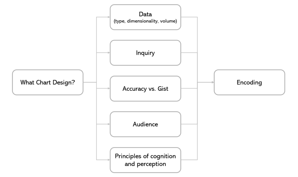
In employing the grammar of graphics approach, there’s an added layer of deliberation to ensure the selection of the most suitable and efficient encoding methods for our design needs. It is important that the encoding methods make sense for the data types, our visual perception system, and our mental schemas1.
As is the case with any design process, there exist priorities, and it helps to be clear on what those priorities are.
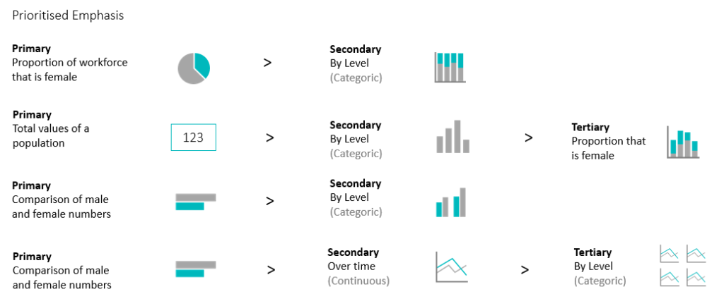
What is the emphasis of our inquiry? Do we wish to show proportion then value over time? or value then proportion over time? Are we interested in raw values, distributions, patterns, trends, or outliers? How accurate do we need to be in the interpretation of data? Choices around accuracy are often dependent on the size and type of data and the intended audience.
The below flowchart depicts the considerations behind my visualisation choices:
Which is quite a lot to consider. And, with whichever method, GoG or taxonomy, I tend to take shortcuts.
The benefit of heuristic thinking, is to save time analysing. When shortcutting the design process, I think back to the natural world.
I’ll ask myself a question of the data, and consider the descriptive words in use, such as :
- Much, many, most, more
- Through, between, compared, difference, by, trace, track, over, above, below, flow
- Change, degree of change
And imagery of those words will come to mind.
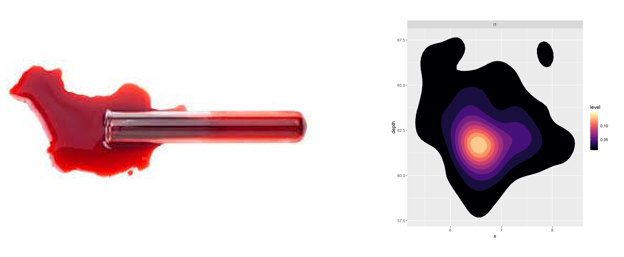
Where is most concentrated?
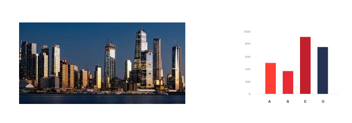
Which is larger?
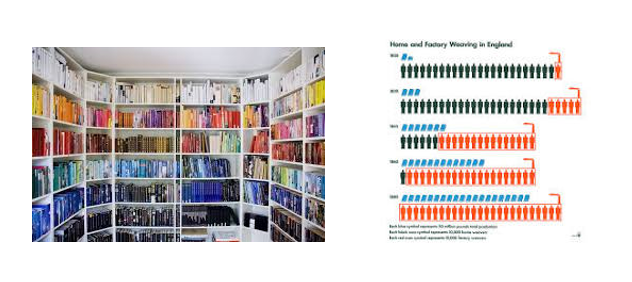
How many of each type?
Where did we go over time?
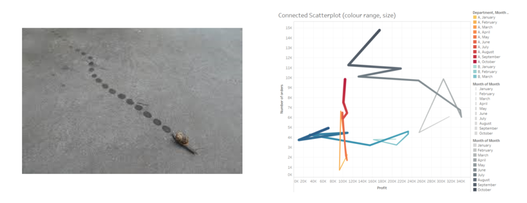
And how fast?
How much?
How many?
Other familiar shapes:
In thinking of multi-dimensionality and colour scales, I think of how these are represented in the natural world, to ensure that the chart makes most intuitive sense. A chart depicting temperature changes, would make more intuitive sense with a colour scale going from orange to blue, than say yellow to green.
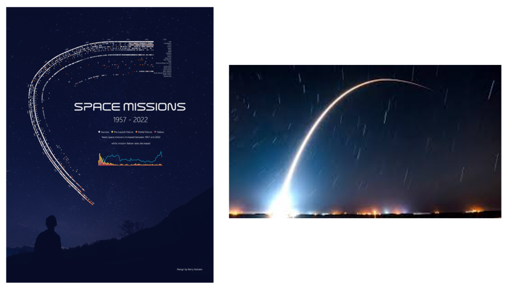
This way of thinking is evident in some of my previous designs. As discussed before, with this Space Missions visual, space here was paramount. There was no room to read left to right, data wasn’t seasonal so a circular illustration was not intuitive, and top to bottom or bottom to top was dull. Taking inspiration from the upwards movement of rocket launches helped build a shape that fit the page nicely. In this design, gist, rather than accuracy was prioritised.
If the encodings are not natural, and do not make intuitive sense, then the keys will be hard to read and interpret.
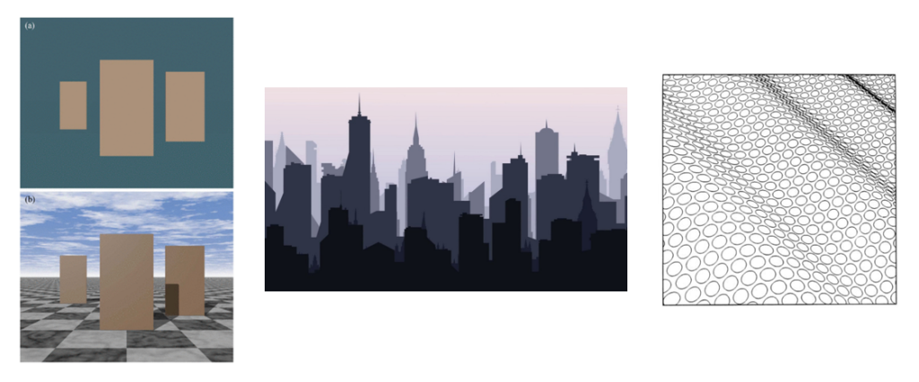
If the encodings violate our natural interpretations and schemas then they will cause issues. For example, overlapping bars, have conflicting depth cues, potentially causing vertigo in some readers (me).
Taken from the APA Dictionary of Psychology a depth cue is “any of a variety of means used to inform the visual system about the depth of a target or its distance from the observer”. There are many documented depth cues, and below I listed just a few examples.
Occultation: Overlapping surfaces, where one object partially blocks the view of another object, it is perceived as closer.
Perspective: Parallel lines converging in the distance.
Relative size: If two objects are known to be the same size.
Absolute size: If the actual size of objects is unknown, a smaller object may appear further away.
Aerial Perspective: Often called distance fog, objects further away have lower saturation and luminance contrast. The foreground has high contrast, and the background has low contrast. Artists often use hue saturation and lightness to create depth in their works.
Texture Gradient Texture of an object is seen more clearly nearer the observer than farther.
Saturation and/or brightness is also used to indicate depth.
The figure of the overlapping bars has conflicting depth cues, occultation indicating one bar is closer than, but the saturation and brightness of the bars is in conflict with perceived distance
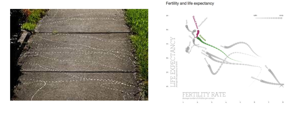
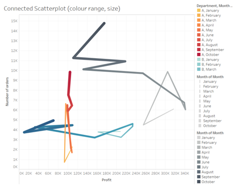
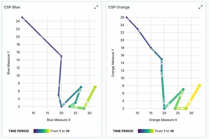
Connected scatters are a great case study in to using cues for ease of interpretability. Double, or triple encoding, whilst in some dataviz practitioners opinions is wasted ink, can help interpretability. From the examples below, you can see each additional encoding or labeling improves interpretability. Showing a change in trail size over time, is easier to conceptualise as time “fades”.
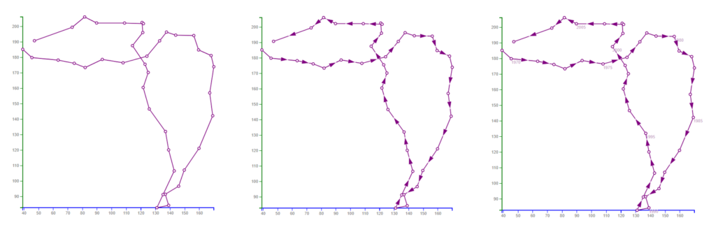
Just about the only thing we talk about on Viz Twitter anymore is connected scatterplots so here it is: my response to @nickdesb's critique of these wonderful little charts.
— Elijah Meeks (@Elijah_Meeks) August 30, 2023
And if you hate Medium as much as you hate Twitter, I've put most of it in a 🧵.https://t.co/YcEQU1JKML
Improving our encodings in line with our mental schemas aids interpretability.
For me, when reading rainfall data, trying to comprehend the amount of rainfall made more sense when I turned the visual upside down because rain falls downward, disperses outward, and doesn’t really collect upward.
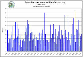
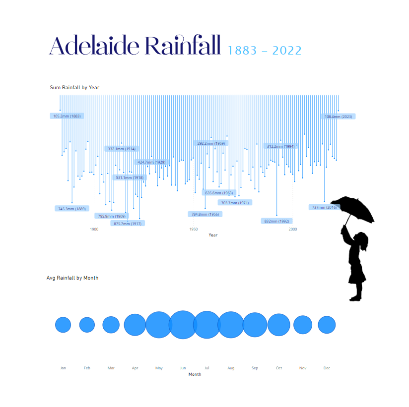
Inverting the bars helped me consume the information far faster (though I’d argue a view of month by years as a heatmap would be easier to interpret again).
How about you? Does this work for you? How do you choose your visualisation designs?
KK