
When building a Deneb custom visual for a client I came across a scenario whereby the currency within the visual showed dollars in Bing browsers but British pounds in other…
Category: Deneb
Independent Scales with Deneb (Ring Chart)
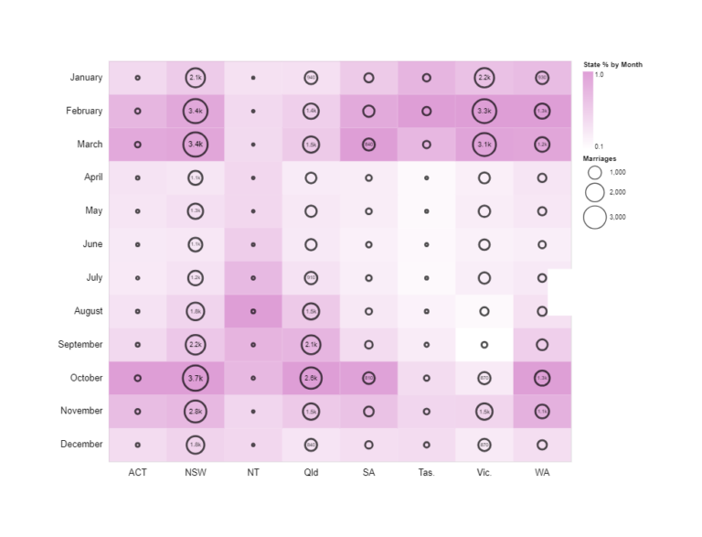
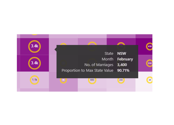
A chart I created for a Workout Wednesday Challenge. The chart shows the number marriages by month and Australian State encoded by size as rings, and (given that each state…
Folding (Unpivot Data) with Vega-Lite & Deneb
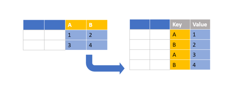
Creating a bar chart with Deneb is relatively simple when using a category field and a measure. But what about when you have only measures? In this particular scenario, I…
Breaking the Rules
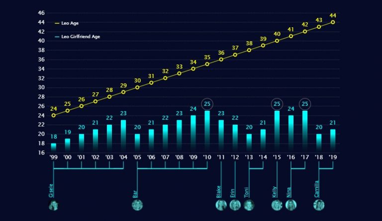
My latest Deneb creation breaks ALL THE RULES of Dataviz But. I like it! This is a visual I designed for myself. I’m fascinated with the human body and the…
Reversed Deviation Icicle Chart
A deviation icicle chart is an uncommon chart to show variance from a target or baseline value across time. There are a multitude of ways to show comparison to target…
On Patterns and Textures
*WARNING* This article contains images that may be potential vestibular and photosensitivity risk. In playing with Deneb this last year I had great fun exploring pattern fill options. This was…
Power BI + Adobe = Magic
Adobe Illustrator has been a tool in my dashboard design kit for quite a while. I’ve used it predominately for creating report assets such as icons, headers and backgrounds. I’ve…
Thinking about target bands
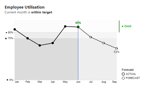
I’ve come across many charts like this in the wild. This one depicts utilisation and RAG status by month. They’re not bad charts, they serve a purpose, but they could…
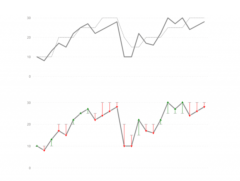
Legend for a layered plot in Deneb
I came across this dataviz in my Twitter feed and it instantly drew my attention: My interest was in the aesthetics of the visual and not the subject matter. I…
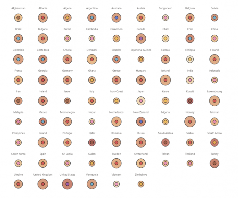
Images and custom shapes in Deneb
Over the past few months, I’ve had considerable fun exploring images and custom shapes with Deneb Custom visual for Power BI. I’ve finally gotten around to blogging about it. There…