
*WARNING* This article contains images that may be potential vestibular and photosensitivity risk.
In playing with Deneb this last year I had great fun exploring pattern fill options. This was an eagerly awaited feature by me as I had wanted to use pattern fill as a means of displaying “unknown” data and also as a means to reduce the amount of bright colours on a report page.
It’s taken some time, but I’ve finally gotten to writing about my experiences and learnings about patterns and textures over this time.
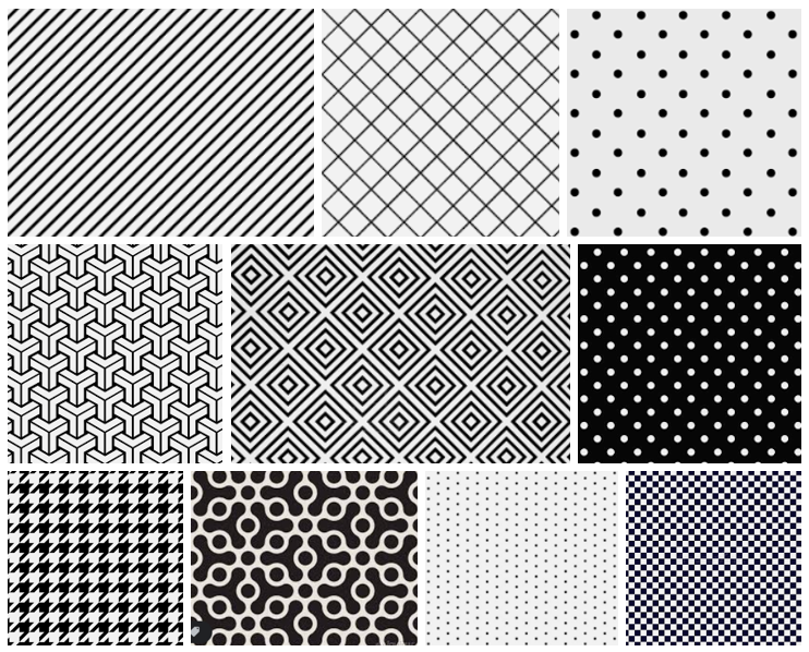
Pattern fill and texture has a great many uses in dataviz.
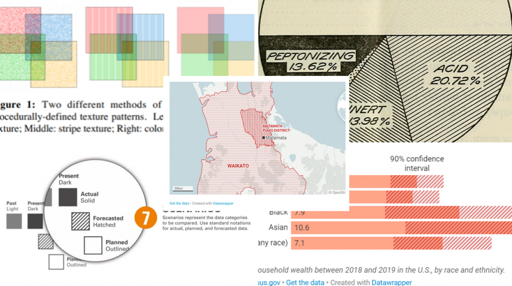
Historically, pattern fill was used for black and white prints. Colour print wasn’t all that common, (quite expensive too), so texture was a great option for visualising density or visually distinct patterns for categorical data. This technique still continues to be used for some black and white publications and even more recently is being explored for e-ink displays1.
There is much discussion about the usefulness of pattern fill when designing for accessibility, particularly those with poor vision or colour-vision deficiency2. The WCAG Standards state that information should not be presented through the use of colour alone. Advice is to supplement with pattern or text cues. It is argued shapes differentiated with contrasting textures are easier to distinguish regardless of visual acuity.
The number of textures that can be rapidly and easily distinguished is in the realm of 12-24; where colour is less than 12. This is particularly useful when visualising large and multi-variate data sets. We can use pattern fill to extend a quite limited colour palette, with textures augmenting colour (or vice versa) 3.
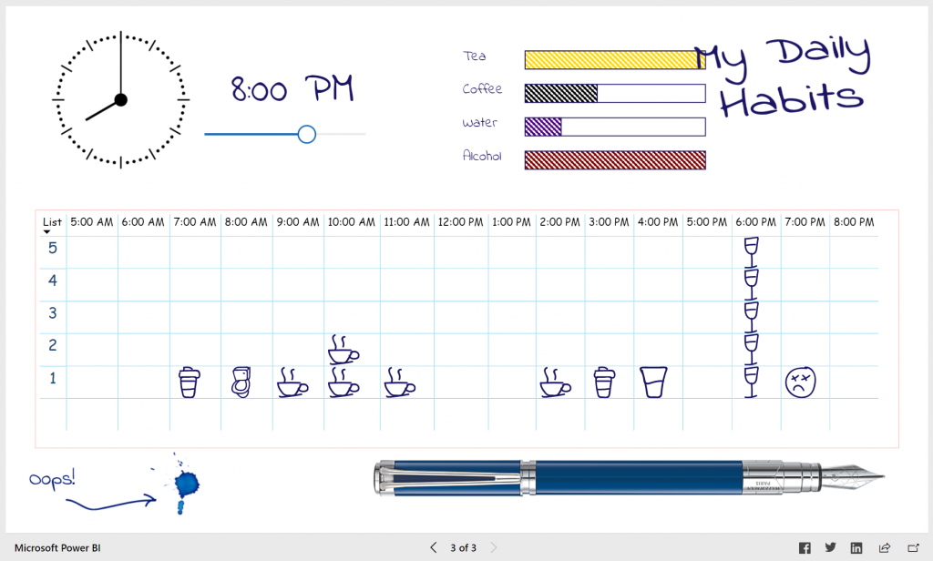
Pattern-fill can be useful when “layering”4 or have semantic meaning used to represent future, “unknown” data or “absence” of data5. It can also have no other purpose than to be an aesthetically pleasing or nostalgic design choice as I had done with this wacky experiment:
But there are some things to be wary of when thinking about pattern fill. Outlined below are a few things I found and noticed when building Deneb designs.
Scalability
Pattern fill is not suited to small shapes for example. Place a cross-hatch pattern in a small circle or rectangle, and you’d be lost as to what you are looking at.
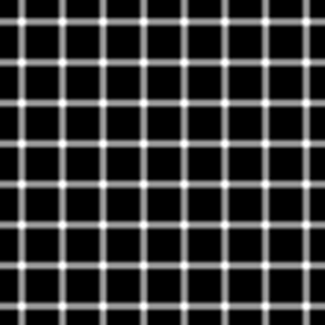
Optical Illusions
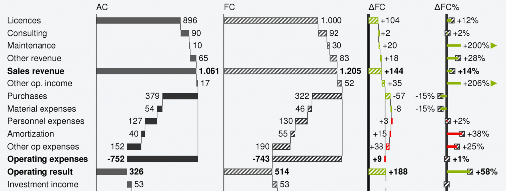
Pattern fill can cause optical illusions, which this blogger drew attention to…
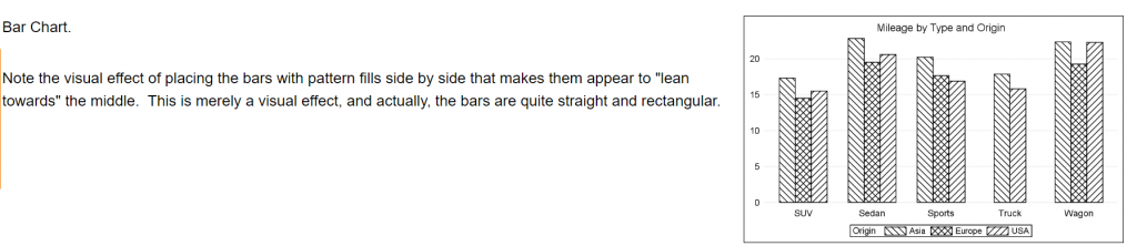
… and which I noticed in my own Deneb designs below:
Visual Vibration
I found charts with too many lines were overwhelming and became lost where one shape would end and another shape start.
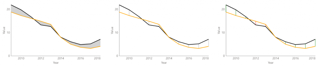
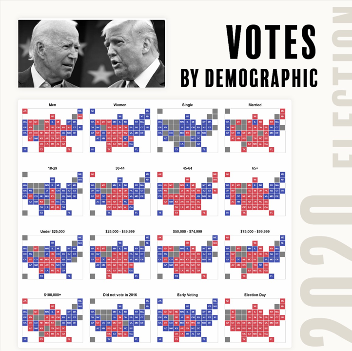
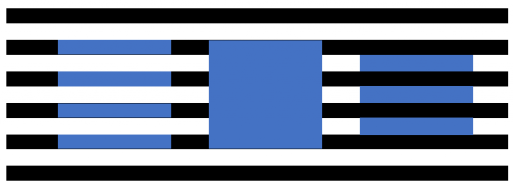
In fact, too much texture and pattern was disorienting, creating an unwanted vibration or moire effect – which Tufte illustrates with the below image and Few6 reiterates. Few argues patterns can create “an annoying shimmering effect… this affects people who are colorblind as much as anyone”. Whilst I think this is mostly a strong opinion piece, I tend to agree with him. This is the same reaction I get when looking at IBCS style dashboard, throw in some drop-shadows7 for some false depth perception and I’m clutching at my chair to keep myself steady. I’m not certain that what causes this effect is fully understood. Though one explanation I’ve seen has inferred the after-image effect, where an image continues to appear briefly even after exposure has ended. In the case of our eyes scattering across the page, we get interference.
This one really hurts my head:
Scintillating Grid
Another interesting find was the scintillating grid, an effect I found quite uncomfortable…
…which I had inadvertently created when I wanted rounded edges on boxes as I thought this would be more visually appealing.
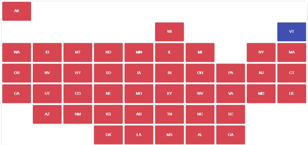
I instead opted for something boxier:
Colour Interactivity
The Bezold effect was something I was already conscious of, given my previous experimentations with gradient backgrounds, but is worth noting for the purpose of this article. Surrounding colours impact how we perceive things.
Vestibular and Photosentivities
Particularly important though is the knowledge that high contrast patterns can hurt people with photosensitivity8.
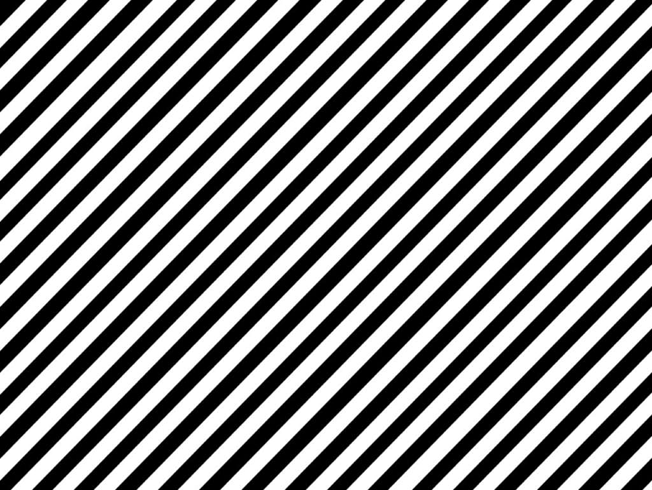
Regular patterns with clearly discernible stripes are potentially harmful when there are more than five light–dark (particularly black-white) pairs of stripes in any orientation10. Particularly for those with epileptic photosensitivity11.
It is advised when working with patterns for accessibility, to avoid sharp contrast designs, make stripes variable in size or slightly wavy.
In my personal opinion, patterns that are slightly irregular are easier on the eyes. The stippling and imperfectly straight lines of hand-drawn viz might be why I find them so appealing.
As a light-sensitive individual (affirmed by a recent visit to the optometrist), I find patterns on the page less aggravating than patterns on a screen, and found some relief when I ‘softened’ black stripes to a lighter grey. Similarly, coloured stripes or geometric patterns that were a lower saturation, less varied in hue and lightness, and placed on an off-white background eased my discomfort.
Thoughts
Overall, I found it quite difficult to work with patterns. Despite this, it is not something I’ll immediately remove from my toolbox. There is still use for it when applied with semantic meaning – it just takes a bit of skill to do well. And when done well – looks absolutely spectacular…
#30DayChartChallenge Day 24 | Theme Day – Financial Times.
— Shad Frigui (@shadfrigui) April 24, 2022
I recreated a graphic made by the FT @ftdata (see quoted tweet).
Tool: #PowerBI
I used the "HTML Content" custom visual for the text on the left and "Deneb" (Vega-Lite) for the rest. https://t.co/Hvt3cBprfZ pic.twitter.com/lD2BVfsZOe
In 2021, 34% of EU gas supply was from Russia, with Eastern, north-eastern and central European countries particularly dependent on Russian imports.
— Sam Joiner (@samjoiner) April 19, 2022
Since the war began on February 24, the EU has paid Russia more than €20bn for gas imports alone. pic.twitter.com/WrF6ZerDdq
✨new project exploring ways to revive forgotten flourishes from analog design for the modern web
— RJ Andrews (@infowetrust) June 7, 2022
We're calling it "CHARTS!" 🎉 see the growing collection here: https://t.co/NI9WfPof0W pic.twitter.com/mugUmyRuFO
Links
1 https://hal.inria.fr/hal-02944212/document
4 https://blog.datawrapper.de/locatormap-pattern-fills-stripes-for-areas/
6 https://www.stephen-few.com/blog/2013/09/16/data-visualization-and-the-blind/
7 https://tealfeed.com/web-accessibility-vestibular-disabilities-0pgot
8 https://www.pasadenapainmanagement.com/stripes-patterns-cause-migraines/
9 https://observablehq.com/@frankelavsky/no-use-of-color-alone-in-data-visualization
11 https://developer.mozilla.org/en-US/docs/Web/Accessibility/Seizure_disorders
very clear and good article easy to understand. Thank you