Skip to content
EXPLORATIONS IN DATA STORYTELLING WITH POWER BI

EXPLORATIONS IN DATA STORYTELLING WITH POWER BI

  • Home
  • Visualisations
  • Templates
    • Deneb Templates
    • SVG Templates
    • PlotlyJS Templates
  • About
  • LinkedIn
  • Twitter
  • YouTube
  • Instagram

Month: April 2022

Power BI + Adobe = Magic

Adobe Illustrator has been a tool in my dashboard design kit for quite a while. I’ve used it predominately for creating report assets such as icons, headers and backgrounds. I’ve…

Continue reading Power BI + Adobe = Magic
Published April 22, 2022
Categorized as Creative, DataViz, Deneb, Experimentation, Musings

Position with PureViz

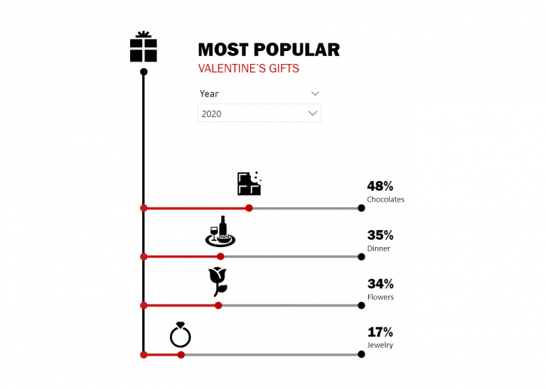
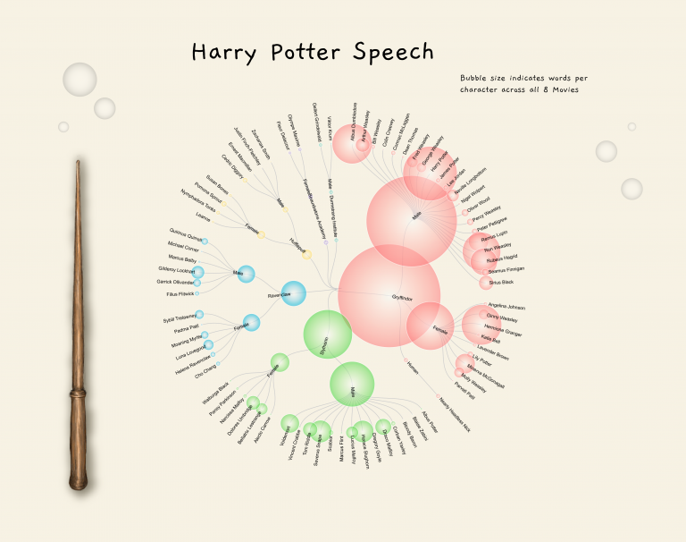
This post is a continuation of my exploration of the latest updates on the PureViz custom visual for Power BI. In my previous post, I looked at colour fill and…

Continue reading Position with PureViz
Published April 11, 2022
Categorized as Creative, Experimentation, How To's, Infographic, PureViz

Comics with PureViz

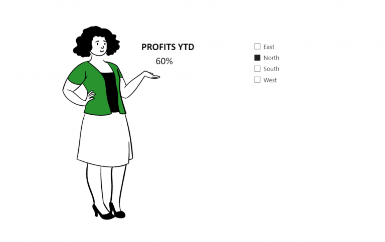
I recently discovered a new feature in PowerPoint – “Cartoon People”. It offers the ability to mix and match bodies, faces and expressions and looked quite a bit of fun.…

Continue reading Comics with PureViz
Published April 2, 2022
Categorized as Custom Visualisations, Infographic, PureViz

Recent Posts

  • Visualise Filters Applied
  • Custom path axis with Charticulator
  • Breaking the Rules
  • Convert to Shape
  • Quick Chart Makeover

Archives

Categories

EXPLORATIONS IN DATA STORYTELLING WITH POWER BI