
Adobe Illustrator has been a tool in my dashboard design kit for quite a while.
I’ve used it predominately for creating report assets such as icons, headers and backgrounds.
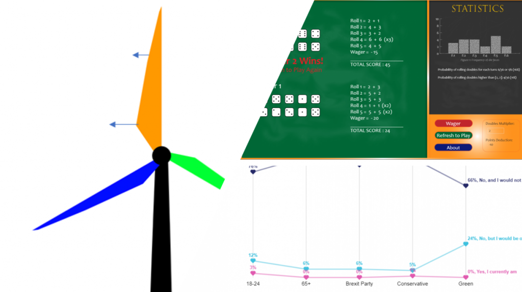
I’ve also used it to create SVG visual elements such as the dice, turbine and scatter plot shapes and markers pictured below.
But there’s another way I increasingly use Illustrator – finishing Power BI visuals for presentation.
Not all data visualisations need be shared as interactive dashboards. Sometimes, they are destined to be in a presentation, document or print.
In the past, I have struggled obtaining high-quality images of PBI reports.
Printing to PowerPoint from Power BI Service now produces a fairly decent and consistent result. Yet it’s not ideal if using uncertified visuals.
Exporting to pdf from Desktop can be a way around this though it’s important to refer to the documentation and note limitations. Once exported, I can open the pdf file in Illustrator, remove any unusual elements that have appeared and then save as a high-quality PNG.
This process is also useful for touching up visuals that couldn’t ordinarily be done in Power BI.
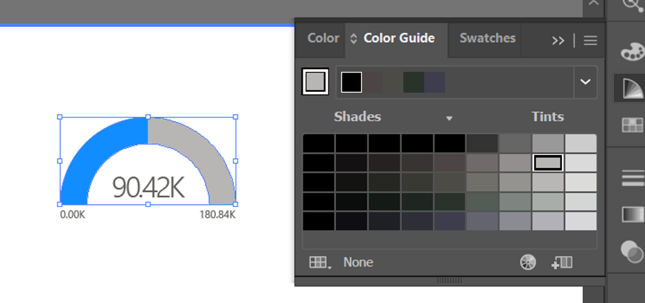
For example, some time back, a simple gauge became the “hero” visual for a project I worked on and was key in organisational communications. I would periodically provide a snip of the visual, in which the communications team requested that I adjust the grey fill of the gauge as it was barely visible in some presentations.
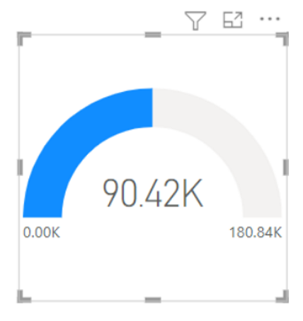
It was not possible to adjust this shade in Power BI, the visual did not have this as a formatting option.
It is however possible using the method above to adjust the shade in Illustrator by selecting an individual element, and making a colour change. The chart can then be selected (rather than the whole report) and exported as SVG (or PNG if desired).
I would not say this is an ideal solution to the problem, especially now there are more custom visualisation options available to designers, but a solution nonetheless, to not only touch up visuals, but provide a quality SVG of overlayed visuals, rather than a blurry snip or cropped PNG.
Yet there is more creative power in touching up visuals for presentation.
Adobe can be used to dress up a visual that, try as one might, looks a little drab…
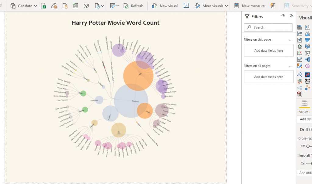
(Created with Deneb custom visual – chart template available here)
In using the example above, I was able to select individual elements and modify colour and gradient.
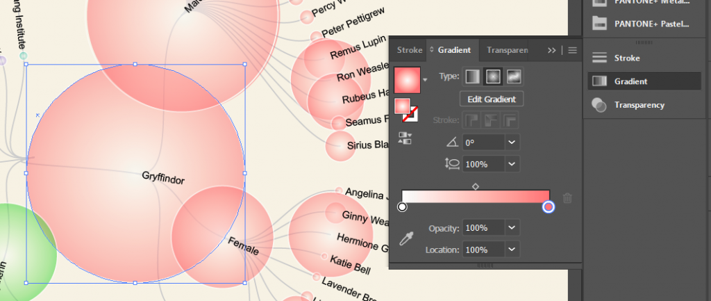
Copy these elements, for decoration.
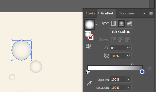
To create something a little bubbly and fun
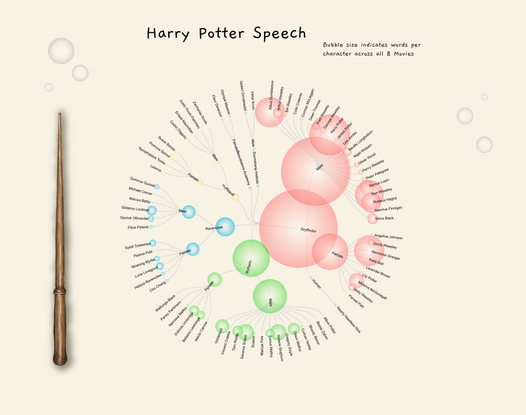
Magic!
Well… the potential is there at least 🙂
You are superb data story teller.
Thats pretty fun!
May I ask, which datasets did you use?
Very cool. Thanks for sharing.
You are the best story teller !
naawwww. thanks 🙂
Hi Kerry,
You do amazing work!! I love your Deneb templates!
This is a fantastic idea, I for some reason cannot get it to work. When I bring a PDF into AI I cannot select an individual visual, it just selects the entire page as a single image. I have tried direct select, that doesn’t help, and nothing is grouped. I just have one visual on the page but need to edit it in AI, so cropping won’t work. If you have any thoughts I would greatly appreciate them!!
Best,
Courtney
That’s odd. Are you using the node tool?
I’ve used this technique a number of times and I’ve not had a problem with it. If you were willing to do a screenshare, reach out to me on LinkedIn.