
Skip to content
EXPLORATIONS IN DATA STORYTELLING WITH POWER BI

EXPLORATIONS IN DATA STORYTELLING WITH POWER BI

  • Home
  • Visualisations
  • Templates
    • Deneb Templates
    • SVG Templates
    • PlotlyJS Templates
  • Services
    • Consultancy & Training
    • Shop Swag
  • About
  • LinkedIn
  • Bluesky
  • YouTube
  • Instagram

Month: May 2021

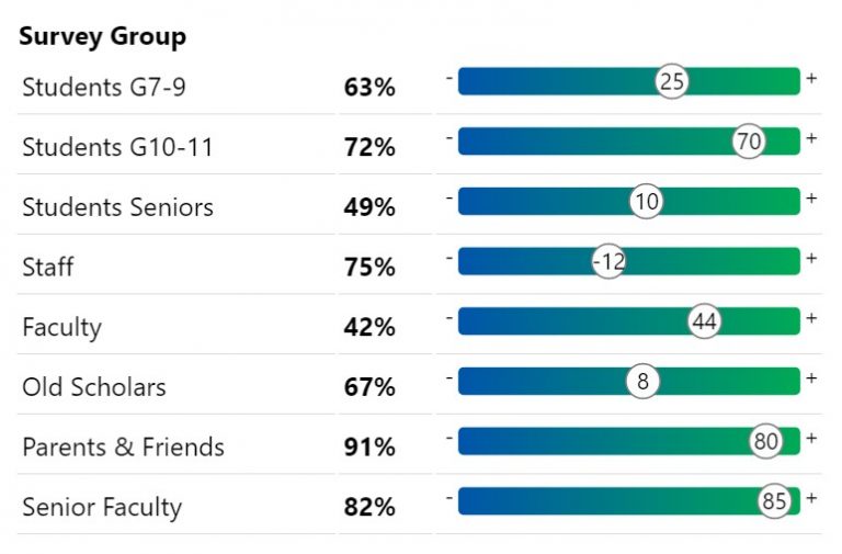
Building a custom Gauge Table with HTML

A quick design for a very specific use case I wanted to visualise scores similar to the above in a way that was quick and easy for me to read…

Continue reading Building a custom Gauge Table with HTML
Published May 26, 2021
Categorized as Custom Visualisations, How To's, HTML Content Visual, SVG

Reasons to avoid gradient backgrounds on Power BI reports
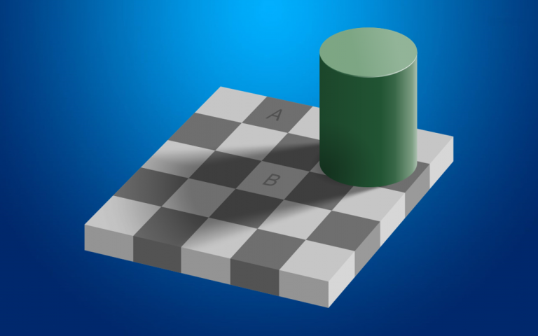
Gradient Optical Illusion

Gradient backgrounds are all the rage in dashboard design. They appear to be floating around everywhere. Looks cool right? Perhaps. I am not a fan, and for some time have…

Continue reading Reasons to avoid gradient backgrounds on Power BI reports
Published May 9, 2021
Categorized as DataViz, Experimentation, Musings, Power BI

Recent Posts

  • A matter of scatter
  • Smoothed Line Faux-Pax’s (and Other Things UI/UX Can’t Teach You About Data Visualisation)
  • Upcoming Workshops
  • Cool report design tips with the updated Image visual
  • Protected: Make your blogs stand-out from the crowd

Archives

Categories

Meta

  • Log in
  • Entries feed
  • Comments feed
  • WordPress.org
EXPLORATIONS IN DATA STORYTELLING WITH POWER BI