
In a previous blog, I wrote about creating polar charts with Power BI Core visuals. This article continues that conversation and demonstrates how to create a radial column chart, with a little ingenuity.
This method is clearly not ideal, but perhaps could be built upon for a use case I haven’t the imagination for.
Radial column charts are preferred over radar charts, as they are viewed to be more interpretable.
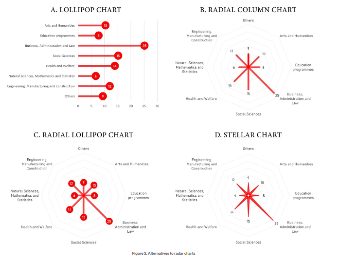
They are also chosen for cyclical and seasonal data, better visual balance, or purely for engaging aesthetics.
So how to go about it with the core visual set?
With donut charts, you cannot yet adjust the height of individual segments, nor stack these segments. Bar and column charts are restrictive, in that you cannot prescribe X1 X2, Y1 Y2 coordinates, so a line chart will be more suitable for this purpose.
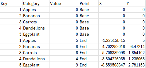
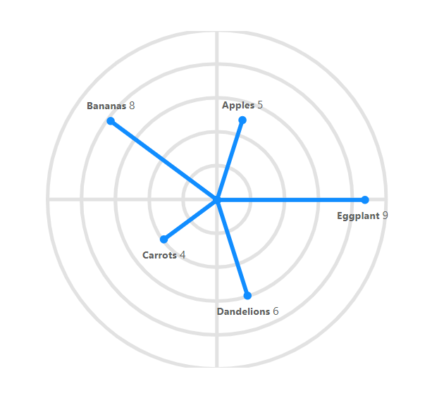
Each line will need to be treated as a category, and for each of those categories, there will need to be a base point X1,Y1 and the end point X2,Y2 illustrated below
The X-axis must be a field, whilst the Y-axis can be a measure.
The data structure needed for the chart is as follows:
There are a number of ways to model your data to achieve this. For demonstration purposes, and to show the calculations required, I will walkthrough steps to achieve this with DAX, though the modelling can be done with Power Query or elsewhere, in whichever way is most suitable for you.
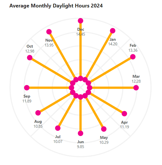
For this example, we will be creating a radial column chart where all base points meet at the centre (0,0)
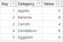
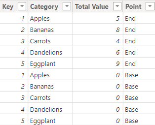
With an initial table of data:
We can join data for our base values using DAX:
Calculated Table = UNION(
    ADDCOLUMNS(SUMMARIZE('Data', 'Data'[Key], 'Data'[Category], "Total Value", SUM('Data'[Value])),"Point", "End"),
    ADDCOLUMNS(SUMMARIZE('Data', 'Data'[Key], 'Data'[Category], "Total Value", 0),"Point", "Base"))
To achieve:
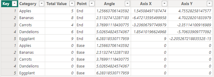
Next, we will need to determine the angle of our lines, which can be achieved with the following calculated column:
Angle =
// degrees = 360/number of categories
// To convert from degrees to radians, multiply the number of degrees by π/180
var spines = MAX('Calculated Table'[Key])
RETURN
(DIVIDE(360,spines)*'Calculated Table'[Key])*(PI()/180)
Our X Position:
Axis X =
// x = rcosθ
'Calculated Table'[Total Value] * COS('Calculated Table'[Angle])
Our Y Position:
Axis Y =
// y = rsinθ
'Calculated Table'[Total Value] * SIN('Calculated Table'[Angle])
For the following data table:
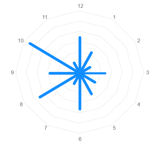
These fields can then be placed into the associated field wells in a line chart visual:
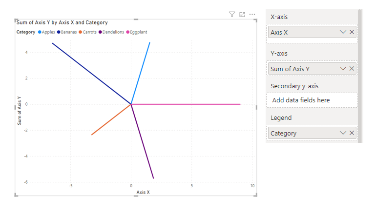
And then formatted to have axes of equal negative and positive magnitude, and the gridlines deselected.
Custom data labels will need to be created to show blank for base points, achieved with a simple measure for the conditional formatting function:
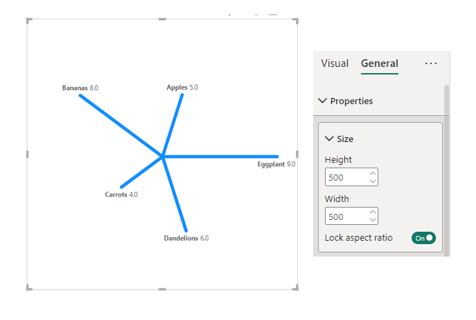
Base Label Title = If(Max('Calculated Table'[Point]) = "Base", "", Max('Calculated Table'[Category]))Removing the title and legend, then creating square dimensions in the properties of the visual, will aid in creating a proportioned plot.
As per the previous blog, a plot background area image will need to be applied to create polar or radial guidelines.
If there were to be a fixed number of categories, such as days, months, or perhaps skillsets, a concentric polygonal background could be created. If these categories are likely to be dynamic, then a concentric circular design is advisable.
Background images are available in the chart templates gallery.
Considerations
Considerations and limitations of this method of creating radial column charts are many. Tooltips and mouse-over function aren’t desirable. Having a custom background image and manually fixing the width and height of the visual may mean sacrificing a degree of visual accuracy.
“Show data as table” function will not return the appropriate values and suggests, though I haven’t tested and confirmed, inaccessibility with a screen reader.
Using Custom Visuals
Using custom visuals such as the radar plot and Deneb will lead to better outcomes, where greater formatting controls can be applied and appropriate transforms can be performed within the custom visual.
Watch this space for more radial charts within Deneb.