
Skip to content
EXPLORATIONS IN DATA STORYTELLING WITH POWER BI

EXPLORATIONS IN DATA STORYTELLING WITH POWER BI

  • Home
  • Visualisations
  • Templates
    • Deneb Templates
    • SVG Templates
    • PlotlyJS Templates
  • Services
    • Consultancy & Training
    • Shop Swag
  • About
  • LinkedIn
  • Bluesky
  • YouTube
  • Instagram

Month: June 2024

Radial Column chart

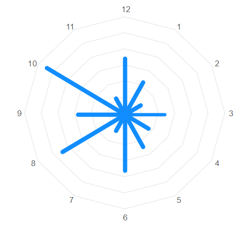
In a previous blog, I wrote about creating polar charts with Power BI Core visuals. This article continues that conversation and demonstrates how to create a radial column chart, with…

Continue reading Radial Column chart
Published June 7, 2024
Categorized as Core Visuals, How To's, Power BI

Polar and radial charts with Power BI Core Visuals
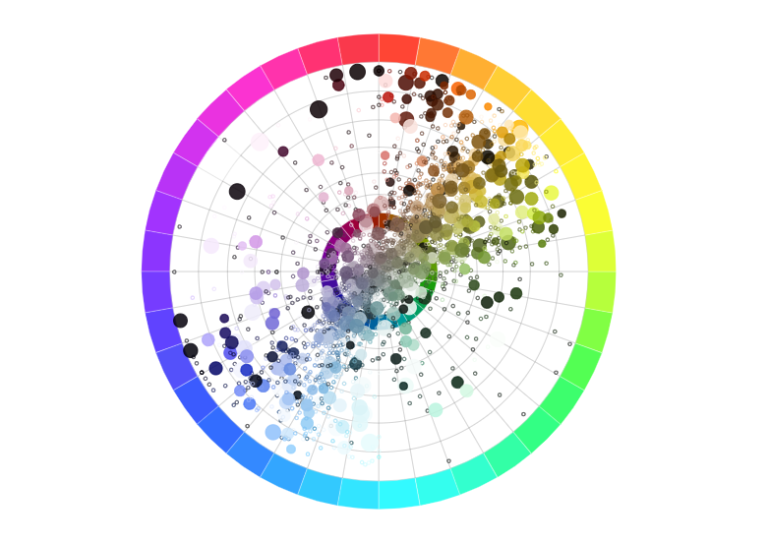
Aside from the pie and donut charts, there is not much in the way of polar plots in the Power BI core visual set. Polar plots are rarely used in…

Continue reading Polar and radial charts with Power BI Core Visuals
Published June 4, 2024
Categorized as Core Visuals, How To's, Power BI

Recent Posts

  • A matter of scatter
  • Smoothed Line Faux-Pax’s (and Other Things UI/UX Can’t Teach You About Data Visualisation)
  • Upcoming Workshops
  • Cool report design tips with the updated Image visual
  • Protected: Make your blogs stand-out from the crowd

Archives

Categories

Meta

  • Log in
  • Entries feed
  • Comments feed
  • WordPress.org
EXPLORATIONS IN DATA STORYTELLING WITH POWER BI