
My latest Deneb creation breaks ALL THE RULES of Dataviz
But.
I like it!
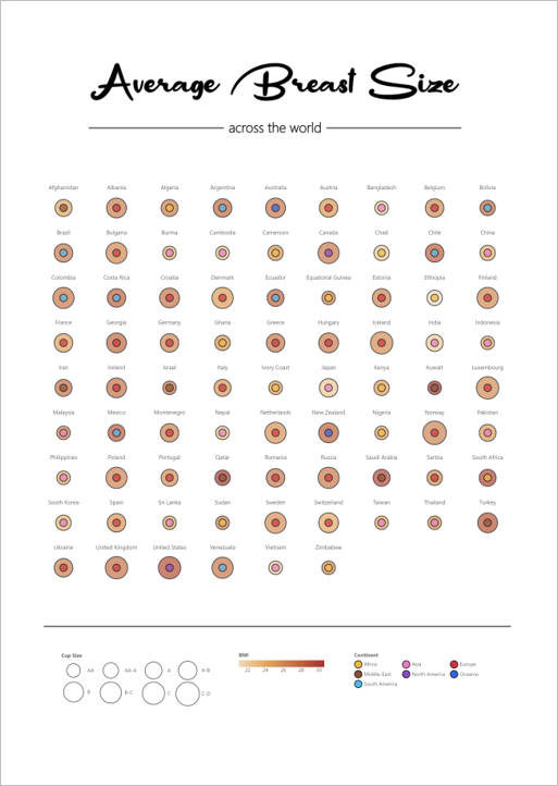
This is a visual I designed for myself. I’m fascinated with the human body and the human form. In my downtime I tend to craft (though lately this has been overtaken with dataviz as a hobby). My crafts are varied, sewing, knitting, modelling, painting and doodling amongst others. Life drawing is one of my favourites – great for those that are time-poor. Sketching many figures and forms in 1 minute, 5 minutes and 30 minutes, means working out those skills and keeping oneself away from the screen.
With this design, I seem to have combined two of my hobbies together. Something I really was keen to keep separated for some time. But. Oh well.
So, what rules did I break?
Weeeell… not rules per se, but aspects that could be improved upon. I’ve listed a few of the more apparent ones below:
1. Choosing an illegible font
I had wanted to go a “curvacious” headline font for this visual, which meant that it could be hard to read for some. In fact, some pointed out they had misread the title as “Average Bread Size” which made the glyphs appear like teacakes or bagels if you are American. Lisa Charlotte Muth has a great article about picking the best fonts for accessibility and legibility in data visualisations.
2. Ordinal size encodings
Encoding ordinal data by size is not usually problematic. However, for this viz, the size difference between the cup size encodings is not necessarily proportional to the size difference of actual cup sizes, and whilst I aware of this, it could confuse others reading it.
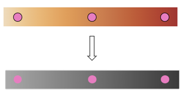
3. Layering colour
As mentioned in a previous post, colour is interactive. Surrounding colour can effect perception by making two disimilar colours appear similar.


And also effect percieved luminosity:
4. Not ordering or grouping for quicker insight
Ordering by size or continent would make for quicker comparison and “insight”. However, that was not my aim for the viz. Spending more time looking at the viz, and dashing around between the differents glyphs made the visual more fun. I had intended to wonder at the diversity of sizes, rather than hunt for the biggest or smallest sizes. It was not like the self-reported data was all that reliable anyway.
5. Probably a few other misnomers like colour palette.
If I were designing this visualisation for others’ consumption, I would have spent more time explaining the data and the relationship (or lack thereof) between cup size and BMI. I might not have chosen the colour palette I had for fear of stereotypical thinking1 and also because it is unlikely friendly for those with colour vision deficiencies.
Yet given this piece was for me, and I understood the encodings, I had no fear of this2.
Final thoughts
As someone once mentioned, if a Dataviz is unintelligible then it is art. Whichever which way this design swings, viz or art, I’m happy.
Keep on Keepin’
/\___/\
|= ͡° ᆺ ͡°)=
\╭☞ \╭☞ FABULOUS!
Kez
1 well, I might not have made this viz fullstop, and perhaps chosen a traditional scatterplot
2 I did have fear. A moment of panic ensued once posted to Twitter.
This pushed me over the edge to try the Derneb Plugin and Vega Liste.
After some cursing and pleeing and giving some names to ChatGPT to make things worse.
I got what I wanted and now have a dynamic visual with 2 rows of mixed bar and line charts.
And rendern times are definantly faster then for the 20+ visuals I used before.