
A deviation icicle chart is an uncommon chart to show variance from a target or baseline value across time.
There are a multitude of ways to show comparison to target when visualising data. Common graphs such as line, bullet, lipstick, and hills & valley are good ways to show comparison to target, each having its own drawbacks.
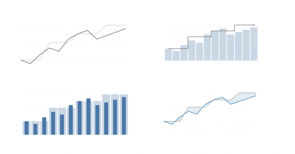
Line and area for example, when using smaller comparison periods, can give a false impression of the magnitude of variance, if the viewer has a tendency to compare volume, rather than position between lines.
Equally, showing lines that cross-over, can mislead the reader as to when the actual outperformed target.
And, with fewer comparison periods, it becomes harder to visually pinpoint the data points we want to compare.
However, when looking over a greater time period, with more data points, all this becomes a moot point, and the effects are lessened. When focusing on trend, rather than specific periods, the line and area charts can become a better choice than bar charts.
Composite charts
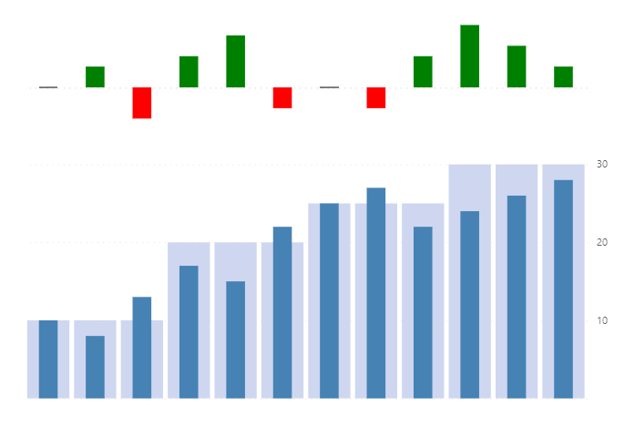
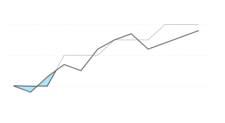
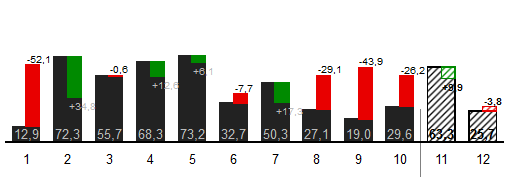
Composite charts like the one pictured above are my preference when trying to highlight the variance between actual and target/forecast values. I feel they work better than trying to convey too much information in one visual such as the one below:
However, composite charts can take up a fair bit of space and visually dominate the report page.
Something a little different
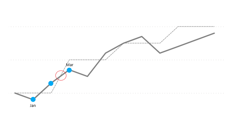
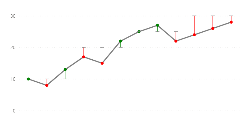
The below chart I created when trying to convey actual values and deviation from target over periods of time in a minimal and condense way. I didn’t have a name for this chart, with a google image search I found this article, from where I borrowed “deviation icicle”. However, this is perhaps not the best name as it is shared with another python chart type.
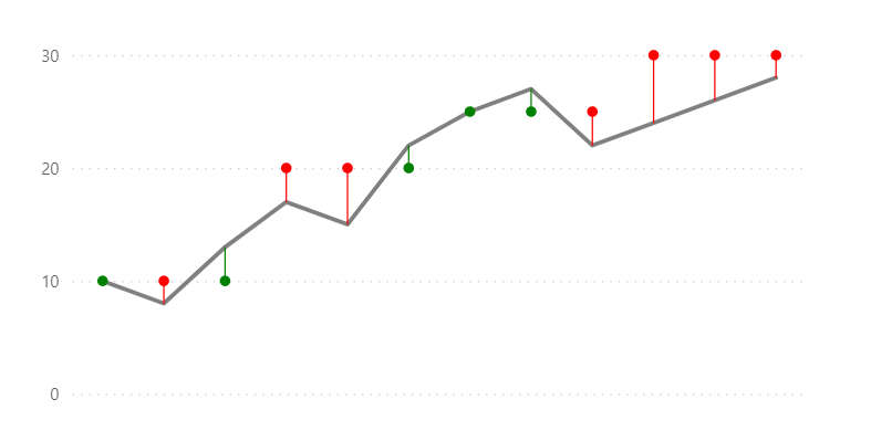
I didn’t mind the chart (though it reminded me of a Christmas Tree), but for my intended use, I felt the direction of the “icicles” wasn’t quite right. I wanted to show variation FROM target, not variation TO target, so I reversed the dots.
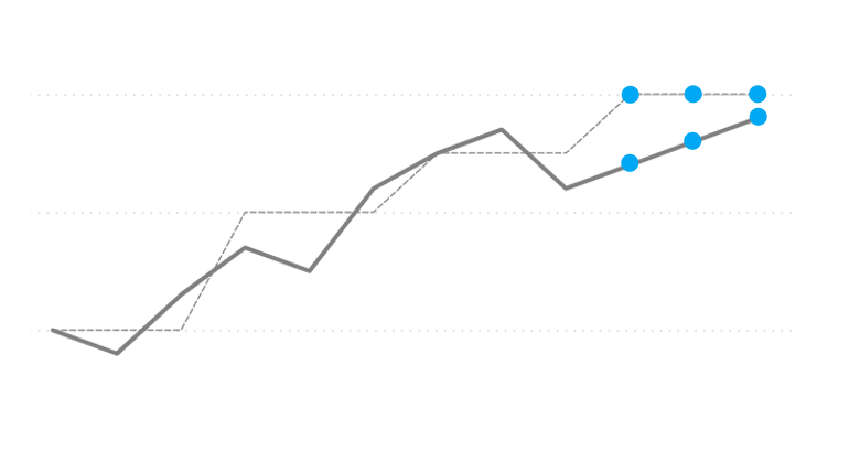
Strange looking chart, but it works for me ¯\_(ツ)_/¯.
The Deneb templates for these charts can be found here and here. Instructional video TBD.
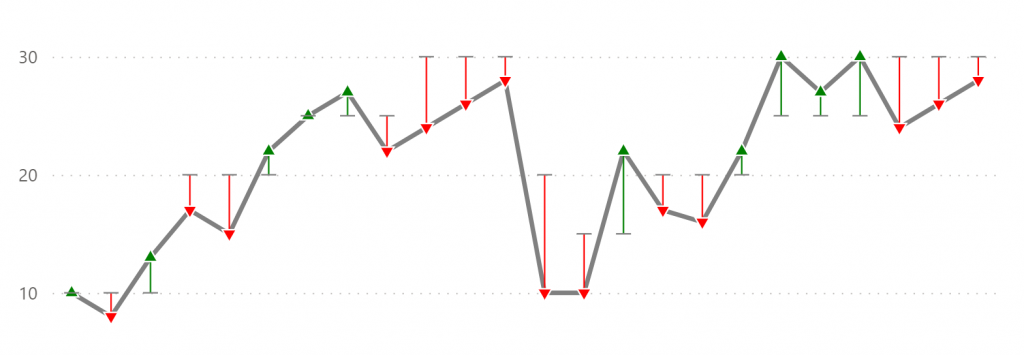
A deviation icicle chart could be a good choice of visual for 6 or greater comparison periods (but not too many) and when there is a need to visually declutter or save space on a report page. Yet it would be unfamiliar for many users, which would likely mean some resistance or difficulty reading it.
As always, the best choice of visual often comes down to the size and shape of the data*, primary focus of data exploration and consumer preference.
If you do use this type of chart, I’d love to know more.
Happy Vizzin’
/\___/\
|= ͡° ᆺ ͡°)=
\╭☞ \╭☞ AWESOME!
*(which can vary, so it’s good to be flexible and update visuals from time to time)