
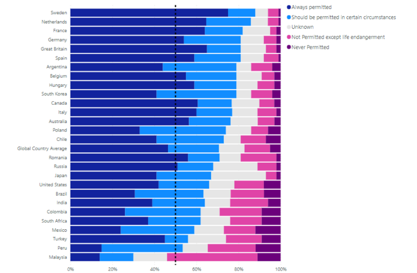
I came across this Global Views on Abortion Report which showed the following graph:
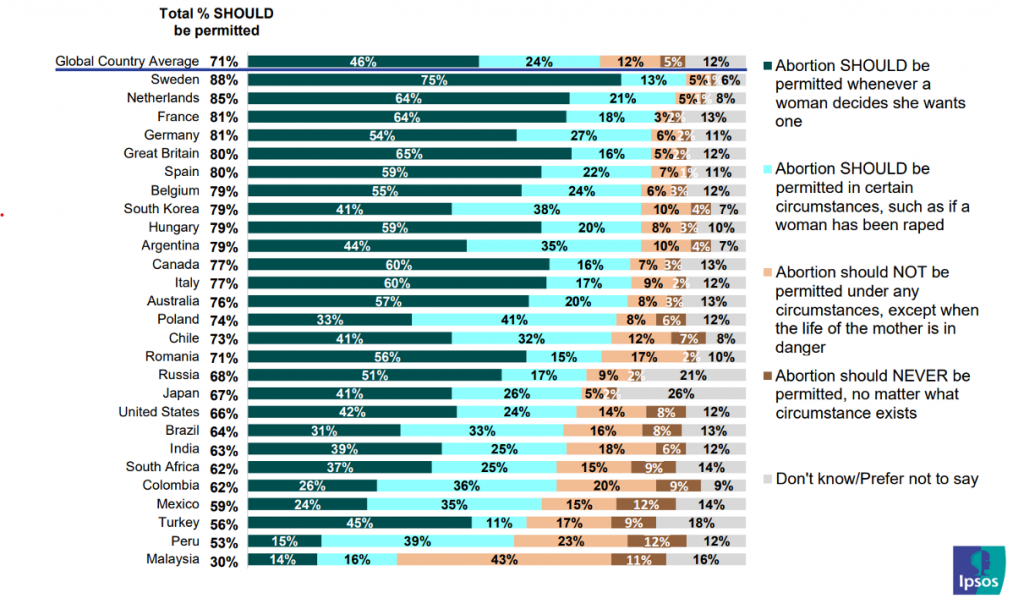
It was great to compare support for permitting abortion across different countries, but it was a little more difficult to compare support for not permitting abortion across countries.
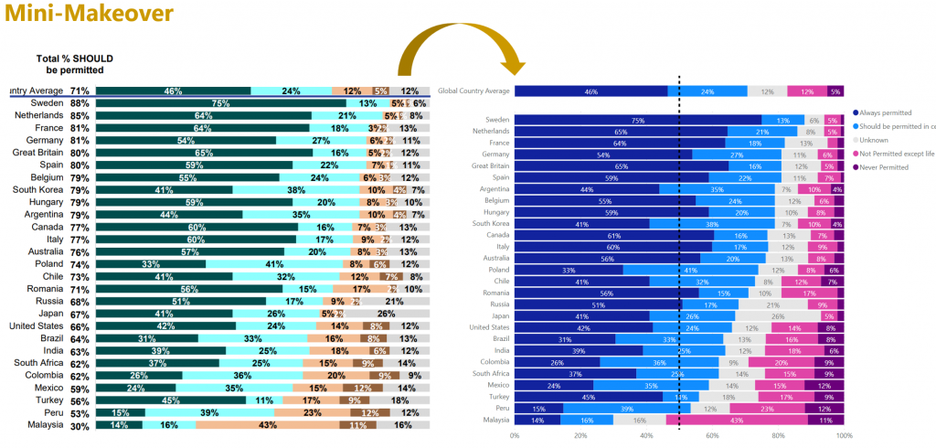
So I thought I’d have a go at modifying the chart slightly.
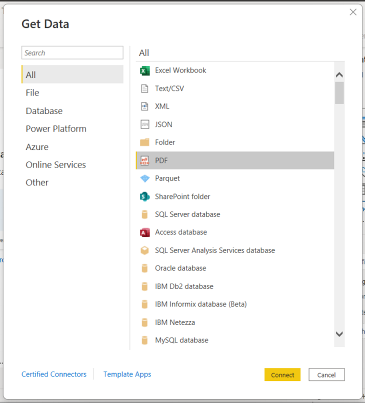
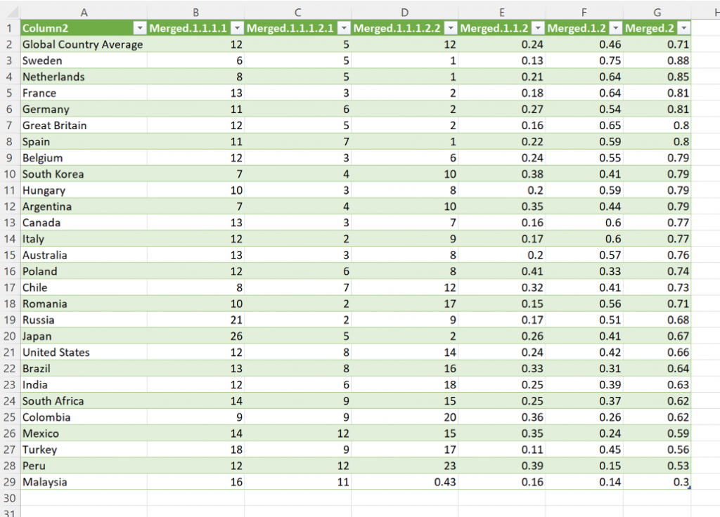
From Excel I connected to the pdf as a data source…
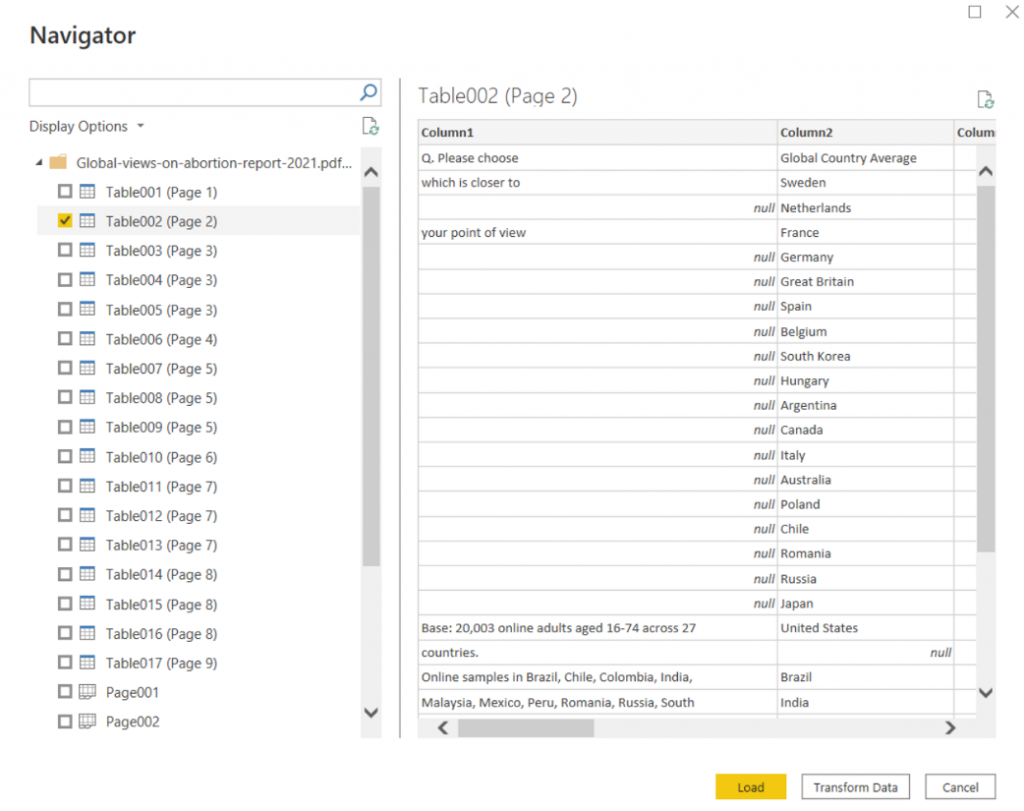
Selected the data from the chart…
Tidied up the data…
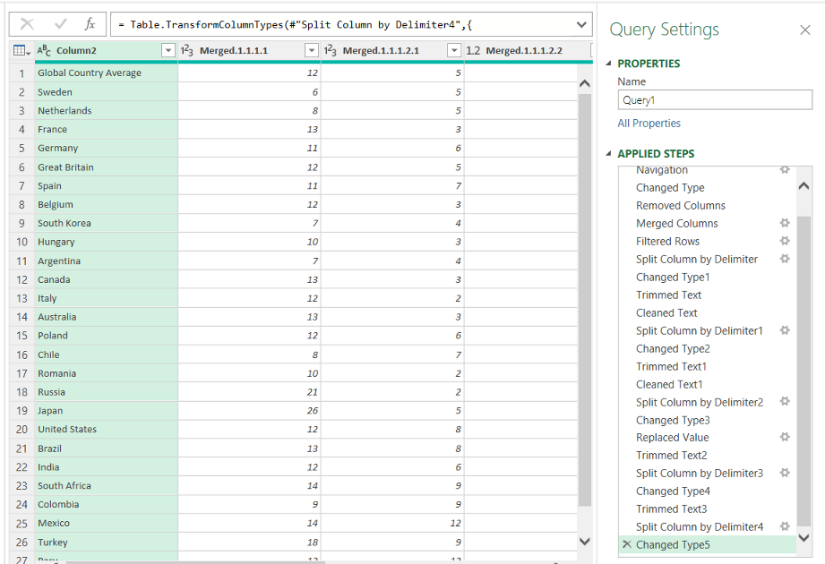
And manually fixed up a few cells once loaded into Excel…
In Power BI I created a Stacked Bar chart similar to the original but with “unknown” between the positive and negative attitudes. By splitting the values in this way, it makes it easier to compare not just the positive attitudes, but also the negative ones. Overlaying a 50% mark also allows us to more readily see the countries where negative attitudes are greater than positive.
When comparing this makeover to the original, the only thing missing is the total permitted values.
Happy Vizzin’
/\___/\
|= ͡° ᆺ ͡°)=
\╭☞ \╭☞ AWESOME!
Kez.
Thanks for sharing your wisdom and creativity. I am a novice with Power BI. I find the instructions useful but not sure if there are more steps needed to it.
The viz is great !