
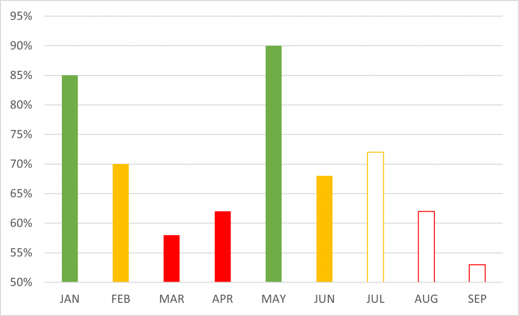
I’ve come across many charts like this in the wild. This one depicts utilisation and RAG status by month.
They’re not bad charts, they serve a purpose, but they could be better.
Bar charts are created by encoding data by length. It is commonly thought that when people read bars, they are comparing length, not position. In this chart, the axis starts at 50%, rather than zero, which can be misleading. For those that read magnitude by length, it gives the illusion that utilisation amount in February is half that of May, when it is not.
The colours can also be misleading. Here, the colours are assigned meaning, Green = Good; Amber = OK, Red = Bad. Green bars that are bigger are “more good”, so it would be no surprise that we would instinctively think that red bars that are bigger would be “more bad”. But that is not the case.
What is intended to be portrayed is performance toward target bands. Utilisation between 80 and 95% is good. Utilisation between 65 and 80% is ok. It’s not immediately obvious from Chart 1 what these targets are. If you are like me, you might be trying to work out what the magic number is that changes status from ok to good, and imagine this as a line over the graph so you can picture how you deviate from target across the months.
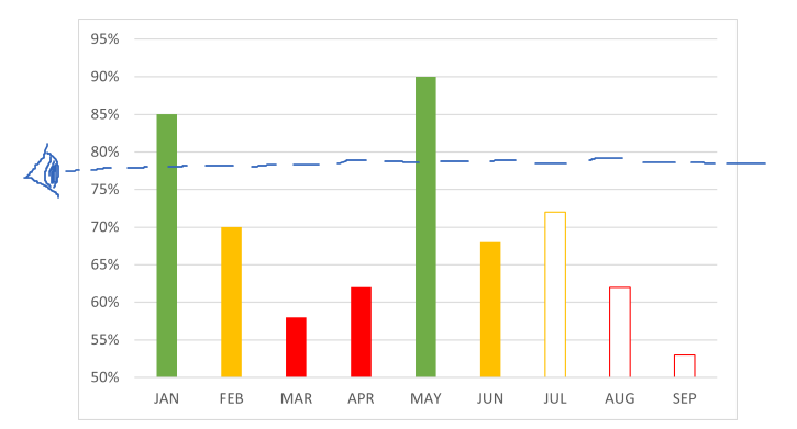
To save some of that cognitive work, the bar chart can be transformed to display these target bands on the page, rather than us trying to picture them in our heads. The bands could convey the KPI status rather than being tied in with utilisation encodings.
The following chart attempts this and is also a common and reasonably effective visualisation.
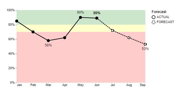
It is often advised to remove points on a line, where we want to convey change over time with continuous data and where the change, trend or pattern in data is more important than the figures. This is usually in an effort to reduce visual clutter. Here the points remain deliberately as the time period will always be 12 calendar months (and thus not too busy) and it is intended to emphasise the monthly results. The slope of the line between points can help better visualise the magnitude of change between the months and gives a sense of flow or continuity.
Whilst it is a good visual it does have a few niggly drawbacks. If it were to be presented on a dashboard with other visuals the large chunk of red can become a visual distraction from other data displayed on the page. It might not be optimal for print or people with colour deficiencies.
So here it is tweaked again.
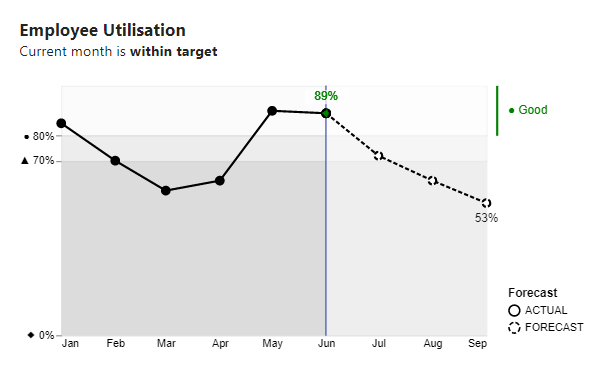
The graph was created using the Deneb custom visual for Power BI. With it offers the flexibility to adjust the axis values to show only 0% 70% and 80% where the target bands start and end. I chose to change the colours to shades of grey in Stephen Few fashion. For me, (and I’m a little unusual at times) this appears to create a layered effect, not entirely desired. I emphasised the current month with colour and a data label, and placed status to the right. This is dynamic. If current month was in the 70-80% target band, a different status will show. The resultant visual is quite information dense, and may not be to everyone’s taste.
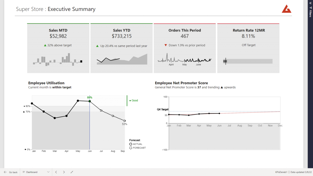
The visual can then be placed on a page with other KPIs, without causing too much distraction.
Quick Tip:
Changing axes values:
"y": {
          "field": "Percent",
          "type": "quantitative",
          "axis": {
            "labelExpr": "datum.label == 0 ? '◆ 0%' : datum.label == 0.7 ? '▲ 70%' : '● 80%'",
            "labelFlush": false,
            "values": [0, 0.7, 0.8],"grid": true
          }
        }
Hi,
This is a very interesting post.
I am also very interested in the whole code for this visual as I am trying to do something similar with background bands but I seem to not be able to (still quite new to vega…).
Any chance you could share the whole vega code for it?
Thanks!
Yes, I have been meaning to
Hello,
Do you have a scatterplot template that has code that changes the edgecolor of the markers if a condition is met? Example: If a company has a labor category that has a rating <= 0 then the edge color is red, else blue?