
A chart I created for a Workout Wednesday Challenge.
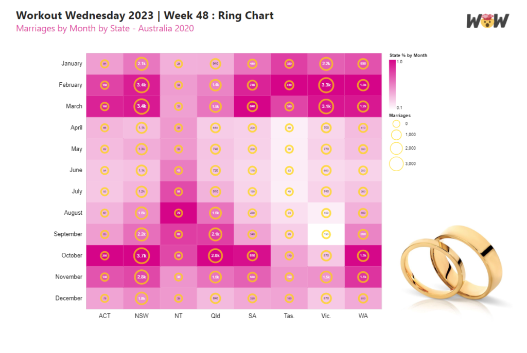
The chart shows the number marriages by month and Australian State encoded by size as rings, and (given that each state has a different total population) marriages by month proportional to the State encoded as a gradient background.
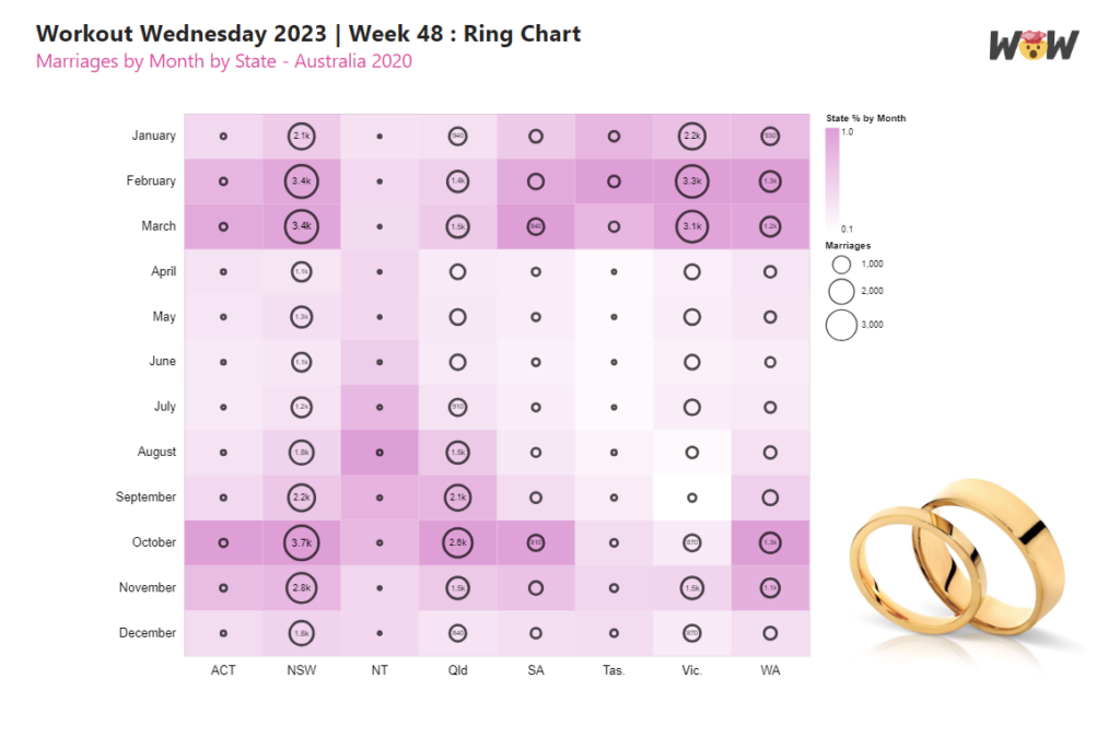
It was rather hurried and rushed out at 2am in the morning. There were contrast issues with the rings against the background so I thought I would return to it to see if this was something that could be improved.
To create the chart I began with the Rectangle Marks:
- Mark Type = “rect”
- “Month” field encoded along the Y-Axis
- “State” field encoded along the X-Axis
- colour encoded with the proportional value of marriages by State
{
  "data": {"name": "dataset"},
  "layer": [
    {
      "mark": {"type": "rect"},
      "encoding": {
        "y": {
          "field": "Month",
          "type": "ordinal",
          "sort": {
            "op": "max",
            "field": "Sort",
            "order": "ascending"
          },
          "title": "",
          "axis": {
            "domain": false,
            "ticks": false,
            "labels": true,
            "labelFontSize": 14,
            "labelAngle": 0,
            "labelPadding": 10,
            "labelColor": "black"
          }
        },
        "x": {
          "field": "State",
          "type": "nominal",
          "title": "",
          "axis": {
            "domain": false,
            "ticks": false,
            "labels": true,
            "labelFontSize": 14,
            "labelAngle": 0,
            "labelPadding": 10,
            "labelColor": "black"
          }
        },
        "color": {
          "field": "State Value",
          "type": "quantitative",
          "title": "Marriages",
          "scale": {
            "range": [
              "transparent",
              "#D50488"
            ]
          },
          "legend": {
            "direction": "vertical",
            "gradientLength": 120,
            "title": "State % by Month"
          }
        }
      }
    }
  ]
}
Then layered the rings on top:
- Mark = “circle”, with constant gold outline and thickness
- “Month” field encoded along the Y-Axis
- “State” field encoded along the X-Axis
- size encoded with “Value” field, with minimum (300) and maximum (1300) size set
{
  "data": {"name": "dataset"},
  "layer": [
    {...},   // rect mark
    {
      "mark": {
        "type": "circle",
        "stroke": "gold",
        "strokeWidth": 4,
        "fill": null
      },
      "encoding": {
        "y": {
          "field": "Month",
          "type": "ordinal",
          "sort": {
            "op": "max",
            "field": "Sort",
            "order": "ascending"
          }
        },
        "x": {
          "field": "State",
          "type": "nominal"
        },
        "size": {
          "field": "Value",
          "type": "quantitative",
          "title": "Marriages",
          "scale": {
            "range": [300, 1300]
          }
        }
      }
    }
  ]
}
Which thus far produced the following graph nicely:
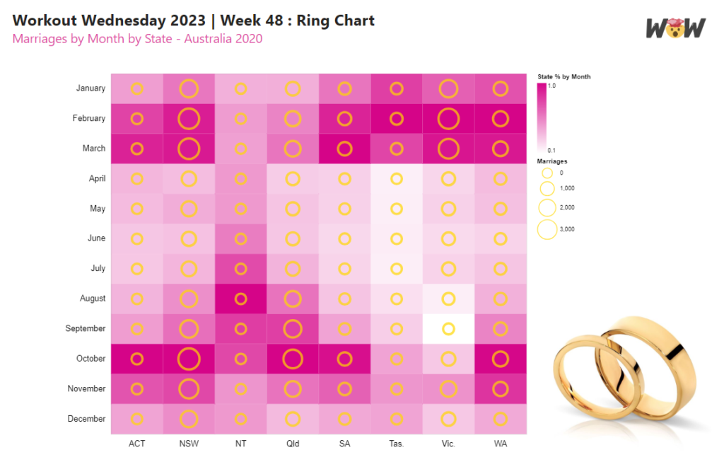
Next, I wanted to add some text labels inside the rings that changed size with the size of the circle.
So I added a third layer:
- Mark = “text”
- “Month” field encoded along the Y-Axis
- “State” field encoded along the X-Axis
- Conditional text colour (If the proportional State Value is less than 45% then black text, else white text), to show good contrast against the background gradient
- Text Size encoded with “Value” field, with a minimum text size of 6pt and maximum text size of 12pt.
{
  "data": {"name": "dataset"},
  "layer": [
    {...},    // rect mark
    {...},    // circle mark
    {
      "mark": "text",
      "encoding": {
        "text": {
          "field": "Value",
          "type": "quantitative",
          "format": ".2s"
        },
        "y": {
          "field": "Month",
          "type": "ordinal",
          "sort": {
            "op": "max",
            "field": "Sort",
            "order": "ascending"
          }
        },
        "x": {
          "field": "State",
          "type": "nominal"
        },
        "color": {
          "condition": {
            "test": "datum['State Value'] < 0.45",
            "value": "black"
          },
          "value": "white"
        },
        "size": {
          "field": "Value",
          "type": "quantitative",
          "scale": {"range": [6, 12]}
        }
      }
    }
  ]
}
This produced a wacky result:

As can be seen, the size of the layered text mark was not independent of the size of the circles. There are a couple of ways to tackle this. One way is to resolve the scales as independent.
{
"data": {"name": "dataset"},
"layer": [
{... }, // rect mark
{... }, // circle mark
{... } // text mark
],
"resolve": {
"scale": {
"color": "independent",
"size": "independent",
"x": "shared",
"y": "shared"
}
}
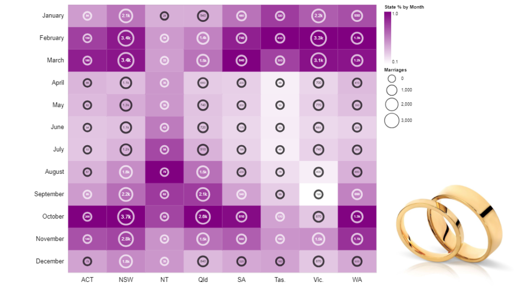
}Next, I wanted to improve the contrast of the rings against the gradient background.
Whilst not in the Vega-lite documentation, I found that the stroke colour could be encoded.
    {
      "mark": {
        "type": "circle",
        "strokeWidth": 4,
        "fill": null
      },
      "encoding": {
        "y": {...},
        "x": {...},
        "size": {...},
        "stroke": {
          "condition": {
            "test": "datum['State Value'] > 0.4",
            "value": "white"
          },
          "value": "black"
        }
      }
    },
Which, whilst improved, was still a little uncomfortable to look at
So I adjusted the gradient, set the minimum circle size to zero and removed the smaller text labels:
Which is a whole lot better to read.
Keep experimenting y’all
Kez.