
In my short career doing data visualization with Power BI, I have always desired the flexibility to do more with my visuals.
So when I came across a demo for Deneb in a meetup last year, I practically lost my head.

And when I finally got my hands on the visual I was not disappointed.
Deneb, as very well described here, uses Vega and Vega-Lite, a visualisation grammar. I didn’t spend much time reading up on the documentation before I started – I’m way too impatient a person. I mean who reads the instructions on the IKEA manuals anyway?
Chart 1 – Horizontal diverging chart
I had a number of charts that I had been busting to create. So I headed over the Vega-Lite template gallery to pick out some examples that looked close enough in design.
I picked up a pyramid, pasted the template into the editor, mapped the field names then BOOM! Will you look at that it just worked!
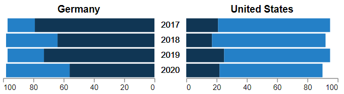
Okay, okay, so now it’s time to read the documentation. I wanted to add a legend, with a quick search I was able to find how to do that. I made additional cosmetic tweaks here and there which were intuitive enough to do.
Eeeek how exciting.
Chart 2 – Line chart with text labels
The second project was also fairly straight forward.
I began with a simple line graph
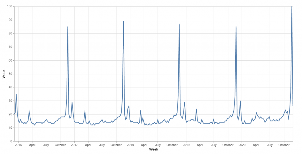
Layered a rectangle mark underneath
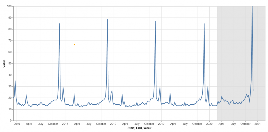
Updated the grid styling and added colour coordinated points
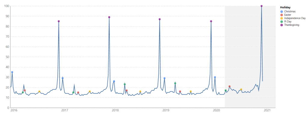
I next added labels and the ability to highlight values upon hovering over the legend
Magic!
Chart 3 – KPI Cards
The next project began as a desire for more control over KPI style visuals. I often find I have to layer visuals to get the features I want for KPIs, which creates unforgiving navigation experiences.
I didn’t spend too much time on these visual types, but was very excited by the flexibility I had.
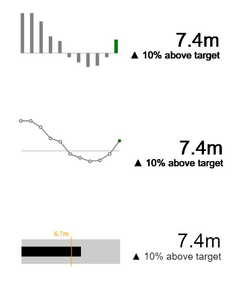
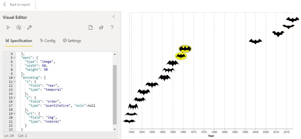
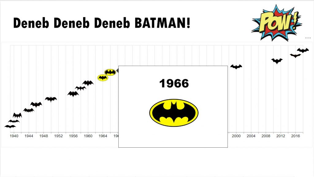
Chart 4 – Image Plot
The fourth chart was the simplest. Here, I wanted to test how images would render.
I copied a basic template from Vega-Lite Examples gallery and removed the Y-Axis
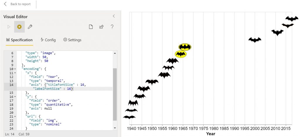
Increased X-axis font size
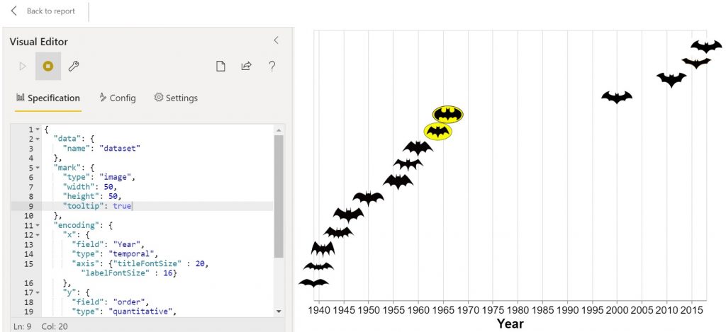
Added tooltip
Pow!
Oh so simple and easy to use!
I cannot wait until it hits AppSource!
Very useful content, do you know if it possible to have the vega-lite title dynamic and linked to the dataset. For example have the KPI text in your KPI cards within the vega-lite title?
If I understand you correctly, I don’t believe it’s possible to have dynamic titles and headers.
ok great thanks, I continue to text using marks as you did in your KPI examples
Hi Kerry,
Your content is amazing, thank you for sharing.
I have been looking everywhere to find a way to lock the axis so that it is always visible when scrolling up/down or to the sides. Do you have any content on this yet?
Thank you
Hi Kerry, Great and informative post, thank you for sharing! I have some doubts about which Python library would be best to integrate into my PowerBI development environment. I see you use Deneb seamlessly, which I wasn’t familiar with until a teammate mentioned it. We were considering whether it would be more beneficial to use Deneb over a couple of more famous libraries with greater community support, such as seaborn or matplotlib, for future support reasons. I’m interested in knowing the reason behind your preference for using Deneb. Could you share your insights? Thanks again!