
A graph I explored through a Makeover Monday challenge.
It didn’t make the final design but I thought I’d write it up for another time.
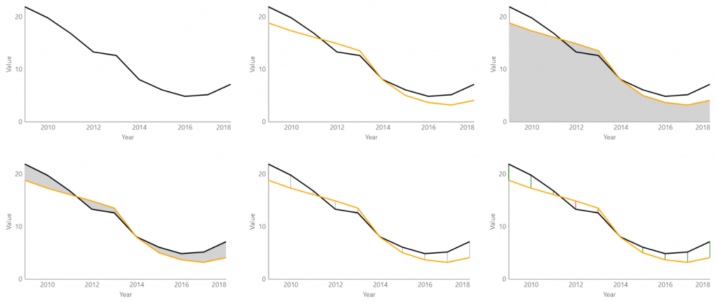
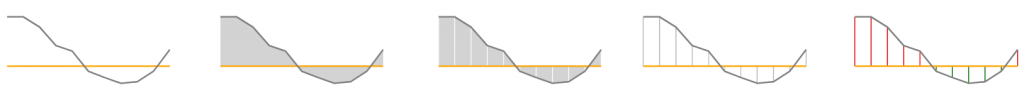
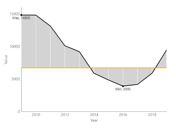
Area fill is sometimes used to highlight variance between two categories on a line chart though I was curious as to whether drawing lines between points may serve as a better depiction of magnitude. Turns out not, in the above image some of the vertical lines appear to be at differing angles. It made a difference when the vertical lines had the same base per below, yet at this point, I had to ask myself why? why do this when a bar chart could be more effective?
Well, there’s no better way of learning than through doing ¯\_(ツ)_/¯
To create the chart, I imported the latest version of the Deneb custom visual and dragged the fields I needed into the panel.
In editor mode, I graphed my first line:
  "data": {
    "name": "dataset"
  },
  "mark": "line",
  "encoding": {
    "color": {
      "value": "black"
    },
    "x": {
      "field": "Year",
      "type": "temporal",
      "title": "Year"
    },
    "y": {
      "field": "Value 1",
      "type": "quantitative",
      "title": "Value"
    }
  }
}
Then my second:
{
  "data": {
    "name": "dataset"
  },
  "layer": [
    {
      "mark": "line",
      "encoding": {...}
    },
    {
      "mark": "line",
      "encoding": {
        "color": {
          "value": "orange"
        },
        "x": {
          "field": "Year",
          "type": "temporal"
        },
        "y": {
          "field": "Value 2",
          "type": "quantitative"
        }
      }
    }
  ]
}
I started with area fill:
{
  "data": {
    "name": "dataset"
  },
  "layer": [
    {
      "mark": {
        "type": "area"
      },
      "encoding": {
        "color": {
          "value": "lightgray"
        },
        "x": {
          "field": "Year",
          "type": "temporal"
        "y": {
          "field": "Value 1",
          "type": "quantitative"
          }
        }
      }
    },
       {
      "mark": "line",
      "encoding": {...}

    },
    {
      "mark": "line",
      "encoding": {...}
    }
  ]
}
The y2 for the area between two lines:
{
  "data": {
    "name": "dataset"
  },
  "layer": [
    {
      "mark": {
        "type": "area"
      },
      "encoding": {
        "color": {...},
        "y": {
          "field": "Value 1",
          "type": "quantitative"
        },
        "y2": {
          "field": "Value 2",
          "type": "quantitative"
        },
        "x": {...}
      }
    },
    {...},
    {...}
  ]
}
The vertical lines were created by changing “area” to “rule”.