
Another visual I explored through a Makeover Monday challenge.
To create the chart I installed the latest version of Deneb, dragged the measures I needed into the fields pane.
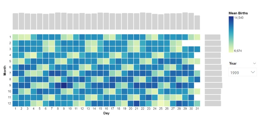
In the editor, I began with the table:
{
  "data": {
    "name": "dataset"
  },
          "mark": {
            "type": "rect",
            "stroke": "white",
            "tooltip": true
          },
          "encoding": {
            "y": {
              "field": "month",
              "type": "ordinal",
              "title": "Month",
              "axis": {
                "domain": false,
                "ticks": false,
                "labels": true,
                "labelAngle": 0,
                "labelPadding": 5
              }
            },
            "x": {
              "field": "date_of_month",
              "type": "ordinal",
              "title": "Day",
              "axis": {
                "domain": false,
                "ticks": false,
                "labels": true,
                "labelAngle": 0
              }
            },
            "color": {
              "aggregate": "mean",
              "field": "births",
              "type": "quantitative",
              "title": "Mean Births",
              "legend": {
                "direction": "vertical",
                "gradientLength": 120
              }
            }
          }
}
Then horizontal concatenation:
{
  "data": {
    "name": "dataset"
  },
  "spacing": 15,
  "bounds": "flush",
  "hconcat": [
    {
      "mark": {...},
      "encoding": {...}
    },
    {
      "mark": {
        "type": "bar",
        "stroke": null,
        "cornerRadiusEnd": 2,
        "tooltip": true,
        "color": "lightgrey"
      },
      "width": 60,
      "encoding": {
        "y": {
          "field": "month",
          "axis": null
        },
        "x": {
          "field": "births",
          "type": "quantitative",
          "aggregate": "mean",
          "axis": null
        }
      }
    }
  ]
}
Then the vertical:
{
  "data": {
    "name": "dataset"
  },
  "spacing": 15,
  "bounds": "flush",
  "vconcat": [
    {
      "height": 60,
      "mark": {
        "type": "bar",
        "stroke": null,
        "cornerRadiusEnd": 2,
        "tooltip": true,
        "color": "lightgrey"
      },
      "encoding": {
        "x": {
          "field": "date_of_month",
          "axis": null
        },
        "y": {
          "field": "births",
          "aggregate": "mean",
          "axis": null
        }
      }
    },
    {
      "spacing": 15,
      "bounds": "flush",
      "hconcat": [...]
    }
  ]
}
Variations on the above chart can be found below:
HI, Great work. It would be awesome if you can share the PBIX files.
can you share the PBIX files????
I can’t support upload and download of files on this site. I do however have a template that should make it easier to get started https://kerrykolosko.com/portfolio/heatmap-with-bars/