
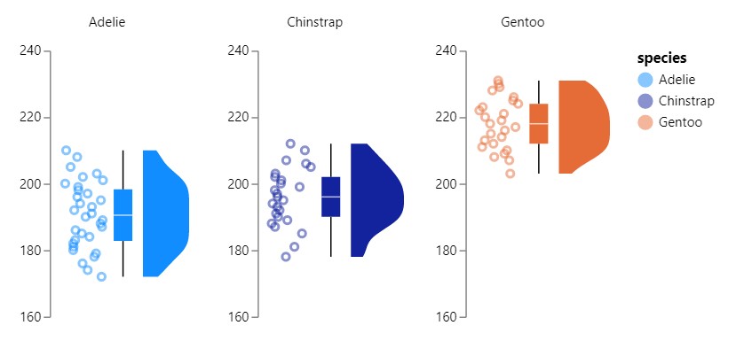
Raincloud plots are a relatively recent and effective addition to the data visualisation toolkit comprising three parts:
1) distributions as density (half-violin plot);
2) summary statistics (box plot) and
3) raw data points (scatter).
They provide statistical inference at a glance as can be done with boxplots but are less likely to obscure multi-modal distributions or patterns and outliers in data.
Raincloud plots are not available natively in Power BI nor, as far as I can tell, are they available via AppSource. I’m not set up to use R or Python, so I took to Deneb to try my hand at them.
I’d been casually tapping away at the plots over the course of a few weeks, trying out various forms using concat to join the separate graphs and DAX RAND() function to create jittered scatter:
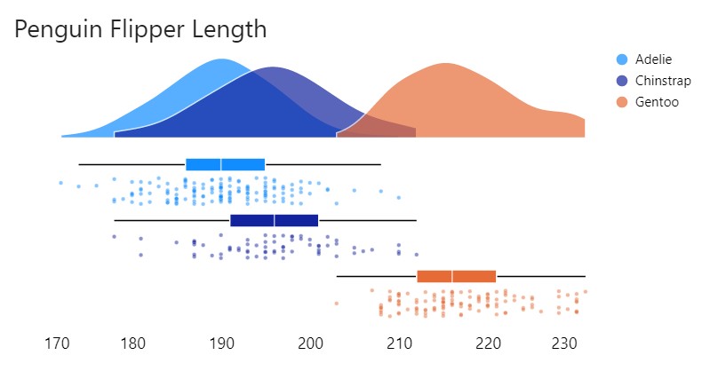
I hadn’t reached anything I was satisfied with until I saw Daniel March-Patrick’s own creation that absolutely blew my socks off!

He had kindly posted a template on GitHub which I borrowed and eagerly played around with.
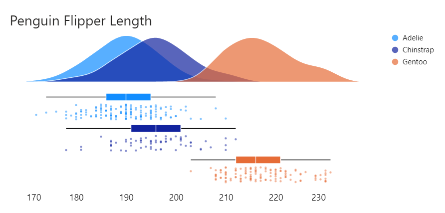
Given I only had three populations to compare, I wanted to overlay the density plots rather than stack them as I had been doing. So I leveraged the template to create the following:
Specification:
{
  "data": {"name": "dataset"},
  "bounds": "flush",
  "spacing": 15,
  "vconcat": [
    {
      "height": 65,
      "width": 400,
      "mark": {
        "type": "area",
        "opacity": 0.7
      },
      "transform": [
        {
          "density": "flipper_length_mm",
          "groupby": ["species"]
        }
      ],
      "encoding": {
        "x": {
          "field": "value",
          "type": "quantitative",
          "scale": {
            "domain": [170, 230]
          },
          "axis": false,
          "title": ""
        },
        "y": {
          "field": "density",
          "type": "quantitative"
        },
        "color": {
          "field": "species",
          "type": "nominal"
        }
      }
    },
    {
      "facet": {
        "row": {"field": "species"}
      },
      "transform": [
        {
          "calculate": "random()",
          "as": "Jitter"
        }
      ],
      "spec": {
        "resolve": {
          "scale": {"y": "independent"}
        },
        "height": 10,
        "width": 400,
        "layer": [
          {"mark": {"type": "boxplot"}},
          {
            "mark": {
              "type": "point",
              "tooltip": true
            },
            "encoding": {
              "y": {
                "field": "Jitter",
                "type": "quantitative",
                "scale": {
                  "range": [35, 15]
                }
              }
            }
          }
        ],
        "encoding": {
          "x": {
            "field": "flipper_length_mm",
            "type": "quantitative",
            "axis": {"title": ""},
            "scale": {
              "domain": [170, 230]
            }
          },
          "color": {
            "field": "species",
            "type": "nominal"
          }
        }
      }
    }
  ]
}
Config:
{
  "padding": 0,
  "view": {"stroke": "transparent"},
  "facet": {"spacing": 2},
  "header": {
    "title": null,
    "labelColor": "white"
  },
  "font": "Segoe UI",
  "area": {
    "color": "#eaeaea",
    "interpolate": "cardinal",
    "stroke": "white"
  },
  "point": {
    "size": 10,
    "opacity": 0.5,
    "color": "#eaeaea",
    "stroke": "white",
    "strokeWidth": 0.25,
    "filled": true
  },
  "axis": {
    "domain": false,
    "grid": false,
    "labelFontSize": 12,
    "ticks": false,
    "tickCount": 5,
    "titleFontSize": 12,
    "titleFontWeight": 400,
    "titleColor": "#605E5C",
    "offset": 10
  },
  "boxplot": {
    "size": 10,
    "outliers": false,
    "box": {
      "color": "#eaeaea",
      "stroke": "white",
      "strokeWidth": 1
    },
    "rule": {"stroke": "black"},
    "median": {"color": "white"}
  },
  "axisY": {"disable": true},
  "legend": {"title": null}
}
And then added population labels using a similar technique here:
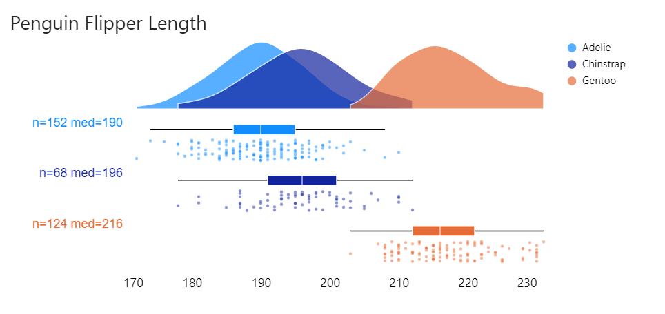
Beauty!
I am one happy lassie 🙂
Tweaking the plots
According to the Vega-Lite documentation, the bandwidth (standard deviation) of the kernel is automatically estimated. In the case that the distribution appears oversmoothed the bandwidth can be adjusted as demonstrated below:
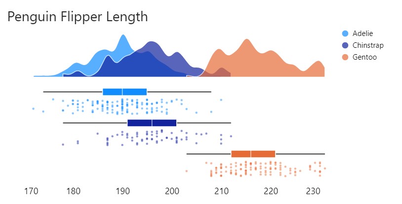
Specifying the extent determines whether the tails of the density distribution are clamped at min/max values. Here I set the bandwidth and adjusted the extent to [170 , 240]:
{
          "density": "flipper_length_mm",
          "groupby": ["species"],
          "bandwidth":3,
          "extent": [170, 240]
        }
Hi,
This is a general question for you about Deneb. From what you know of it, can it be used to create a 3d visual much like a 3d scatterplot that can be done in R. I have visualized some x,y,z data in a custom R/HTML visual already (as shown here: https://www.youtube.com/watch?v=Ax-jgwnolNI) but I want something more.
And I am wondering if Deneb would be the tool to use. You are on the bleeding edge of use from what I can tell and am curious about your opinion.
thx,
wes
Have you looked at Microsoft Sanddance?
This is based off Vega (you can edit the Vega spec) and uses a 3D renderer (rather than SVG or canvas).
Info here:
https://cloudblogs.microsoft.com/opensource/2019/10/10/microsoft-open-sources-sanddance-visual-data-exploration-tool/
AppSource here:
https://appsource.microsoft.com/en-us/product/power-bi-visuals/wa200000430?tab=overview
There’s also a new plotly visual in AppSource that might do the trick
This is great! Any chance you could share with us a json for import?
https://kerrykolosko.com/portfolio/raincloud-labelled/
Hi Kerry!
This might be an odd question, but have you worked on a visualization for Adelie Penguins for the unit Data Visualization at Monash University? I am currently studying the same unit and using vega-lite for my visualization idioms and your work here has just blown my mind. It feels like I have landed on a gold mine where I can find inspiration not just for my assignment but to actually see how great and impactful visualizations can be.
Warm regards
No, I haven’t worked on a visual for penguins at Monash 🙂
Hi Kerry!
This is a fantastic solution. I am trying something similar. Unfortunately, the number high number of samples of my raw data is slowing down the rendering. What are your suggestions to overcome this issue? Would it be possible to create similar plots using summarised data instead?
Thank you,
Tanjil
Using the Canvas renderer instead of SVG render can potentially help.
I would visit this page for more info https://deneb-viz.github.io/performance
You could sample the data, or use only the density plot and boxplot with outliers.
This worked previously nicely but now (with Vega-Lite 5.16.1 and Deneb 1.6.0.2) density plots are stacked. Do you have any hints how to restore the previous behaviour?