
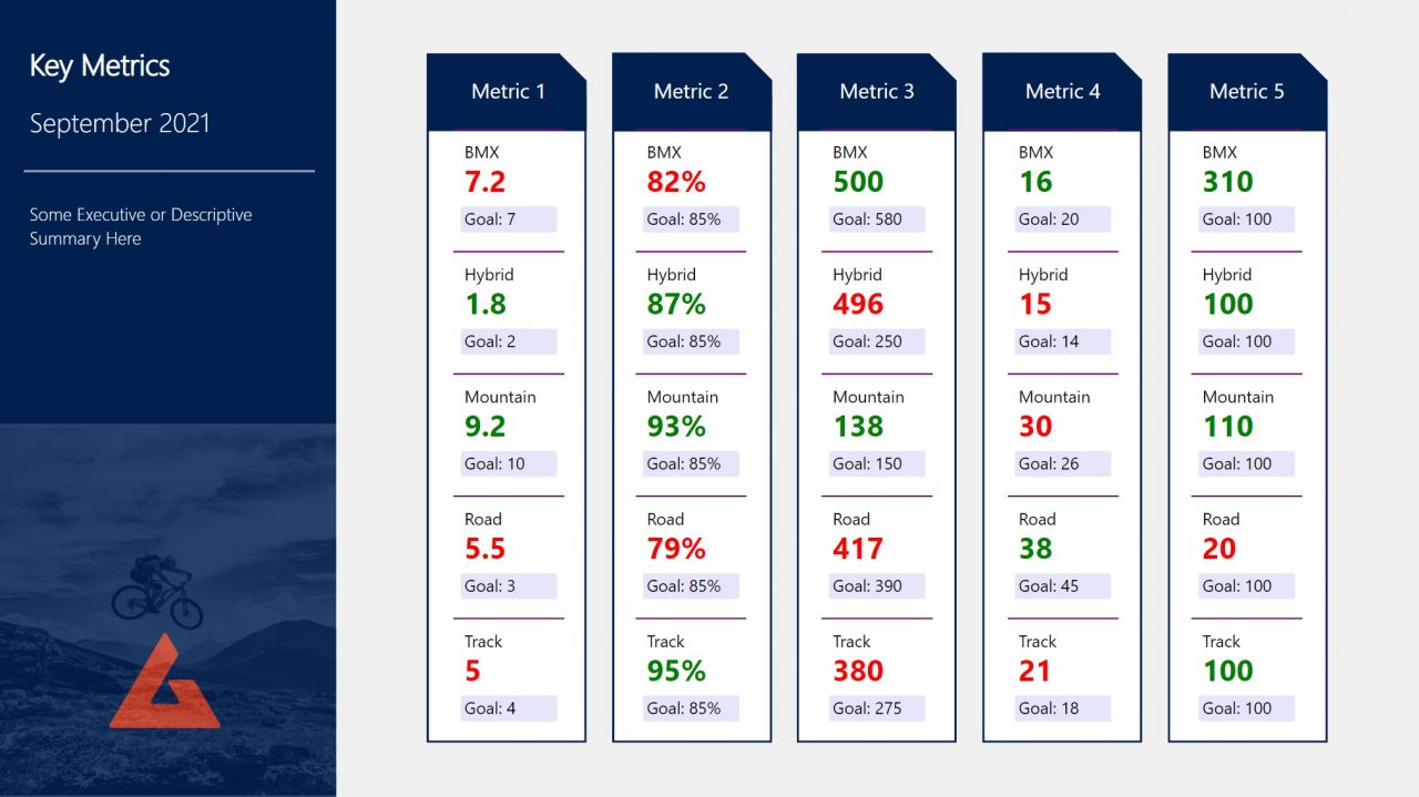
I came across a Power BI report in development that had 127 visuals (with 107 of them being KPI Cards) on a page. It took a while to load (between 10545 – 17910 ms) however, this particular report was designed for print.
I needed to add an additional page to this report with a similar amount of KPIs to be displayed. I began to think of ways I could achieve the same look and feel but with better performance. Also, I really didn’t want to be placing that many individual visuals down and worrying about alignment and filters on each.
If I could have it all in one visual, that would certainly save me some effort. Could I use Deneb, PureViz or HTML Content perhaps?
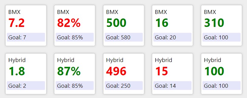
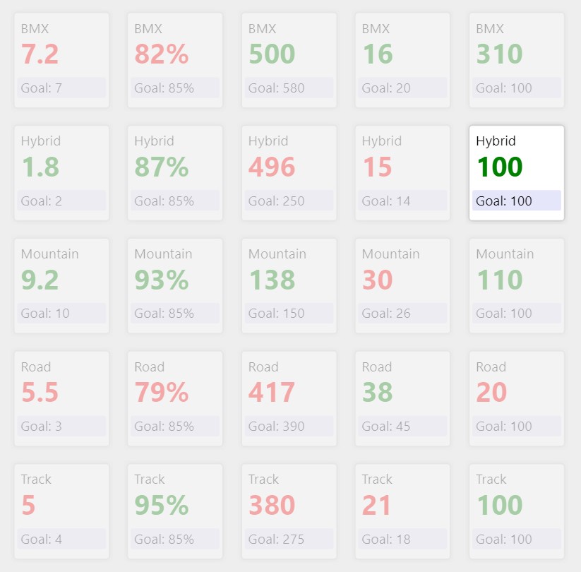
I chose to explore the Matrix visual. These KPI cards were square, which worked perfectly as the Matrix can only render square SVGs. The KPIs were organised by Metric and Unit which worked well for having all the KPIs in a single Matrix. Plus, I know through experience the Matrix visual is more performant.
SVG Card
I set about “drawing” the SVG on a 150 by 150 imaginary canvas
- KPI Title at position X=15 Y=40, font-size=15pt
- Actual Value at position X=15 Y=85, font-size=30pt
- Goal Box at position X=10 Y=105, height=30, fill=lavender
- Goal Value at position X=15 Y=127, font-size=15pt
- Divider Line at position X=0 Y=2, stroke-width=2, fill=purple
I then set about adding KPI values and conditional formatting with DAX, and once complete set the Data Category of the measure to “Image URL”.
Matrix Visual
I placed the fields and SVG measure in a Matrix visual.
I set the Matrix table style to “None”, increased row padding, removed gridlines, and set column / row outlines from “Bottom only” to “None”.
The final code and result worked wonderfully and the page rendered in 179ms compared to the previous at 10545ms:
SVG Card =
"data:image/svg+xml;utf8, " &
"<svg xmlns='http://www.w3.org/2000/svg' viewBox='0 0 150 150' overflow='visible'>

  --- Divider Line ---
<line x1='0' y2='2' x2='150' y2='2' style='stroke:purple; stroke-width:2;' />

  --- Section Title ---
    <text text-anchor='left' font-size='15pt' font-family='Segoe UI' x='15' y='40'>"&MAX(KPIs[Unit])&"</text>

  --- KPI Figure ---
    <text text-anchor='left' font-weight= 'bold' font-size='30pt' font-family='Segoe UI' x='15' y='85' fill='"&MAX(KPIs[RAG])&"'>"&IF(MAX(KPIs[Measure])="Percentage",FORMAT(MAX(KPIs[Actual]),"#%"),MAX(KPIs[Actual]))&"</text>

  --- Goal Box ---
  <rect x='10' y='105' rx='3' ry='3' width='130' height='30' fill='lavender'></rect>
  <text text-anchor='left' font-size='15pt' font-family='Segoe UI' x='15' y='127'>Goal: "&IF(MAX(KPIs[Measure])="Percentage",FORMAT(MAX(KPIs[Goal]),"#%"),MAX(KPIs[Goal]))&"</text>
</svg>"
Alternatives
Here’s a KPI Card Style with border and outer glow I briefly played around with:
SVG Card Shadow =

"data:image/svg+xml;utf8, " &
"<svg xmlns='http://www.w3.org/2000/svg' viewBox='0 0 150 150' overflow='visible'>

  --- Glow Shadow ---
<defs>
<filter id='glow'><feDropShadow dx='0' dy='0' stdDeviation='5' flood-color='lightgray'/></filter>
</defs>

  --- Outline ---
<rect x='5' y='5' rx='5' ry='5' width='140' height='140' style='stroke:lightgray; stroke-width:2; fill:white; filter:url(#glow)' />

  --- Section Title ---
    <text text-anchor='left' font-size='15pt' font-family='Segoe UI' x='15' y='35'>"&MAX(KPIs[Unit])&"</text>

  --- KPI Figure ---
    <text text-anchor='left' font-weight= 'bold' font-size='30pt' font-family='Segoe UI' x='15' y='80' fill='"&MAX(KPIs[RAG])&"'>"&IF(MAX(KPIs[Measure])="Percentage",FORMAT(MAX(KPIs[Actual]),"#%"),MAX(KPIs[Actual]))&"</text>

  --- Goal Box ---
  <rect x='10' y='100' rx='3' ry='3' width='130' height='30' fill='lavender'></rect>
  <text text-anchor='left' font-size='15pt' font-family='Segoe UI' x='15' y='122'>Goal: "&IF(MAX(KPIs[Measure])="Percentage",FORMAT(MAX(KPIs[Goal]),"#%"),MAX(KPIs[Goal]))&"</text>

</svg>"
Gotchas
As this report was for print, testing for screen readers wasn’t necessary. I did it anyway because future Kerry may want to know such things 🙂
The screen reader experience was very unpleasant. Despite the measure being set to Image URL and having put aria-labels in the SVG, the narrator read the measure as text. I wasn’t wholly surprised as the tooltips for images in matrices display the URL or in this case, SVG code, which I fail to see as useful. Annoyingly, I could not turn these Tooltips off, though there are workarounds such as setting custom tooltips and adjusting transparencies.
Hi Kerry,
Thank you very much for this wonderful and useful post.
When I was exploring it I noticed the presence of a small typo.
should be (y2 is used 2 times).
Otherwase everything else is perfect.
Thanks for sharing
Sorry the error is on line 3
“” should be “”
Which powerbi component or custom visual are you using?
Any custom visual or simple matrix , or card, kpi from standard powerbi
The standard matrix table
Can you please make a video on the below blog ?
kerrykolosko.com/kpi-cards-with-core-matrix-visual/