
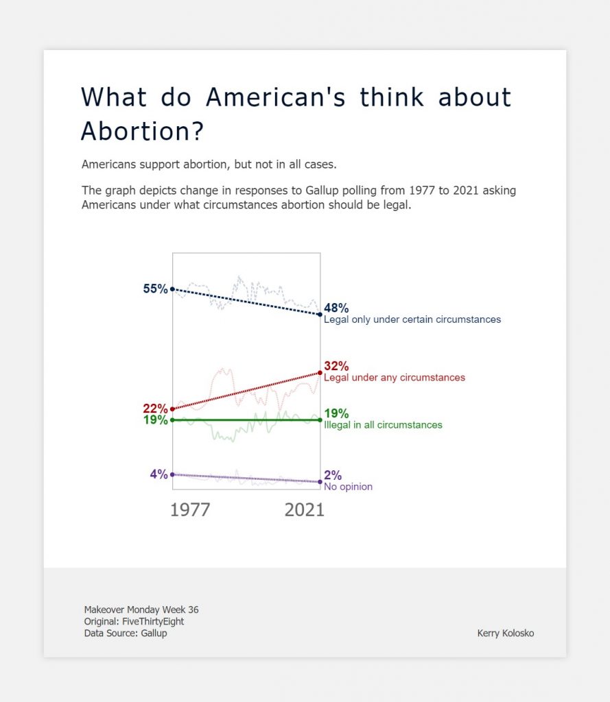
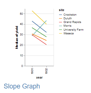
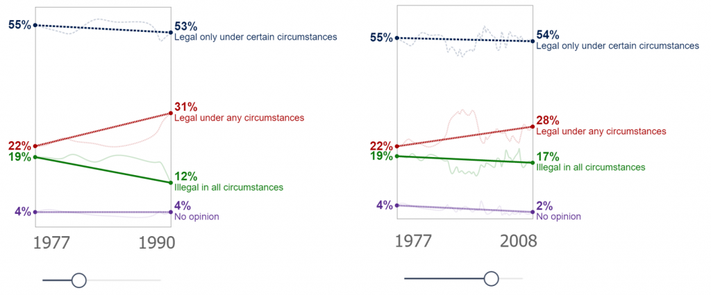
Makeover Monday again! and this time I’m creating a slope graph. Yes, I could achieve this with the core visualisation, but I wouldn’t have as much control as I desired over the axis and labelling.
So, I thought I’d make use of Deneb and browse the Vega-Lite gallery for a slope graph.
Hmmm… the slope graph example doesn’t extend to the axes…
After some fiddling around I decided to take an alternate and unconventional approach.
I had been meaning to explore interpolation of lines for some time and this seemed the perfect opportunity. For those that are new to the concept of interpolation, this blog by Dan Burzo provides an excellent illustration.
I began with semi-transparent monotone lines then layered marks for the min and max values, followed by the opaque slope lines. To create the slopes I set the interpolation to “bundle” (think edge bundling) which produces a straightened cubic basis spline according to the curve’s beta. I then set beta to zero to create a flat line between the first and last points.
I removed the axis and layered min and max dates and a date slicer with Power BI core visuals.
{
  "data": {"name": "dataset"},
  "encoding": {
    "x": {
      "timeUnit": "yearmonth",
      "field": "Poll Date_1",
      "type": "temporal",
      "axis": null
    },
    "y": {
      "field": "Value",
      "type": "quantitative",
      "axis": null
    },
    "strokeDash": {
      "field": "Attribute",
      "type": "nominal",
      "legend": null
    },
    "color": {
      "field": "Attribute",
      "legend": null
    }
  },
  "layer": [
    {
      "mark": {
        "type": "line",
        "interpolate": "monotone"
        "opacity": 0.2
      }
    },
    {
      "mark": {
        "type": "line",
        "interpolate": "bundle",
        "tension": 0,
        "strokeWidth": 3
      }
    },
    {
      "encoding": {
        "x": {
          "aggregate": "max",
          "field": "Poll Date_1"
        },
        "y": {
          "aggregate": {
            "argmax": "Poll Date_1"
          },
          "field": "Value"
        }
      },
      "layer": [
        {
          "mark": {"type": "circle","size":50}},
        {
          "mark": {
            "type": "text",
            "align": "left",
            "baseline": "bottom",
            "dx": 6,
            "fontWeight": "bold",
            "fontSize":20
          },
          "encoding": {
            "text": {
              "field": "Label 1",
              "type": "nominal"
            }
          }
        },
        {
          "mark": {
            "type": "text",
            "align": "left",
            "baseline": "top",
            "dx": 6,
            "fontWeight": "normal",
            "fontSize":16,"limit":600
          },
          "encoding": {
            "text": {
              "field": "Label 2",
              "type": "nominal"
            }
          }
        }
      ]
    },
    {
      "encoding": {
        "x": {
          "aggregate": "min",
          "field": "Poll Date_1"
        },
        "y": {
          "aggregate": {
            "argmin": "Poll Date_1"
          },
          "field": "Value"
        }
      },
      "layer": [
        {"mark": {"type": "circle","size":50}},
        {
          "mark": {
            "type": "text",
            "align": "right",
            "fontWeight": "bold",
            "fontSize":20,
            "dx": -6
          },
          "encoding": {
            "text": {
              "field": "Label 3",
              "type": "nominal"
            }
          }
        }
      ]
    }
  ]
}
Hi Kerry,
Is it possible to get a copy of your .pbix file to have a closer look at how you built this in deneb? Thanks.
Great visualization. Is it possible to get a copy of the PBIX file?
Thanks…
This is awesome. I would like to try using this.
I have 5 categories (A-E), 4 years (2020-2023). Actual values by month.
I want to plot each category on trellis (row), actual values by month as faint lines, and overlay with trend straight line between 2020 and 2023. Will you be able to share the PBIX?