
In recent days I received an email about a development program with sponsorship available for individuals who identify as being from a diverse background. This was followed by a long list of groups.
The list concluded with:
- Female
- LGBTIQ+
- Any other culturally or linguistically diverse persons
After reading the list I thought to myself, “surely, that’s just captured 90% of the general population..?”
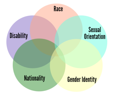
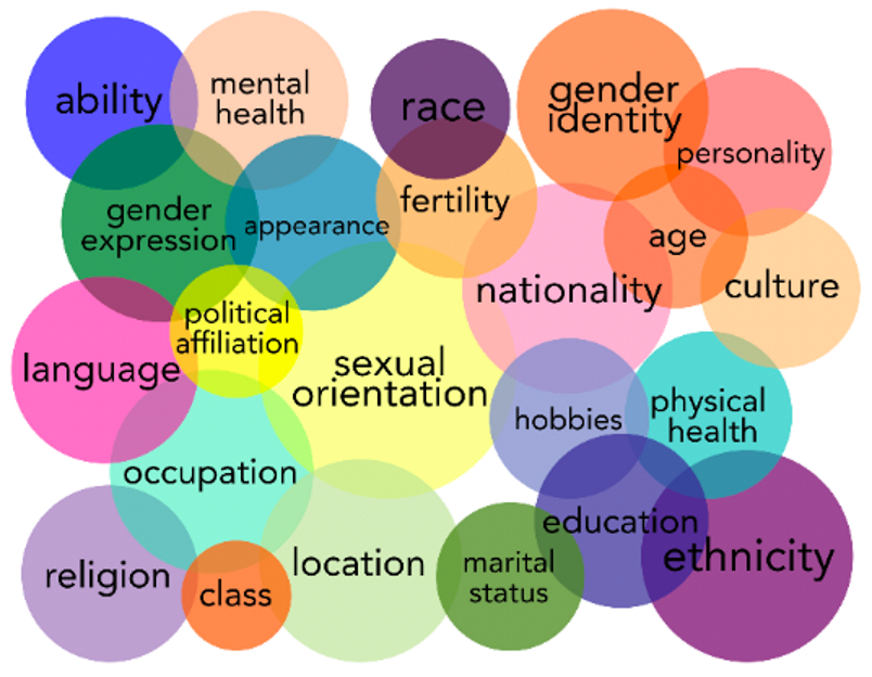
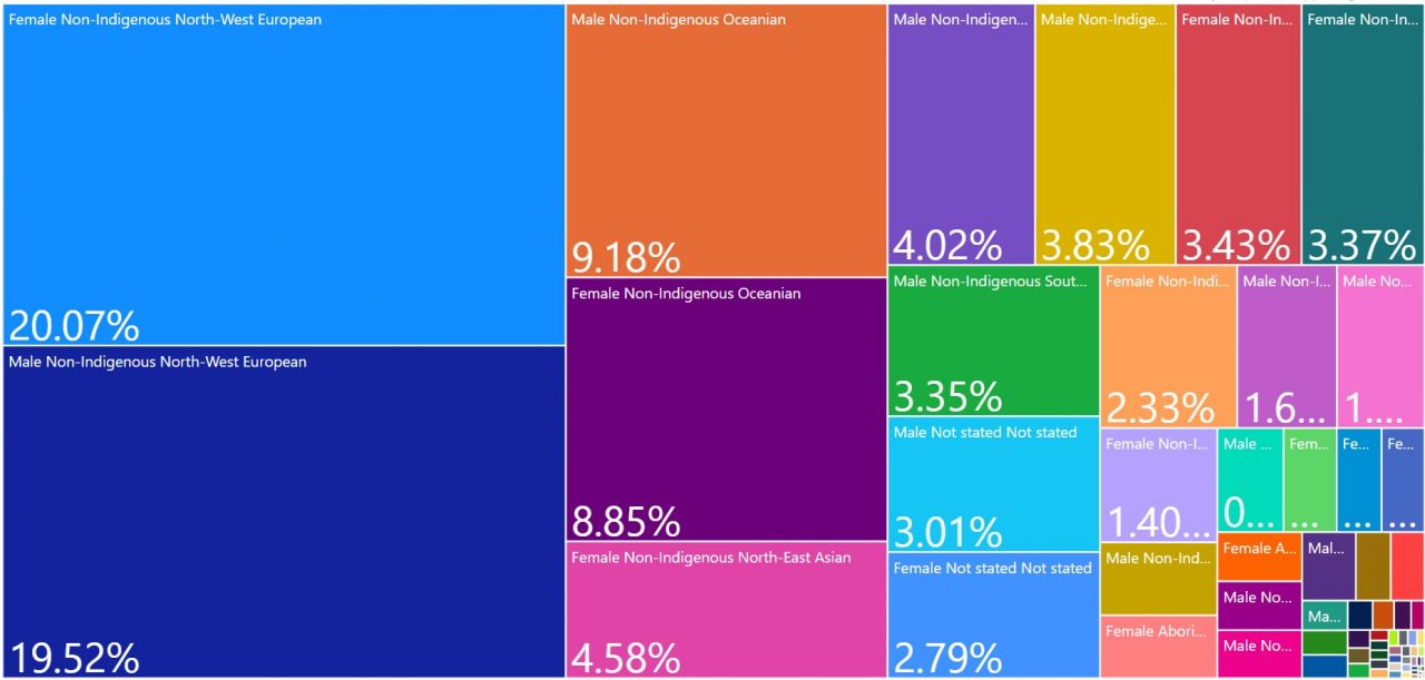
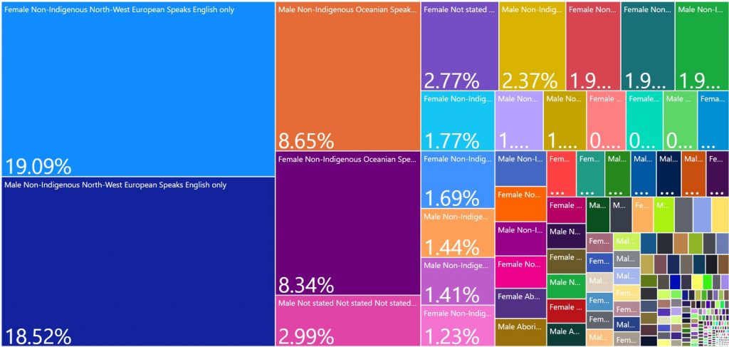
In thinking about it, I hadn’t really seen Australia’s diversity illustrated in any other way than abstracted Venn diagrams and multiple pie charts.
So, in doing what I do, I thought I’d explore this notion.
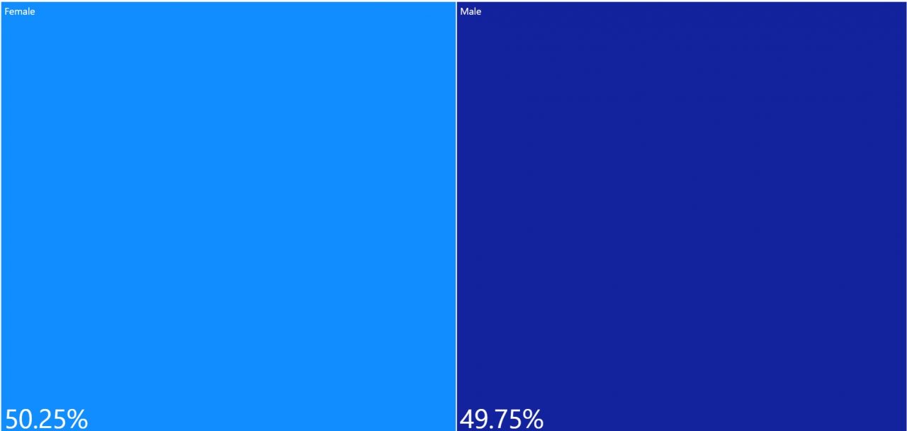
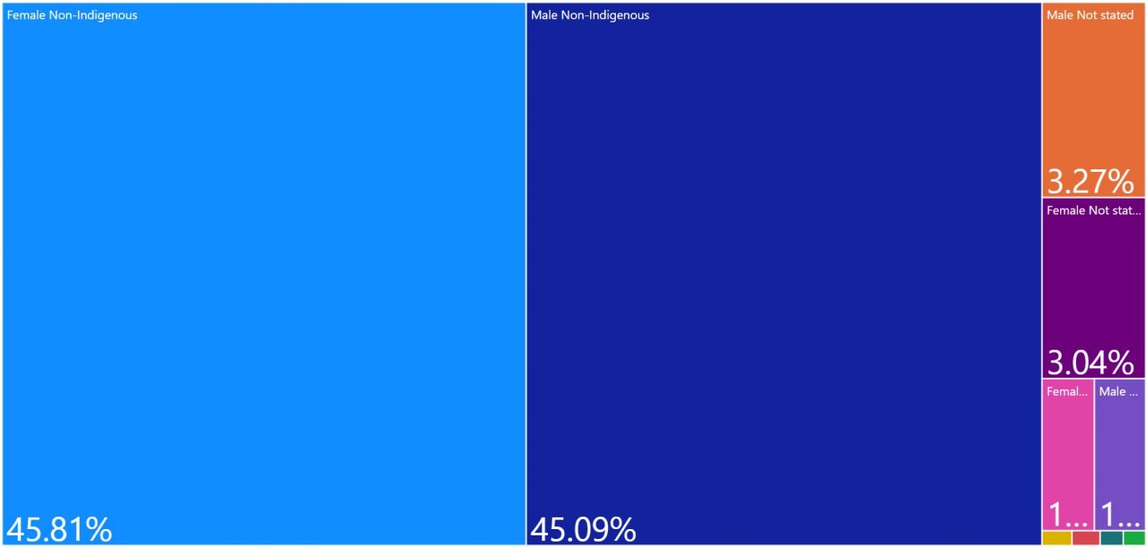
I obtained data from the 2016 Australian census
And drilled down by Sex
By Indigenous identity
By ancestry
By language spoken at home
That’s about all the data I had, but I’m sure if I had info on LGBTIQ+ and disability, it would be further segmented still. Given that other sources estimate 3.5% of adults are non-heterosexual, and approximately 18% live with disability, that could potentially take the largest homogeneous group to 15%, if that’s where one chose to draw the line 🙂
Curious.