
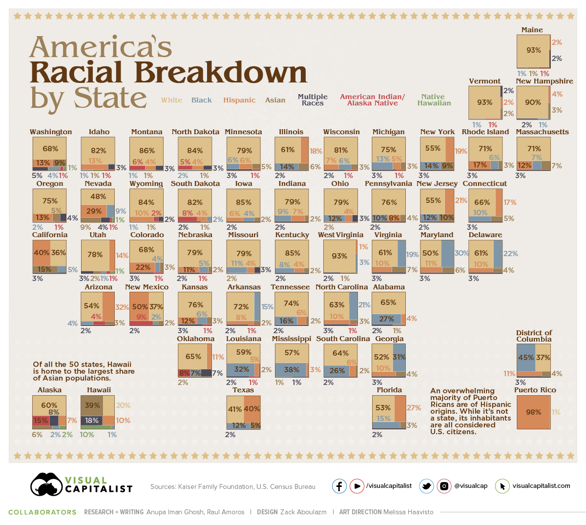
Another creation from a Makeover Monday challenge using Deneb custom visual for Power BI.
The original visualisation by Visual Capitalist can be found here.
I thought I’d make a slight modification to the original by choosing a stacked bar chart in place of the treemaps. I would remove the data labels and use an axis instead. My thinking was that the data labels were a little busy and it might be easier to judge proportions and magnitude along one axis (height) than by volume (or area) of irregular shapes.
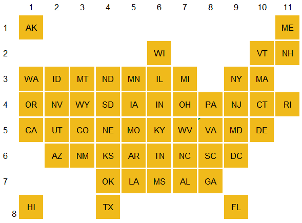
To create the plot of the States, I leveraged a tile map from this fabulous blog and mapped X Y coordinates.
I then imported the Deneb custom visual, dragged my data into the fields pane and opened the editor.
I began with the Stacked Bar chart with legend:
{
"data": {
"name": "dataset"
},
"mark": {
"type": "bar",
"width": 50, "tooltip":true
},
"encoding": {
"y": {
"aggregate": "sum",
"field": "Value",
"type": "quantitative",
"axis": {"format": "%","offset": 5,"grid":false},
"title": null
},
"color": {
"field": "Attribute",
"type": "nominal",
"legend": {
"orient": "top",
"titleOrient": "top"
},
"title": "Ethnicity"
}
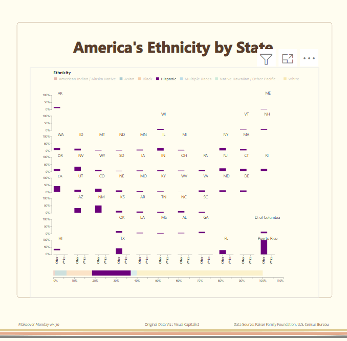
}I then wanted to “filter” the categories upon legend mouseover (rather than select) in which I set the parameters and conditions
 {
  "data": {
    "name": "dataset"
  },
  "params": [
        {
          "name": "highlight",
          "select": {
            "type": "point",
            "fields": [
              "Attribute"
            ]
          },
          "bind": {
            "legend": "mouseover"
          }
        }
      ],
    "mark": {
      "type": "bar",
      "width": 50, "tooltip":true
    },
    "encoding": {
      "y": {
        "aggregate": "sum",
        "field": "Value",
        "type": "quantitative",
        "axis": {"format": "%","offset": 5,"grid":false},
      "title": null
      },
      "color": {
        "field": "Attribute",
        "type": "nominal",
        "legend": {
          "orient": "top",
          "titleOrient": "top"
        },
        "title": "Ethnicity"
      },
      "opacity": {
          "condition": {
            "param": "highlight",
            "value": 1
          },
          "value": 0
        }
    }
I then “faceted” the charts with X and Y coordinates and made them 50 x 50 in size:
 {
  "data": {
    "name": "dataset"
  },
  "facet": {
    "row": {
      "field": "Y",
      "title": "",
      "header": {
        "labelAngle": 0,
        "labelColor": "transparent"
      }
    },
    "column": {
      "field": "X",
      "title": "",
      "header": {
        "labelAngle": 0,
        "labelColor": "transparent"
      }
    }
  },
  "spec": {
    "width": 50,
    "height": 50,
        "params": [
        {
          "name": "highlight",
          "select": {
            "type": "point",
            "fields": [
              "Attribute"
            ]
          },
          "bind": {
            "legend": "mouseover"
          }
        }
      ],
    "mark": {
      "type": "bar",
      "width": 50, "tooltip":true
    },
    "encoding": {
      "y": {
        "aggregate": "sum",
        "field": "Value",
        "type": "quantitative",
        "axis": {"format": "%","offset": 5,"grid":false},
      "title": null
      },
      "color": {
        "field": "Attribute",
        "type": "nominal",
        "legend": {
          "orient": "top",
          "titleOrient": "top"
        },
        "title": "Ethnicity"
      },
      "opacity": {
          "condition": {
            "param": "highlight",
            "value": 1
          },
          "value": 0
        },
      "text": {
        "field": "State",
        "type": "nominal"
      }
    }
  }
}
Variations
In a variation, I thought to separate the stacked bar chart into two groupings to allow the readers to contrast the majority group.
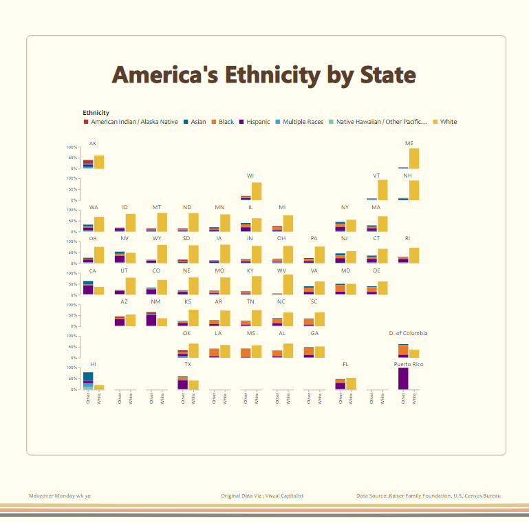
And by adding a total bar at the bottom which could also be “highlighted” via the legend mouseover.
Complete code below:
{
  "data": {
    "name": "dataset"
  },
  "params": [
    {
      "name": "highlight",
      "select": {
        "type": "point",
        "fields": [
          "Attribute"
        ]
      },
      "bind": {
        "legend": "mouseover"
      }
    }
  ],
  "vconcat": [
    {
      "facet": {
        "row": {
          "field": "Y",
          "title": "",
          "header": {
            "labelAngle": 0,
            "labelColor": "transparent"
          }
        },
        "column": {
          "field": "X",
          "title": "",
          "header": {
            "labelAngle": 0,
            "labelColor": "transparent"
          }
        }
      },
      "spec": {
        "width": 50,
        "height": 50,
        "mark": {
          "type": "bar",
          "tooltip": true
        },
        "transform": [
          {
            "filter": "datum.State != 'Total'"
          }
        ],
        "encoding": {
          "x": {
            "field": "Attribute (groups)",
            "type": "ordinal",
            "axis": {
              "title": ""
            }
          },
          "y": {
            "aggregate": "sum",
            "field": "Value",
            "type": "quantitative",
            "axis": {
              "format": "%",
              "offset": 5,
              "grid": false
            },
            "title": null
          },
          "color": {
            "field": "Attribute",
            "type": "nominal",
            "legend": {
              "orient": "top",
              "titleOrient": "top"
            },
            "title": "Ethnicity"
          },
          "opacity": {
            "condition": {
              "param": "highlight",
              "value": 1
            },
            "value": 0
          },
          "text": {
            "field": "State",
            "type": "nominal"
          }
        }
      }
    },
    {
      "width": 800,
      "mark": {
        "type": "bar",
        "tooltip": true
      },
      "transform": [
        {
          "filter": "datum.State === 'Total'"
        }
      ],
      "encoding": {
        "x": {
          "aggregate": "sum",
          "field": "Value",
          "type": "quantitative",
          "axis": {
            "format": "%",
            "offset": 5,
            "grid": false
          },
          "title": null
        },
        "color": {
          "field": "Attribute",
          "type": "nominal",
          "legend": {
            "orient": "top",
            "titleOrient": "top"
          },
          "title": "Ethnicity"
        },
        "opacity": {
          "condition": {
            "param": "highlight",
            "value": 1
          },
          "value": 0.2
        }
      }
    }
  ]
}
Hi Kerry, this is customization. Could you please shed more light on how you created the tiled map? And how do you import into Power BI? Looking forward to hearing from you.
meant to say great customization 🙂