
With the February and March 2023 Desktop releases comes more features enabling us to enhance our KPI visualisations out of the box. This article talks specifically to the DAX function LINEST() and the new Subtitle and Dividers formatting options.
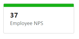
For a simple enhancement, we can add the divider to KPI Cards, without title and subtitle, and have the colour of these dividers conditionally formatted according to KPI status.
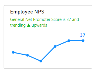
We can use LINESTX() to find the slope of a trend line. If the values are trending up over time, the slope will be positive, if the values are trending downwards over time the slope will be negative. The following is derived from https://xxlbi.com/blog/simple-linear-regression-in-dax/.
Trend =
VAR Known =
FILTER (
SELECTCOLUMNS (
ALLSELECTED ( Table[Column] ),
"Known[X]", [Measure X],
"Known[Y]", [Measure Y]
),
AND (
NOT ( ISBLANK ( Known[X] ) ),
NOT ( ISBLANK ( Known[Y] ) )
)
)
VAR SlopeIntercept =
LINESTX(Known, Known[Y], Known[X])
VAR Slope =
SELECTCOLUMNS(SlopeIntercept, [Slope1])
RETURN
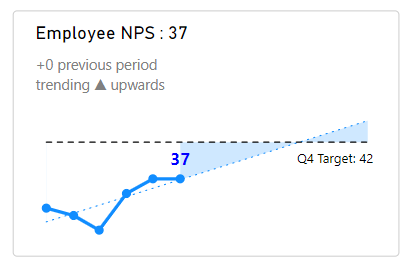
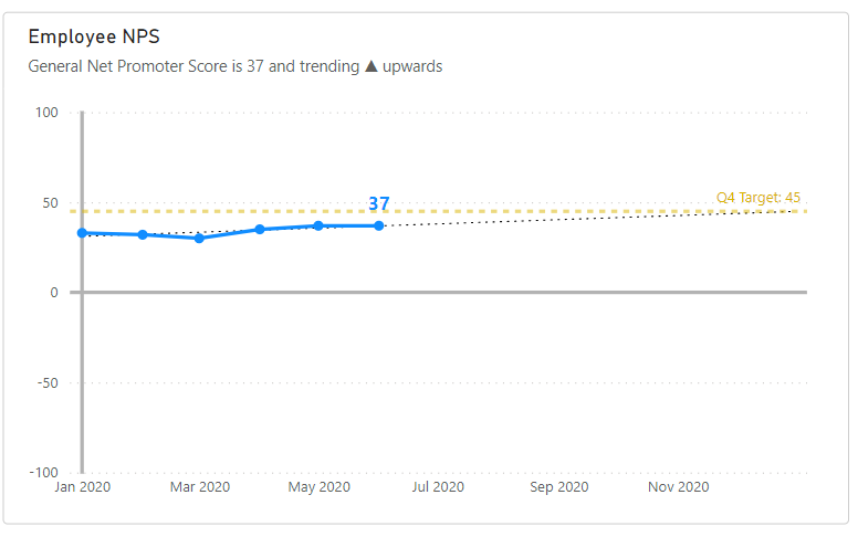
IF(Slope > 0, "trending ▲ upwards", "trending ▼ downwards")Once we’ve found the slope, we can use additional DAX to create a descriptive subtitle for our KPI chart.
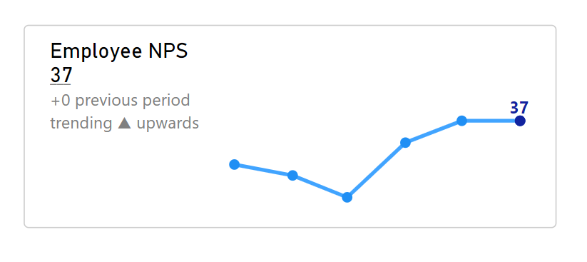
With additional touches, we can conditionally format the data labels on our values to return a specified colour for the last value, and transparent for all others. Alternatively, we can layer another DAX measure that returns only the last value to then plot a point and label at the end of the series in a different colour.
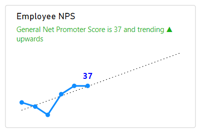
Using LINESTX() again, we can create a new measure to plot the line of best fit. This could also be done using analytics trend line, however currently, there is limited formatting for this option.
By placing a measure that returns the values for a line of best fit in the visual fields well we can format thinner lines.
The title and subtitle can be split across lines using unicode characters, and deselecting the wrap text option.
Title = "Employee NPS" & UNICHAR(10) & CONVERT([Current NPS], STRING)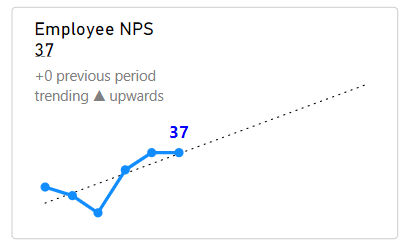
A target line can be plotted with a DAX measure. To create a data label showing both category and value, a Y-Axis Constant line from the analytics pane can also be drawn, with the line set to 100% transparency, the label set to black.
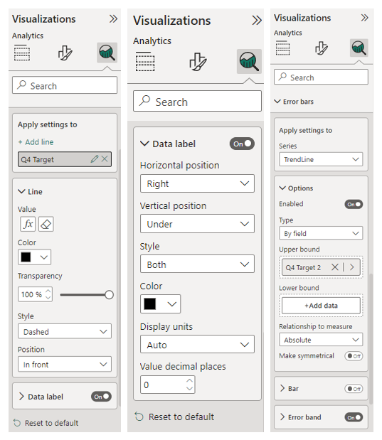
Error bands can be used from the analytics pane to fill the area between the trend line and target line. An additional area can be plotted on top between values and target line with colour set to white.
Adjusting the spacing above and below titles and subtitles, and adjusting the axes ranges with conditional logic, we can change the alignment of the visuals to make them appear more compact.
Constant lines can also be used to emphasise Y and X axes. With regard to NPS, it makes sense to view the whole range of possible values from -100 to +100
Excellent Kerry is there a way to have the pbix file
Excellent exercise Kerry is there a way to have the pbix file
I’m wondering the same about the file. Any way to get it?
Very nice, just wondering what the slope1 is? i’m gettin’ an error on that one…and PBIX would we awesome to have.
Hi Marc, Have you figured out what the ‘slope 1’ refers to? thanks a lot
don’t worry, read the post again and figured it out. thanks
Thanks, that’s really cool. What’s the DAX you’ve used for [Current NPR]?
thank you for the information
Hi can you please share the pbix file?
I am trying to figure out, is this 2 visuals combined. You are using the Card Visual for the verbiage part, and a line graph for the chart?
The first one is the multi-row card, all others are a line chart
pls can i have the pbix – huge thanks
It’s fantastic, with rewarding and clear explanations. It would be better to have the Pbix file