
May 2023 Power BI Desktop brought the beginnings of measure-driven data labels.
Currently available on bar and line charts, but not yet scatter charts.
With measure-driven data labels you are able to replace the default label values with a custom field or measure.
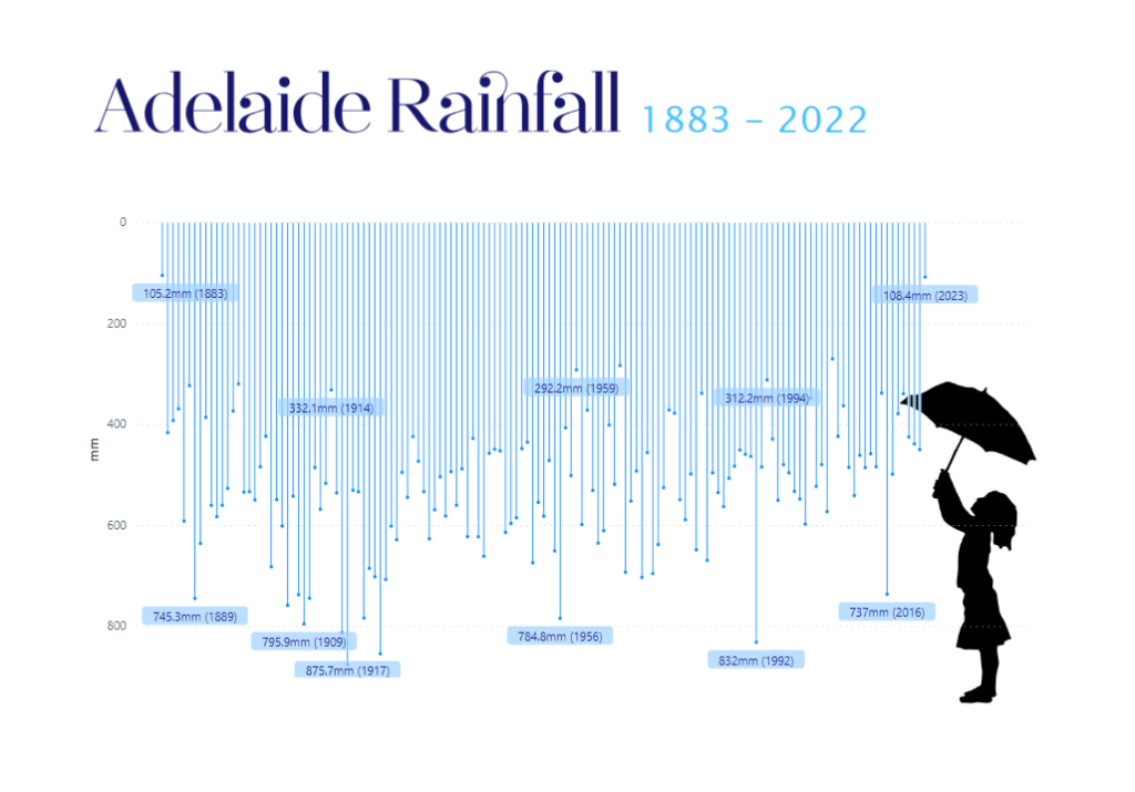
In my case, I created a simple calculation to show the rain with mm units and the year of measurement:
mm (YY) = SUM(AdelaideRainfall[Rainfall]) &"mm" & " (" & Max(AdelaideRainfall[Year]) & ")"To create the chart, I used the default line chart, with line width reduced to zero, line markers enabled and error bars enabled with base as zero.
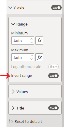
Y-Axis was inverted to resemble rainfall
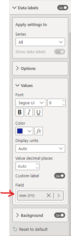
I enabled the ‘Custom label‘ option and added the custom measure to the field well:
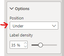
Tweaked position and label density

Simple
Loving this design Kerry…
Thank you Chandoo!
This visualization is amazing, but I didn’t get how to build it. What is the axis X to create a line like a bar?