
Skip to content
EXPLORATIONS IN DATA STORYTELLING WITH POWER BI

EXPLORATIONS IN DATA STORYTELLING WITH POWER BI

  • Home
  • Visualisations
  • Templates
    • Deneb Templates
    • SVG Templates
    • PlotlyJS Templates
  • Services
    • Consultancy & Training
    • Shop Swag
  • About
  • LinkedIn
  • Bluesky
  • YouTube
  • Instagram

Category: How To’s

Area between two lines

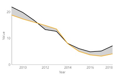
A graph I explored through a Makeover Monday challenge. It didn’t make the final design but I thought I’d write it up for another time. Area fill is sometimes used…

Continue reading Area between two lines
Published July 3, 2021
Categorized as Deneb, How To's, Vega-Lite

Building a custom Gauge Table with HTML
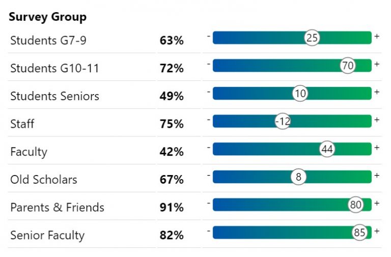
A quick design for a very specific use case I wanted to visualise scores similar to the above in a way that was quick and easy for me to read…

Continue reading Building a custom Gauge Table with HTML
Published May 26, 2021
Categorized as Custom Visualisations, How To's, HTML Content Visual, SVG

A cheat’s guide to Power BI report design
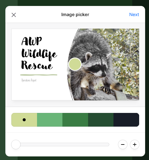
Quick Power BI report design using PowerPoint. How I create a custom Colour Palette and Theme in 5 easy steps. When designing reports I look to an organisation’s style guide…

Continue reading A cheat’s guide to Power BI report design
Published April 18, 2021
Categorized as How To's

Posts pagination

Newer posts Page 1 … Page 3

Recent Posts

  • A matter of scatter
  • Smoothed Line Faux-Pax’s (and Other Things UI/UX Can’t Teach You About Data Visualisation)
  • Upcoming Workshops
  • Cool report design tips with the updated Image visual
  • Protected: Make your blogs stand-out from the crowd

Archives

Categories

Meta

  • Log in
  • Entries feed
  • Comments feed
  • WordPress.org
EXPLORATIONS IN DATA STORYTELLING WITH POWER BI