
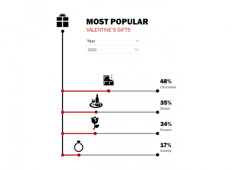
This post is a continuation of my exploration of the latest updates on the PureViz custom visual for Power BI. In my previous post, I looked at colour fill and…
Category: How To’s
Raincloud Plots with Deneb
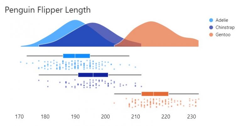
Raincloud plots are a relatively recent and effective addition to the data visualisation toolkit comprising three parts: 1) distributions as density (half-violin plot); 2) summary statistics (box plot) and 3)…
Faceted Charts with Deneb
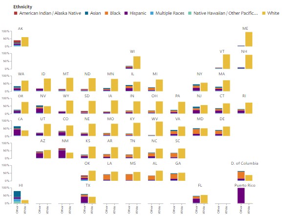
Another creation from a Makeover Monday challenge using Deneb custom visual for Power BI. The original visualisation by Visual Capitalist can be found here. I thought I’d make a slight…
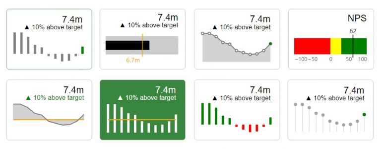
Microcharts and radial gauges
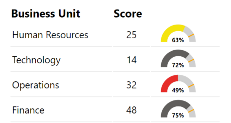
I’d written in a previous post about building a custom gauge table with HTML. This is an extension of that post with DAX for additional gauges or microcharts. Radial Gauge…
Conditional KPI Cards with Deneb
I’d written a piece recently on exploring the Deneb custom visual for Power BI. In that post I touched on KPI Style visuals. I hadn’t seen much in the way…
Heatmap with marginal bars
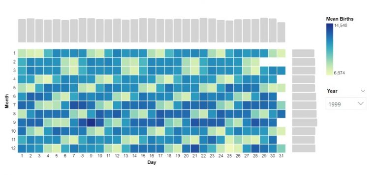
Another visual I explored through a Makeover Monday challenge. To create the chart I installed the latest version of Deneb, dragged the measures I needed into the fields pane. In…
Area between two lines
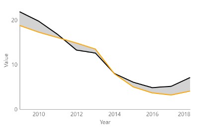
A graph I explored through a Makeover Monday challenge. It didn’t make the final design but I thought I’d write it up for another time. Area fill is sometimes used…
Building a custom Gauge Table with HTML
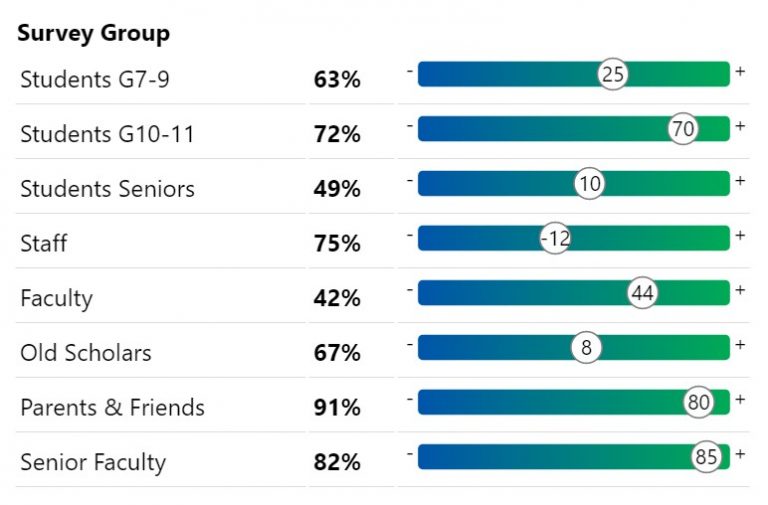
A quick design for a very specific use case I wanted to visualise scores similar to the above in a way that was quick and easy for me to read…
A cheat’s guide to Power BI report design
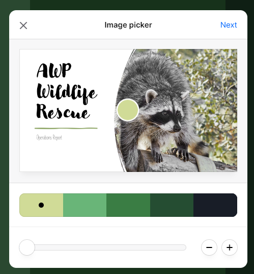
Quick Power BI report design using PowerPoint. How I create a custom Colour Palette and Theme in 5 easy steps. When designing reports I look to an organisation’s style guide…