
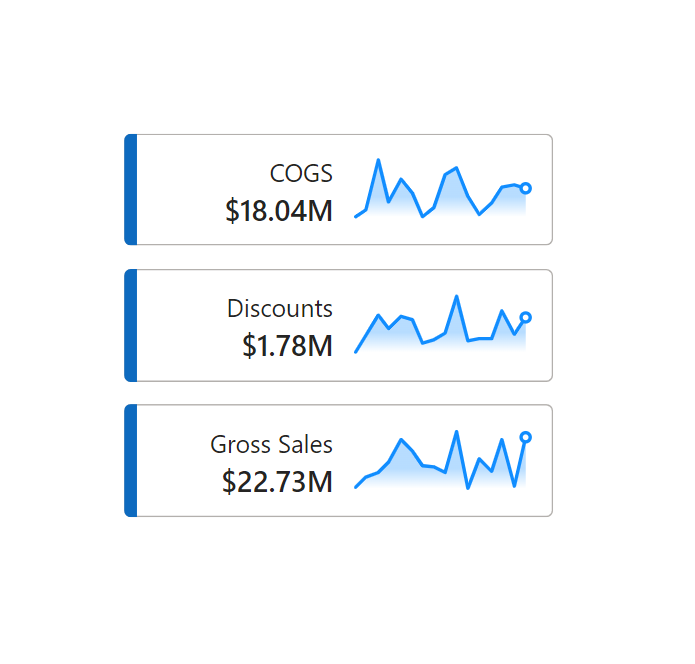
To use in a singular visual
Opaque Area Sparkline (no one value) bright =
// Static line color - use %23 instead of # for Firefox compatibility (Measure Derived from Eldersveld Modified by Kolosko)
VAR LineColour = "%23118DFF"
VAR PointColour = "white"
VAR Defs = "<defs>
    <linearGradient id='grad' x1='0' y1='25' x2='0' y2='50' gradientUnits='userSpaceOnUse'>
        <stop stop-color='#118DFF' offset='0' />
        <stop stop-color='#118DFF' offset='0.3' />
        <stop stop-color='white' offset='1' />
    </linearGradient>
</defs>"
// "Date" field used in this example along the X axis
VAR XMinDate = MIN(financials[Date])
VAR XMaxDate = MAX(financials[Date])

// Obtain overall min and overall max measure values when evaluated for each date
VAR YMinValue = MINX(Values(financials[Date]),CALCULATE([SUM Gross Sales]))
VAR YMaxValue = MAXX(Values(financials[Date]),CALCULATE([SUM Gross Sales]))

// Build table of X & Y coordinates and fit to 50 x 150 viewbox
VAR SparklineTable = ADDCOLUMNS(
    SUMMARIZE('financials',financials[Date]),
        "X",INT(150 * DIVIDE(financials[Date] - XMinDate, XMaxDate - XMinDate)),
        "Y",INT(50 * DIVIDE([SUM Gross Sales] - YMinValue,YMaxValue - YMinValue)))

// Concatenate X & Y coordinates to build the sparkline
VAR Lines = CONCATENATEX(SparklineTable,[X] & "," & 50-[Y]," ", financials[Date])

// Last data points on the line
VAR LastSparkYValue = MAXX( FILTER(SparklineTable, financials[Date] = XMaxDate), [Y])
VAR LastSparkXValue = MAXX( FILTER(SparklineTable, financials[Date] = XMaxDate), [X])

// Add to SVG, and verify Data Category is set to Image URL for this measure
VAR SVGImageURL =
    "data:image/svg+xml;utf8," &
    --- gradient---
    "<svg xmlns='http://www.w3.org/2000/svg' x='0px' y='0px' viewBox='-7 -7 164 64'>" & Defs &
     "<polyline fill='url(#grad)' fill-opacity='0.3' stroke='transparent'
      stroke-width='0' points=' 0 50 " & Lines &
      " 150 150 Z '/>" &
    --- Lines---
    "<polyline
        fill='transparent' stroke='" & LineColour & "'
        stroke-linecap='round' stroke-linejoin='round'
        stroke-width='3' points=' " & Lines &
      " '/>" &
    --- Last Point---
        "<circle cx='"& LastSparkXValue & "' cy='" & 50 - LastSparkYValue & "' r='4' stroke='" & LineColour & "' stroke-width='3' fill='" & PointColour & "' />" &
        "</svg>"
RETURN SVGImageURL
To use in a table or matrix
Opaque Area Sparkline (no one value) bright =
// Static line color - use %23 instead of # for Firefox compatibility (Measure Derived from Eldersveld Modified by Kolosko)
VAR LineColour = "%23118DFF"
VAR PointColour = "white"
VAR Defs = "<defs>
    <linearGradient id='grad' x1='0' y1='25' x2='0' y2='50' gradientUnits='userSpaceOnUse'>
        <stop stop-color='#118DFF' offset='0' />
        <stop stop-color='#118DFF' offset='0.3' />
        <stop stop-color='white' offset='1' />
    </linearGradient>
</defs>"
// "Date" field used in this example along the X axis
VAR XMinDate = MIN(financials[Date])
VAR XMaxDate = MAX(financials[Date])

// Obtain overall min and overall max measure values when evaluated for each date
VAR YMinValue = MINX(Values(financials[Date]),CALCULATE([SUM Gross Sales]))
VAR YMaxValue = MAXX(Values(financials[Date]),CALCULATE([SUM Gross Sales]))

// Build table of X & Y coordinates and fit to 50 x 150 viewbox
VAR SparklineTable = ADDCOLUMNS(
    SUMMARIZE('financials',financials[Date]),
        "X",INT(150 * DIVIDE(financials[Date] - XMinDate, XMaxDate - XMinDate)),
        "Y",INT(50 * DIVIDE([SUM Gross Sales] - YMinValue,YMaxValue - YMinValue)))

// Concatenate X & Y coordinates to build the sparkline
VAR Lines = CONCATENATEX(SparklineTable,[X] & "," & 50-[Y]," ", financials[Date])

// Last data points on the line
VAR LastSparkYValue = MAXX( FILTER(SparklineTable, financials[Date] = XMaxDate), [Y])
VAR LastSparkXValue = MAXX( FILTER(SparklineTable, financials[Date] = XMaxDate), [X])

// Add to SVG, and verify Data Category is set to Image URL for this measure
VAR SVGImageURL =
    IF(HASONEVALUE(financials[Country]),
    "data:image/svg+xml;utf8," &
    --- gradient---
    "<svg xmlns='http://www.w3.org/2000/svg' x='0px' y='0px' viewBox='-7 -7 164 64'>" & Defs &
     "<polyline fill='url(#grad)' fill-opacity='0.3' stroke='transparent'
      stroke-width='0' points=' 0 50 " & Lines &
      " 150 150 Z '/>" &
    --- Lines---
    "<polyline
        fill='transparent' stroke='" & LineColour & "'
        stroke-linecap='round' stroke-linejoin='round'
        stroke-width='3' points=' " & Lines &
      " '/>" &
    --- Last Point---
        "<circle cx='"& LastSparkXValue & "' cy='" & 50 - LastSparkYValue & "' r='4' stroke='" & LineColour & "' stroke-width='3' fill='" & PointColour & "' />" &
        "</svg>",
     BLANK())
RETURN SVGImageURL
To modify to ignore date filters:
// "Date" field used in this example along the X axis
VAR XMinDate = CALCULATE(MIN(financials[Date]), ALL(financials[Date]))
VAR XMaxDate = CALCULATE(MAX(financials[Date]), ALL(financials[Date]))

// Obtain overall min and overall max measure values when evaluated for each date
VAR YMinValue = CALCULATE(MINX(Values(financials[Date]),CALCULATE([SUM COGS])), ALL(financials[Date]))
VAR YMaxValue = CALCULATE(MAXX(Values(financials[Date]),CALCULATE([SUM COGS])), ALL(financials[Date]))

// Build table of X & Y coordinates and fit to 50 x 150 viewbox
VAR SparklineTable = ADDCOLUMNS(
    SUMMARIZE(ALL('financials'),financials[Date]),
        "X",INT(150 * DIVIDE(financials[Date] - XMinDate, XMaxDate - XMinDate)),
        "Y",INT(50 * DIVIDE([SUM COGS] - YMinValue,YMaxValue - YMinValue)))
Hello Kerry
How do i use the template, some guuidelines, please or any tutorial
https://www.youtube.com/watch?v=mLn6ZiIwd1A
Hi Kerry,
They look amazing! When I try with my dataset, I cannot see the border of the line, I only see a blue rectangle. It looks like the top of the area chart was cut off. Do you have any guess why? I appreciate any tips you might have. Kind regards.
Good job. I’ve tried a lot but I can’t figure out how to adapt this to work at the month level on the X-axis.
Hello Kerry,
When I try template– gradient area sparkline with last point with my dataset, I cannot see the graph, I only see a circle point. Please help me with suggestions.
Thank you.
Kind regards.
Hello Ms Kerry,
Hope you are fine and doing well,
as i tried this code , in this code why [sum gross sale] need in a measure, ?
As my table
Date Planned %
and financials date i changed with my dates, but [sum gross sale] need to change with [ Planned %] but in code it not showing maybe it ‘s not a measure ? how to solve ?
have a look at the text output of the SVG. It may be that the data format of the [Planned %] is causing issues.
The svg url works perfectly in Power BI Desktop. However, when publishing to the Service the images disappears. Has anyone else dealt with this behavior and how did you get it to work? Thanks.
Using firefox?
Hello Kerry,
The template worked at the beginning, but after a week the gradient area disappeared, and I only see the line with the circle point. Any clue about how to solve it? Thank you.
Best regards.
I noticed that some of my other HTML visuals had some elements not rendering. It might be a chromium issue or Power BI update issue that will resolve in a few weeks.