
DAX measures to create SVG images for use in matrix or table visuals
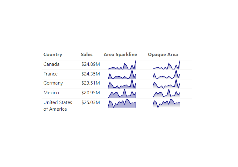
Area Sparkline
Area Sparkline =
// Line and area colours - use %23 instead of # for Firefox compatibility (Measure Derived from Eldersveld Modified by Kolosko)

// "Date" field used in this example along the X axis
VAR XMinDate = MIN(financials[Date])
VAR XMaxDate = MAX(financials[Date])

// Obtain overall min and overall max measure values when evaluated for each date
VAR YMinValue = MINX(Values(financials[Date]),CALCULATE([SUM Gross Sales]))
VAR YMaxValue = MAXX(Values(financials[Date]),CALCULATE([SUM Gross Sales]))

// Build table of X & Y coordinates and fit to 50 x 150 viewbox
VAR SparklineTable = ADDCOLUMNS(
    SUMMARIZE('financials',financials[Date]),
        "X",INT(150 * DIVIDE(financials[Date] - XMinDate, XMaxDate - XMinDate)),
        "Y",INT(50 * DIVIDE([SUM Gross Sales] - YMinValue,YMaxValue - YMinValue)))

// Concatenate X & Y coordinates to build the sparkline
VAR Lines = CONCATENATEX(SparklineTable,[X] & "," & 50-[Y]," ", financials[Date])

// Add to SVG, and verify Data Category is set to Image URL for this measure
VAR SVGImageURL = IF(HASONEVALUE(financials[Country]),
    "data:image/svg+xml;utf8," &
    "<svg xmlns='http://www.w3.org/2000/svg' x='0px' y='0px' viewBox='0 0 150 50'>" &
     "<polyline fill='navy' fill-opacity='0.3' stroke='navy'
      stroke-width='3' points=' 0 50 " & Lines &
      " 150 150 Z '/></svg>",
     BLANK())
RETURN SVGImageURL
Transparent Gradient Sparkline
Opaque Area Sparkline =
// line and area colour - use %23 instead of # for Firefox compatibility (Measure Derived from Eldersveld Modified by Kolosko)
VAR Defs = "<defs>
    <linearGradient id='grad' x1='0' y1='25' x2='0' y2='50' gradientUnits='userSpaceOnUse'>
        <stop stop-color='navy' offset='0' />
        <stop stop-color='transparent' offset='1' />
    </linearGradient>
</defs>"
// "Date" field used in this example along the X axis
VAR XMinDate = MIN(financials[Date])
VAR XMaxDate = MAX(financials[Date])

// Obtain overall min and overall max measure values when evaluated for each date
VAR YMinValue = MINX(Values(financials[Date]),CALCULATE([SUM Gross Sales]))
VAR YMaxValue = MAXX(Values(financials[Date]),CALCULATE([SUM Gross Sales]))

// Build table of X & Y coordinates and fit to 50 x 150 viewbox
VAR SparklineTable = ADDCOLUMNS(
    SUMMARIZE('financials',financials[Date]),
        "X",INT(150 * DIVIDE(financials[Date] - XMinDate, XMaxDate - XMinDate)),
        "Y",INT(50 * DIVIDE([SUM Gross Sales] - YMinValue,YMaxValue - YMinValue)))

// Concatenate X & Y coordinates to build the sparkline
VAR Lines = CONCATENATEX(SparklineTable,[X] & "," & 50-[Y]," ", financials[Date])

// Add to SVG, and verify Data Category is set to Image URL for this measure
VAR SVGImageURL = IF(HASONEVALUE(financials[Country]),
    "data:image/svg+xml;utf8," &
    "<svg xmlns='http://www.w3.org/2000/svg' x='0px' y='0px' viewBox='0 0 150 50'>" & Defs &
     "<polyline fill='url(#grad)' fill-opacity='0.3' stroke='navy'
      stroke-width='3' points=' 0 50 " & Lines &
      " 150 150 Z '/></svg>",
     BLANK())
RETURN SVGImageURL
Amazing. Thank you for sharing. 🙏👍
This is exceptional, remarkable work. Very inspiring, congratulations
how to change the datapoints in the chart , how many there are in the current dax, i just want to rollback the 12 months data in the chart.
How can I use this to show the trend for a measure in a measures table
Отлично
Terrific work! You are such a talent, Kerry!
image
Hi, When I use your code, this is how my sparkline looks like. Though the graph is small, there is alot of blank space below it, because of which the row height is getting increases. Can you please let me know how to get rid of this space?
Have you changed the image height and width in the formatting pane settings?
You are a prince! .. Many thanks
I don’t have days set with name financial.. so it’s not working for me .. please advise