
Bullet
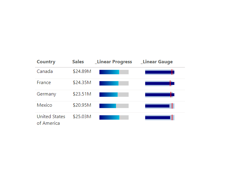
_Linear Gauge Normalised =
VAR MAXPlan = [Profit Plan]
VAR MAXActual = [Profit Actual]
VAR MAXTarget = [Profit Target]
VAR AXISRANGE = MAXX(
    {
        MAXPlan,
        MAXActual,
        MAXTarget
    },
    [Value]
)
VAR TRACKWIDTH = MAXPlan/AXISRANGE*100
VAR PERCENTAGEFILL = MAXActual/AXISRANGE*100
VAR PERCENTAGETARGET = MAXTarget/AXISRANGE*100
RETURN
IF(HASONEVALUE(financials[Country]),
"data:image/svg+xml;utf8," & "
    <svg width='100' height='20' viewBox='-2 -2 102 22' xmlns='http://www.w3.org/2000/svg' xmlns:xlink='http://www.w3.org/1999/xlink' overflow='visible'>
        <rect id='track' x='0' y='2' width='"&TRACKWIDTH&"' height='18' fill='lightsteelblue'/>
        <rect id='fill' x='0' y='6' width="& "'"& PERCENTAGEFILL &"'"&" height='10' fill='navy'></rect>
        <rect id='marker' x="&"'"&PERCENTAGETARGET&"'"&" y='1' width='2' height='20' fill='red'></rect>
    </svg>
", BLANK())
Progress Bar
_Linear Progress =
VAR Actual = [Gross Sales]
VAR Target = [Gross Sales Target]
VAR PERCENTAGEFILL = Actual/Target*100
RETURN
IF(HASONEVALUE(financials[Country]),
"data:image/svg+xml;utf8," &
"<svg width='100' height='20' viewBox='-2 -2 102 22' xmlns='http://www.w3.org/2000/svg' xmlns:xlink='http://www.w3.org/1999/xlink' display= 'block'  overflow='visible'>
  <defs>
    <linearGradient id='linear' x1='0%' y1='0%' x2='"&100+(100-PERCENTAGEFILL)&"%' y2='0%'>
      <stop offset='0%'   stop-color='navy'/>
      <stop offset='100%' stop-color='cyan'/>
    </linearGradient>
  </defs>
<rect id='track' x='0' y='3' rx='0' ry='0' width='100' height='15' fill='#D0D0D0' />
<rect id='fill' x='0' y='3' rx='0' ry='0' width="& "'"& PERCENTAGEFILL &"'"&" height='15' fill='url(#linear)'></rect>
</svg>"
, BLANK())
Hi, thanks for this visual! I tried to add a second target line in the bullet chart by simply duplicating every line that contains “PERCENTAGETARGET”, which worked. But when there is no data, the graphic shows this extra target line. Would you know why?
Hi from Adelaide, thanks so much for sharing your SVG linear gauge, you’ve saved my bacon. I’ve added a couple of enhancements including a data label and colour coding of the horizontal bar if it’s over or under the marker bar value. I’ve also included support for sort ordering. It works really nicely in a matrix where you need to drill down to view individual employees’ productivity against the rolled-up team average.
Client-facing hours %, Chart = IF(NOT(ISEMPTY(‘Provider Activity’)),
VAR vClientFacingPerc = [Client-facing hours %]
VAR vNetClientFacingPerc = CALCULATE([Client-facing hours %], REMOVEFILTERS(‘Provider Activity'[Provider ID]))
VAR vTrackBar = 100
VAR vFillBar = vClientFacingPerc * 100
VAR vMarkerBar = vNetClientFacingPerc * 100
VAR AXISRANGE = MAXX(
{
vTrackBar,
vFillBar,
vMarkerBar
},
[Value]
)
VAR vTrackBarWidth = vTrackBar / AXISRANGE * 100
VAR vFillBarWidth = vFillBar / AXISRANGE * 100
VAR vMarkerBarPos = vMarkerBar / AXISRANGE * 100
VAR vFillBarColour = SWITCH(TRUE(),
NOT(ISFILTERED(‘Provider Activity'[Provider ID])), “#1059FF”,
vFillBar > vTrackBar, “yellow”,
vFillBar >= vMarkerBar, “lime”,
“red”
)
RETURN
“data:image/svg+xml;utf8,” & ”
vTrackBar, “show”, “none”) & “‘/>
98, 98, vMarkerBarPos) & “‘ y=’1′ width=’2′ height=’20’ fill=’#1059FF’/>
” & FORMAT(vClientFacingPerc, “0.00%;-0.00%;0%”) & ”
”
)
Why my target line is not adjusting as per the target, it is always coming at the start.
You may have typed something incorrectly
I had to put a Round(,0) in all variables. My Power BI Desktop in portuguese-brazil was showing “30,54”, which is not recognized by html.
Hello Kerry, whenever I add the 3 measures in the variables, then the bullet shows only the Marker in the beginning of the bullet. But when I replace the variables with digits, then everything works as expected.
For example, this one doesn’t work
VAR MAXPlan = [_Sales Annual target]
VAR MAXActual = [Sales €]
VAR MAXTarget = [_Sales Target YTD]
While this one works
VAR MAXPlan = [_Sales Annual target]
VAR MAXActual = 90000000
VAR MAXTarget = 95000000
I would appreciate it so much if you can guide me on what I might be doing wrong.
If you view the svg as text rather than image, what does it return?
Hi,
Thank you for this inspiring page.
Can you advice on how we can control sorting of the SVG column in a Table visual?
Example: How can I sort ‘_Linear Gauge Normalised’ by [Profit Target] or any other measures
I have produced my own custom SVG progress bar (measure). I don’t even understand what the default sort is set to.
Kind regards
Hi, there is a technique Daniel Marsh-Patrick has used to do a SVG sort. I’ve provided a link to his PBIX file which shows this via this page : https://kerrykolosko.com/portfolio/lollipop-sparkline/