
Skip to content
EXPLORATIONS IN DATA STORYTELLING WITH POWER BI

EXPLORATIONS IN DATA STORYTELLING WITH POWER BI

  • Home
  • Visualisations
  • Templates
    • Deneb Templates
    • SVG Templates
    • PlotlyJS Templates
  • Services
    • Consultancy & Training
    • Shop Swag
  • About
  • LinkedIn
  • Bluesky
  • YouTube
  • Instagram

Author: admin

Earworms and T-Shirts

I recently had an earworm “Shut Up and Dance with Me” reverberating in my brain whilst I was working and… going off in the the tangents that I do… drew…

Continue reading Earworms and T-Shirts
Published July 20, 2023
Categorized as Uncategorized

Smoothed lines with Core Visuals vs. Deneb
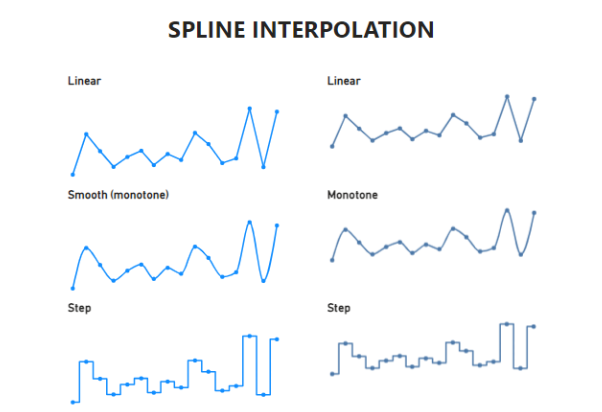
July 2023 Power BI desktop update now has new line type option of “smooth”. This is the equivalent of of spline interpolation of cubic monotone. Other examples of interpolation are…

Continue reading Smoothed lines with Core Visuals vs. Deneb
Published July 19, 2023
Categorized as Uncategorized

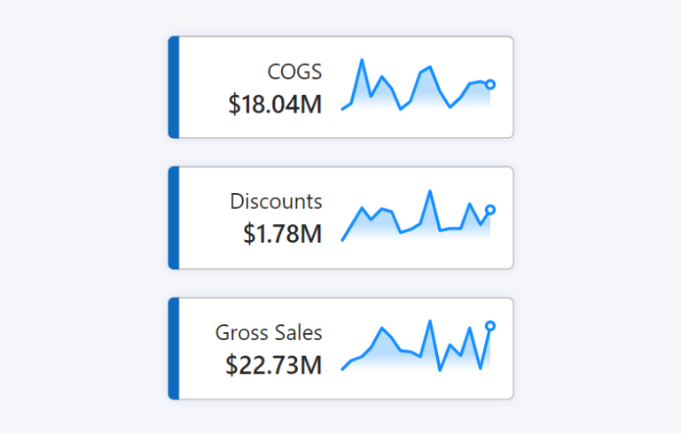
Adding sparklines to New Card Visual

The New Card Visual is out in preview for the June 2023 Power BI Desktop – and it’s absolutely fantastic. With this first drop of the Card Visual we can…

Continue reading Adding sparklines to New Card Visual
Published June 13, 2023
Categorized as Core Visuals, How To's, Power BI, SVG

Measure-driven data labels

May 2023 Power BI Desktop brought the beginnings of measure-driven data labels. Currently available on bar and line charts, but not yet scatter charts. With measure-driven data labels you are…

Continue reading Measure-driven data labels
Published May 28, 2023
Categorized as Core Visuals, How To's

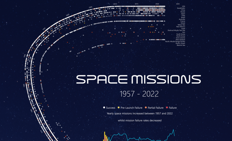
Custom path axis with Charticulator

If there is one stand-out feature of Charticulator… …it is the ease at which we can design data visualisations along custom path axes. If you’re into the technical details, there…

Continue reading Custom path axis with Charticulator
Published September 29, 2022
Categorized as Charticulator, How To's

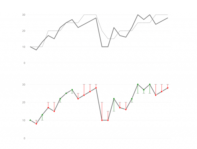
Reversed Deviation Icicle Chart

A deviation icicle chart is an uncommon chart to show variance from a target or baseline value across time. There are a multitude of ways to show comparison to target…

Continue reading Reversed Deviation Icicle Chart
Published September 5, 2022
Categorized as Custom Visualisations, Deneb, Experimentation

Community Heroes

Personal reflections.

Published March 3, 2022
Categorized as Uncategorized

Playing with data on an empty stomach…
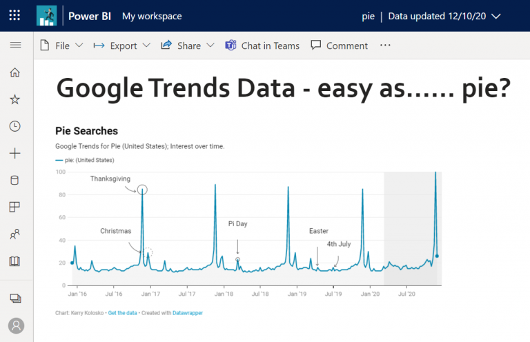
I couldn’t tell you why, but one day I decided to check out Google Trends, knowing about it of course, but never having actually used it. I navigated to the…

Continue reading Playing with data on an empty stomach…
Published April 17, 2021
Categorized as HTML Content Visual, Uncategorized

Posts pagination

Newer posts Page 1 Page 2

Recent Posts

  • A matter of scatter
  • Smoothed Line Faux-Pax’s (and Other Things UI/UX Can’t Teach You About Data Visualisation)
  • Upcoming Workshops
  • Cool report design tips with the updated Image visual
  • Protected: Make your blogs stand-out from the crowd

Archives

Categories

Meta

  • Log in
  • Entries feed
  • Comments feed
  • WordPress.org
EXPLORATIONS IN DATA STORYTELLING WITH POWER BI