
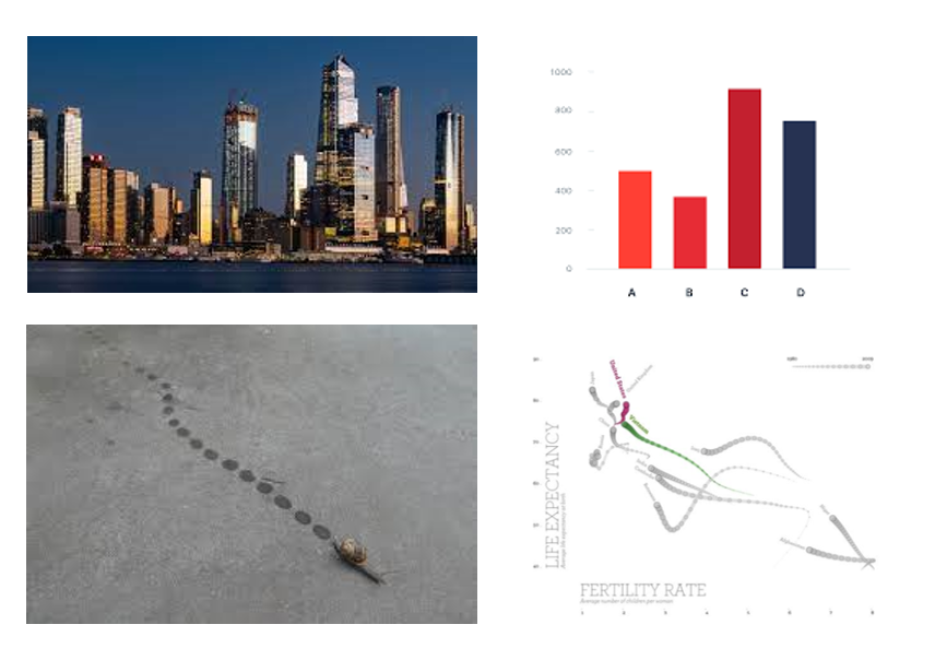
“When shortcutting the design process, I think back to the natural world.” In my years of data visualisation consultancy, I am often asked “How do I choose the right visual?”. The answer I provide is often long-winded. There are typically two main approaches for choosing the right visualisation for your data. The first method (how… Continue reading How do you choose the right visual? Turning to nature for dataviz inspo
Results for "Deneb"
We found 78 results for your search.
Ring Chart
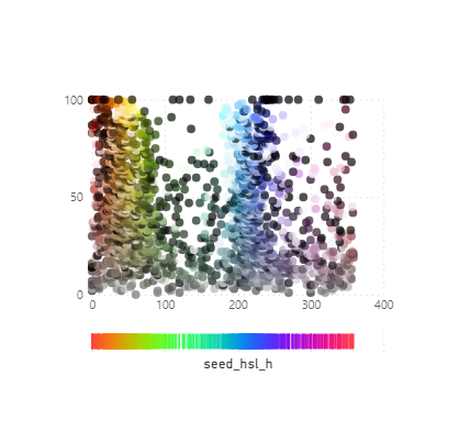
Beeswarm
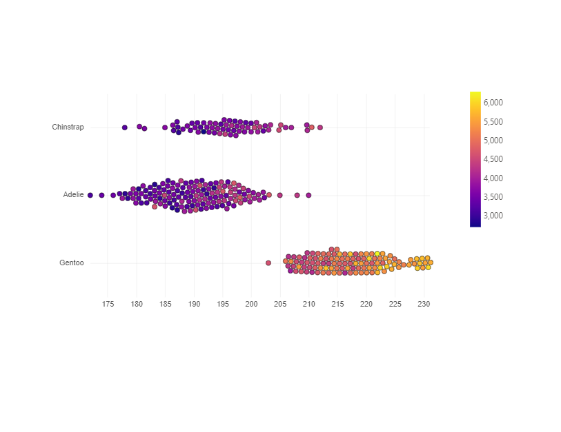
See also : https://github.com/PBI-David/Deneb-Showcase – Beeswarm
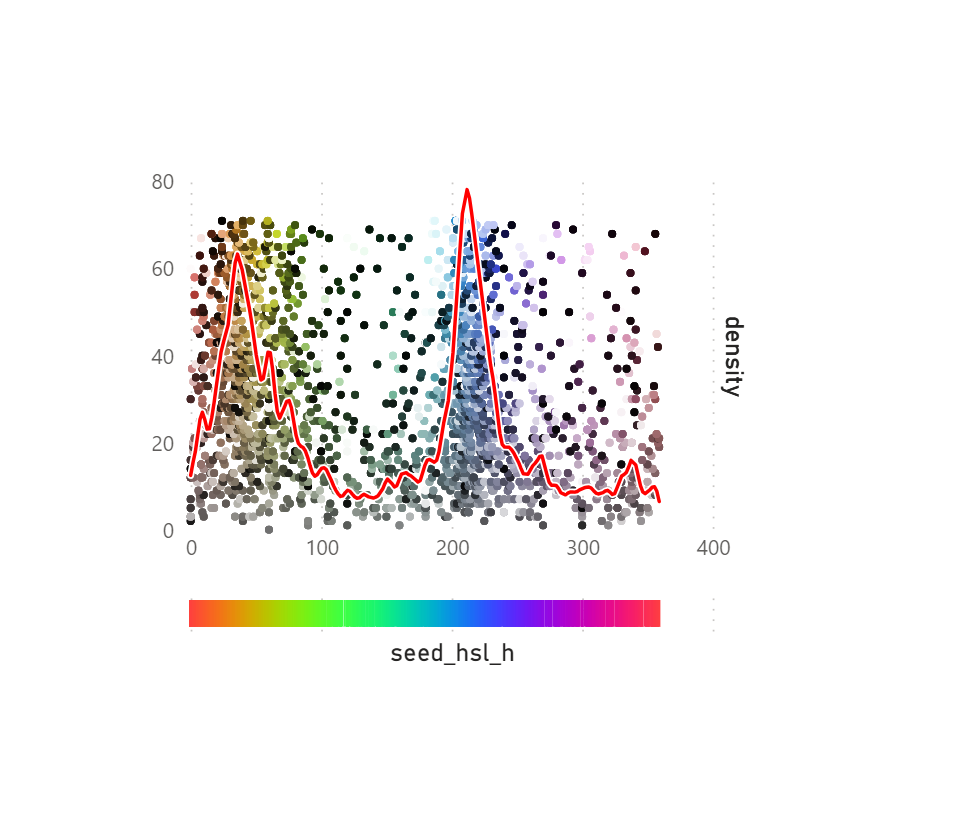
Strip Dot Plot with Density
Strip Dot plot
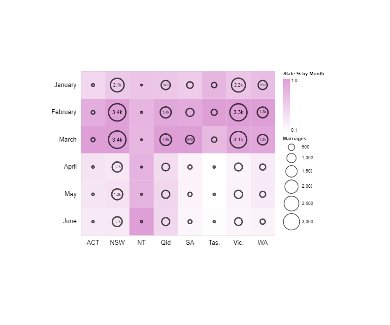
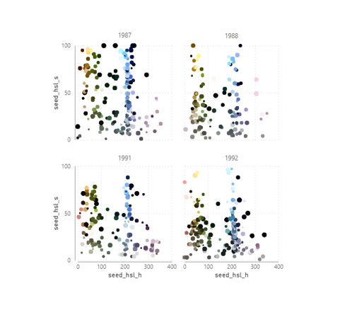
Small Multiple Bubble Plot
To use colour codes from a field or measure set “color”: { “scale”: null }, to use categorical colours remove “color”: { “scale”: null } from the JSON
Compact Progress Bars
Requires a DAX Measure to return highest value of all categories used to position labels to the right Max all categories (DAX) = CALCULATE (MAXX (DISTINCT ( ‘Table'[Category] ),CALCULATE ( SUM ( ‘Table'[Measure] ) ) ),ALLSELECTED ( ‘Table )) Change colours with HEX or CSS colours :
Fixed-Width Bar with Leader Lines
Auto-width Bar
Adding sparklines to New Card Visual

The New Card Visual is out in preview for the June 2023 Power BI Desktop – and it’s absolutely fantastic. With this first drop of the Card Visual we can see flexible formatting options such as accent bars, images, backgrounds, padding, spacing and alignment. For a more comprehensive look check out this post. There are… Continue reading Adding sparklines to New Card Visual