
Results for "Deneb"
We found 78 results for your search.
Simple Fixed Height Bar
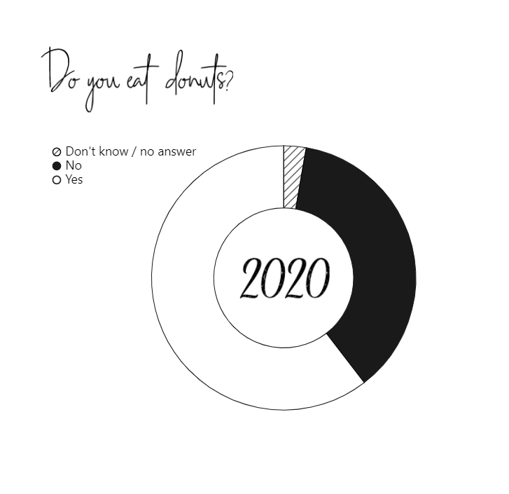
Visualising 2021

2021 was an extraordinary year for me. I’m a woman of few words, so rather than write about it, I’d thought I’d illustrate it. The below image is deeply personal, so I shan’t explain it all. Those that have seen my crafts, will know that I lack in artistic ability. I try to shake my… Continue reading Visualising 2021
Chart Templates
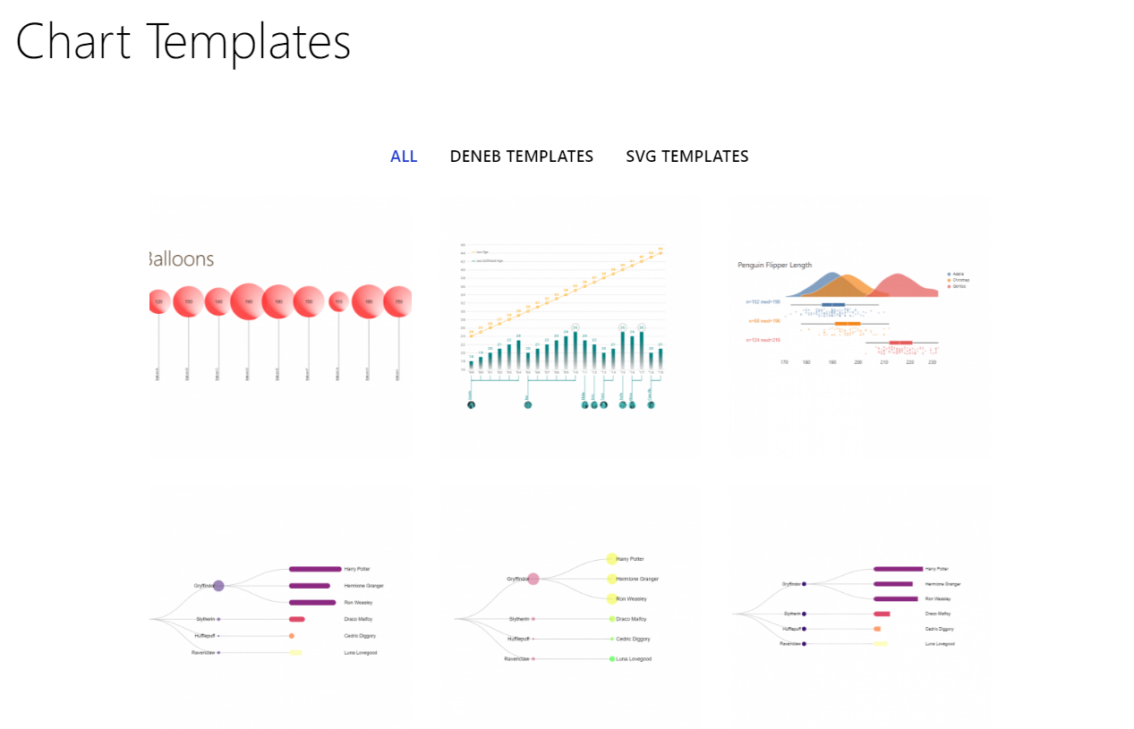
Templates for various Power BI custom visuals including Deneb and PlotlyJS. Learn how to import a template here. More templates and .pbix files here.
KPI Cards with Core Matrix Visual

I came across a Power BI report in development that had 127 visuals (with 107 of them being KPI Cards) on a page. It took a while to load (between 10545 – 17910 ms) however, this particular report was designed for print. I needed to add an additional page to this report with a similar… Continue reading KPI Cards with Core Matrix Visual
Line interpolation
Makeover Monday again! and this time I’m creating a slope graph. Yes, I could achieve this with the core visualisation, but I wouldn’t have as much control as I desired over the axis and labelling. So, I thought I’d make use of Deneb and browse the Vega-Lite gallery for a slope graph. Hmmm… the slope… Continue reading Line interpolation
Heatmap with marginal bars
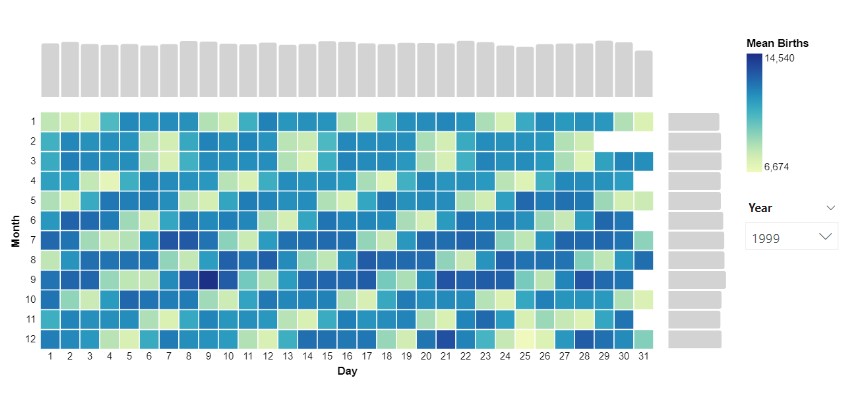
Another visual I explored through a Makeover Monday challenge. To create the chart I installed the latest version of Deneb, dragged the measures I needed into the fields pane. In the editor, I began with the table: Then horizontal concatenation: Then the vertical: Variations on the above chart can be found below:
Area between two lines
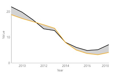
A graph I explored through a Makeover Monday challenge. It didn’t make the final design but I thought I’d write it up for another time. Area fill is sometimes used to highlight variance between two categories on a line chart though I was curious as to whether drawing lines between points may serve as a… Continue reading Area between two lines