
When building a Deneb custom visual for a client I came across a scenario whereby the currency within the visual showed dollars in Bing browsers but British pounds in other browsers, despite the core visuals displaying dollars across all browsers. Thanks to a little help from DMP, this was resolved by using pbiFormat and manually… Continue reading Formatting Locale, Values and Tooltips in Deneb
Results for "Deneb"
We found 78 results for your search.
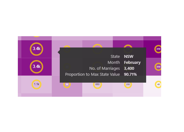
Independent Scales with Deneb (Ring Chart)
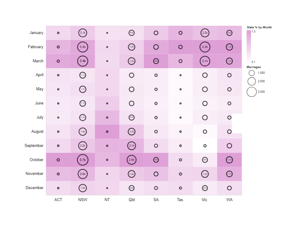
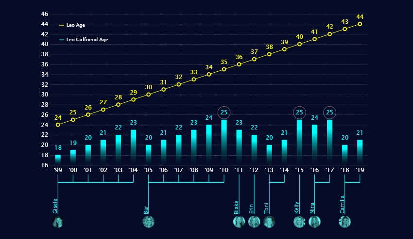
A chart I created for a Workout Wednesday Challenge. The chart shows the number marriages by month and Australian State encoded by size as rings, and (given that each state has a different total population) marriages by month proportional to the State encoded as a gradient background. It was rather hurried and rushed out at… Continue reading Independent Scales with Deneb (Ring Chart)
Folding (Unpivot Data) with Vega-Lite & Deneb
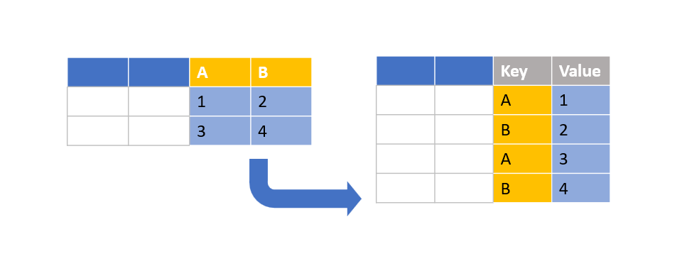
Creating a bar chart with Deneb is relatively simple when using a category field and a measure. But what about when you have only measures? In this particular scenario, I had wanted to use a simple bar chart to display actual vs. target. A bullet chart would have done this, however, didn’t really fill the… Continue reading Folding (Unpivot Data) with Vega-Lite & Deneb
Smoothed lines with Core Visuals vs. Deneb
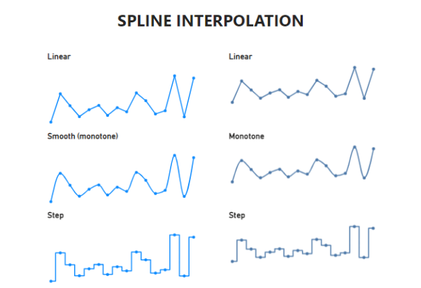
July 2023 Power BI desktop update now has new line type option of “smooth”. This is the equivalent of of spline interpolation of cubic monotone. Other examples of interpolation are demonstrated below. Note that “natural” and “cardinal” offshoot the data points.
Legend for a layered plot in Deneb
I came across this dataviz in my Twitter feed and it instantly drew my attention: My interest was in the aesthetics of the visual and not the subject matter. I became curious to see if I could recreate the style with Deneb in Power BI. After a bit of fiddling about I produced something similar:… Continue reading Legend for a layered plot in Deneb
Images and custom shapes in Deneb
Over the past few months, I’ve had considerable fun exploring images and custom shapes with Deneb Custom visual for Power BI. I’ve finally gotten around to blogging about it. There are some cool techniques I learned along the way such as changing the scales of trail marks, clipping point marks, using multiple datasets and performing… Continue reading Images and custom shapes in Deneb
Raincloud Plots with Deneb
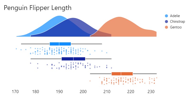
Raincloud plots are a relatively recent and effective addition to the data visualisation toolkit comprising three parts: 1) distributions as density (half-violin plot); 2) summary statistics (box plot) and 3) raw data points (scatter). They provide statistical inference at a glance as can be done with boxplots but are less likely to obscure multi-modal distributions… Continue reading Raincloud Plots with Deneb
Faceted Charts with Deneb
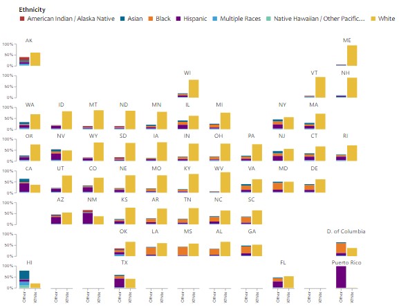
Another creation from a Makeover Monday challenge using Deneb custom visual for Power BI. The original visualisation by Visual Capitalist can be found here. I thought I’d make a slight modification to the original by choosing a stacked bar chart in place of the treemaps. I would remove the data labels and use an axis… Continue reading Faceted Charts with Deneb
Conditional KPI Cards with Deneb
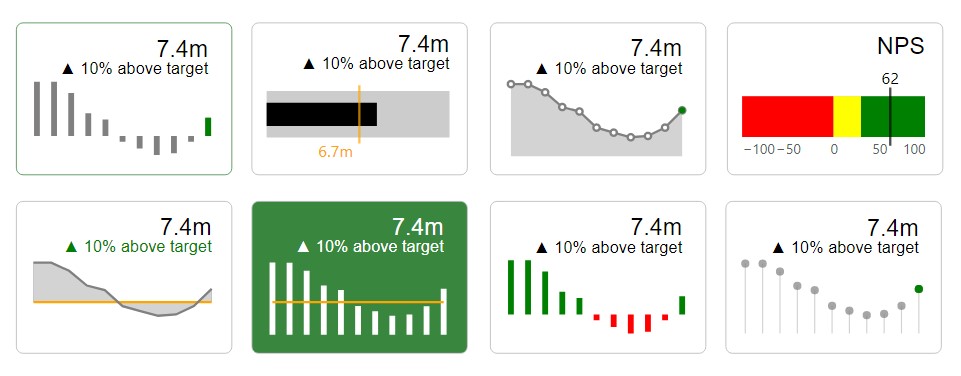
I’d written a piece recently on exploring the Deneb custom visual for Power BI. In that post I touched on KPI Style visuals. I hadn’t seen much in the way of KPI Style visuals in the Vega-Lite Examples Gallery so I thought I’d revisit them and explore them a little more. I focused on styles… Continue reading Conditional KPI Cards with Deneb
Exploring Deneb for Power BI
In my short career doing data visualization with Power BI, I have always desired the flexibility to do more with my visuals. So when I came across a demo for Deneb in a meetup last year, I practically lost my head. And when I finally got my hands on the visual I was not disappointed.… Continue reading Exploring Deneb for Power BI