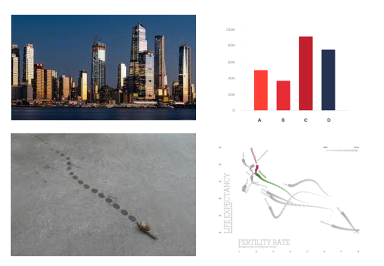
“When shortcutting the design process, I think back to the natural world.” In my years of data visualisation consultancy, I am often asked “How do I choose the right visual?”.…
Category: Musings
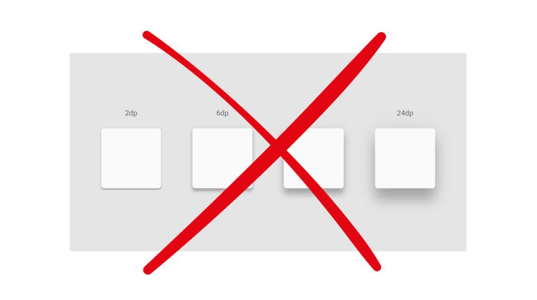
Drop the Drop Shadows!
*WARNING* This article contains images that may be potential vestibular and photosensitivity risk. Drop shadows should be used with caution in UI/UX design. When overused or poorly implemented, drop shadows can…
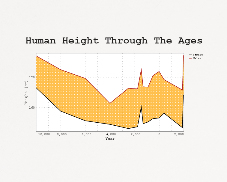
On Patterns and Textures
*WARNING* This article contains images that may be potential vestibular and photosensitivity risk. In playing with Deneb this last year I had great fun exploring pattern fill options. This was…
Power BI + Adobe = Magic
Adobe Illustrator has been a tool in my dashboard design kit for quite a while. I’ve used it predominately for creating report assets such as icons, headers and backgrounds. I’ve…
Visualising 2021
2021 was an extraordinary year for me. I’m a woman of few words, so rather than write about it, I’d thought I’d illustrate it. The below image is deeply personal,…
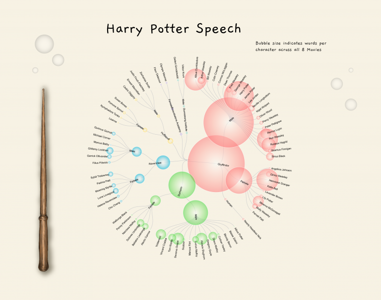
Exploring diversity
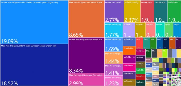
In recent days I received an email about a development program with sponsorship available for individuals who identify as being from a diverse background. This was followed by a long…
Reasons to avoid gradient backgrounds on Power BI reports
Gradient backgrounds are all the rage in dashboard design. They appear to be floating around everywhere. Looks cool right? Perhaps. I am not a fan, and for some time have…
My biggest wish for the Power BI suite?
A no-code wizard for common statistical analyses. Common statistical analyses such as Multiple Linear Regression, Factor Analysis, ANOVAs, MANOVAs, and the like are hard to perform in Power BI. At…
On the importance of data literacy…
Well, checking your sources at least.. I once presented on Psuedo-Profound Bullshit (yes, it’s an academic term) and people’s receptivity to bullshit. To my own, and my teams amusement, I…

