
*WARNING* This article contains images that may be potential vestibular and photosensitivity risk. Drop shadows should be used with caution in UI/UX design. When overused or poorly implemented, drop shadows can…
Adding sparklines to New Card Visual
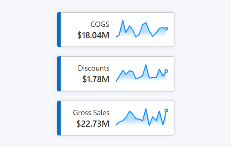
The New Card Visual is out in preview for the June 2023 Power BI Desktop – and it’s absolutely fantastic. With this first drop of the Card Visual we can…
Measure-driven data labels
May 2023 Power BI Desktop brought the beginnings of measure-driven data labels. Currently available on bar and line charts, but not yet scatter charts. With measure-driven data labels you are…
KPI trend indicators on Core Visuals
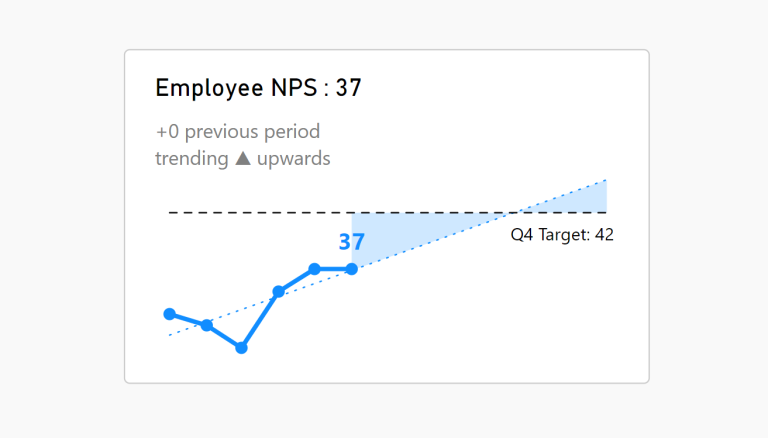
With the February and March 2023 Desktop releases comes more features enabling us to enhance our KPI visualisations out of the box. This article talks specifically to the DAX function…
Visualise Filters Applied
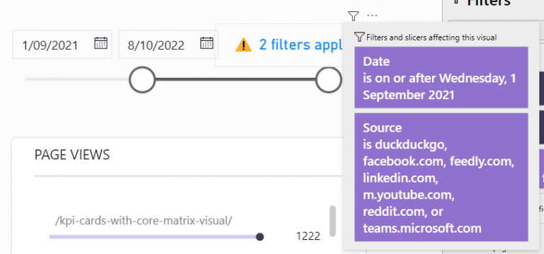
Creating a DAX measure to notify filters have been applied to a report is helpful when there are hidden slicer or filter panels.
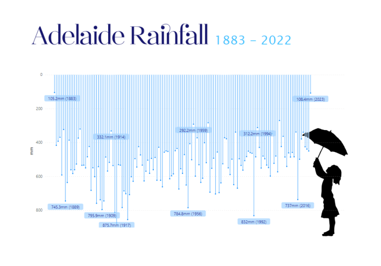
Custom path axis with Charticulator
If there is one stand-out feature of Charticulator… …it is the ease at which we can design data visualisations along custom path axes. If you’re into the technical details, there…
Breaking the Rules
My latest Deneb creation breaks ALL THE RULES of Dataviz But. I like it! This is a visual I designed for myself. I’m fascinated with the human body and the…
Convert to Shape
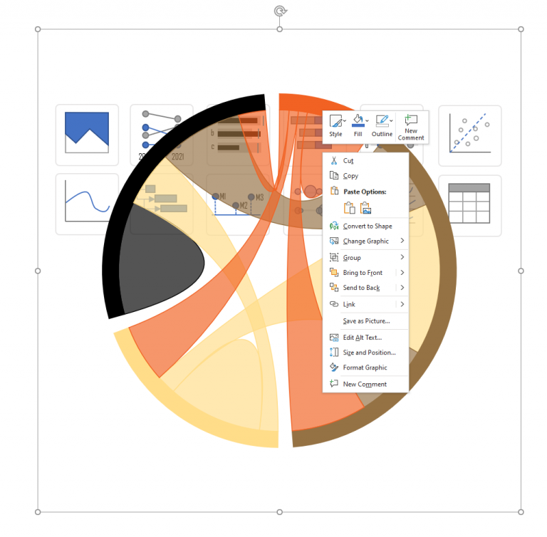
A PowerPoint Quick Trick I found myself needing to create some chart icons this week and I was without my trusty Adobe Illustrator. I instead brought out PowerPoint and began…
Quick Chart Makeover
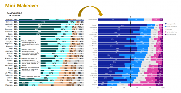
I came across this Global Views on Abortion Report which showed the following graph: It was great to compare support for permitting abortion across different countries, but it was a…
Reversed Deviation Icicle Chart
A deviation icicle chart is an uncommon chart to show variance from a target or baseline value across time. There are a multitude of ways to show comparison to target…