
This mid-year has been an awfully busy time for me. A number of family events, holidays and a company change, have kept me occupied. Which has meant that it’s taken…
On Patterns and Textures
*WARNING* This article contains images that may be potential vestibular and photosensitivity risk. In playing with Deneb this last year I had great fun exploring pattern fill options. This was…
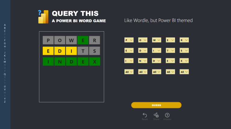
Power BI + Adobe = Magic
Adobe Illustrator has been a tool in my dashboard design kit for quite a while. I’ve used it predominately for creating report assets such as icons, headers and backgrounds. I’ve…
Position with PureViz
This post is a continuation of my exploration of the latest updates on the PureViz custom visual for Power BI. In my previous post, I looked at colour fill and…
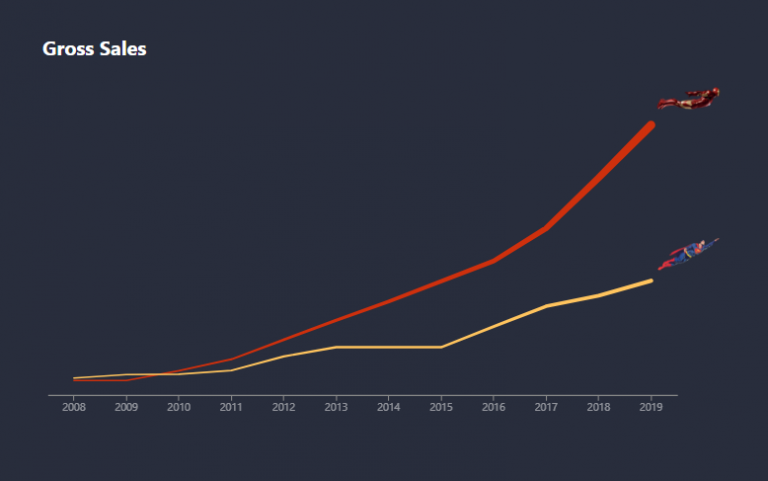
Comics with PureViz
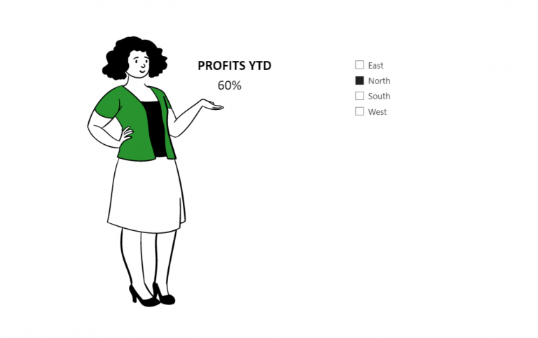
I recently discovered a new feature in PowerPoint – “Cartoon People”. It offers the ability to mix and match bodies, faces and expressions and looked quite a bit of fun.…
Thinking about target bands
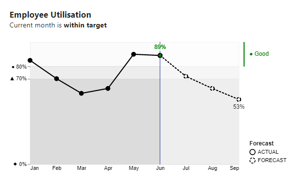
I’ve come across many charts like this in the wild. This one depicts utilisation and RAG status by month. They’re not bad charts, they serve a purpose, but they could…
Community Heroes
Personal reflections.
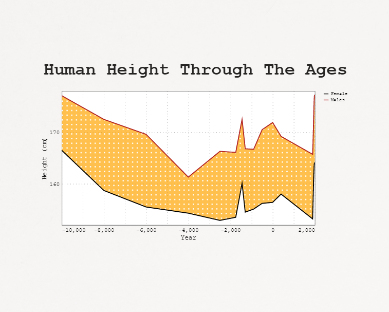
Legend for a layered plot in Deneb
I came across this dataviz in my Twitter feed and it instantly drew my attention: My interest was in the aesthetics of the visual and not the subject matter. I…
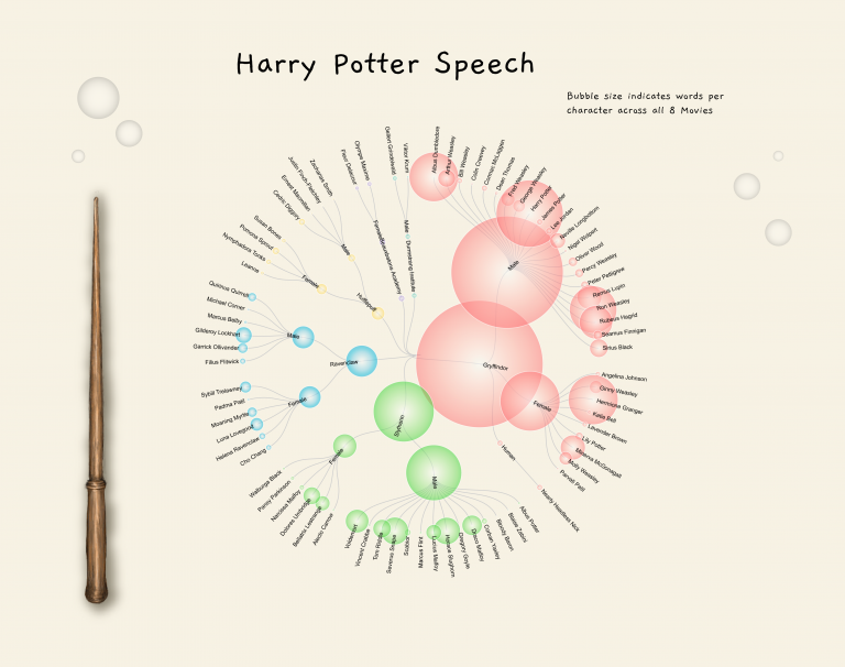
Images and custom shapes in Deneb
Over the past few months, I’ve had considerable fun exploring images and custom shapes with Deneb Custom visual for Power BI. I’ve finally gotten around to blogging about it. There…
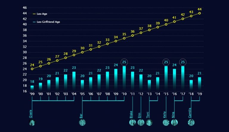
Visualising 2021
2021 was an extraordinary year for me. I’m a woman of few words, so rather than write about it, I’d thought I’d illustrate it. The below image is deeply personal,…